Sherwin-Williams Chatroom (SW 6171) is a refined, muted green-gray that offers a calming and modern aesthetic. This versatile neutral is perfect for creating spaces that feel grounded, tranquil, and effortlessly stylish. With its understated elegance, Chatroom works beautifully in both residential and commercial interiors, making it a favorite among designers.
Chatroom has a balanced blend of green and gray undertones, giving it a soft, organic feel. The green undertones add warmth and depth, while the gray influence keeps the color neutral and sophisticated. Depending on the lighting, Chatroom can lean more green in brighter spaces or appear slightly cooler in shaded areas. Its chameleon-like quality allows it to adapt seamlessly to various environments, making it an excellent choice for creating a cohesive look throughout your home or office.
Sherwin-Williams Chatroom pairs beautifully with a range of complementary hues, thanks to its neutral yet distinctive profile. Here are a few suggestions to inspire your palette:
Chatroom’s versatility and understated elegance make it suitable for a wide range of applications. Whether you’re looking to create a serene retreat or a polished, professional environment, Chatroom rises to the occasion.
Chatroom’s soothing, neutral tones make it an excellent choice for living rooms and shared spaces. Pair it with warm wooden furniture and natural textures like woven rugs or linen upholstery to enhance its organic vibe. Add pops of color through artwork and decor for a balanced, inviting look.
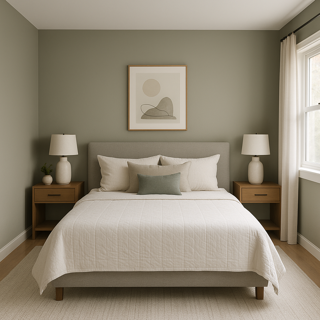
Because of its calming nature, Chatroom is ideal for bedrooms where relaxation is key. Layer soft textiles like plush throws and pillows in coordinating colors to create a sanctuary that feels restful and cohesive.
Chatroom brings a spa-like quality to bathrooms. Pair it with white subway tiles and polished chrome fixtures for a clean, modern aesthetic. Add greenery, such as potted plants, to further emphasize its natural undertones.
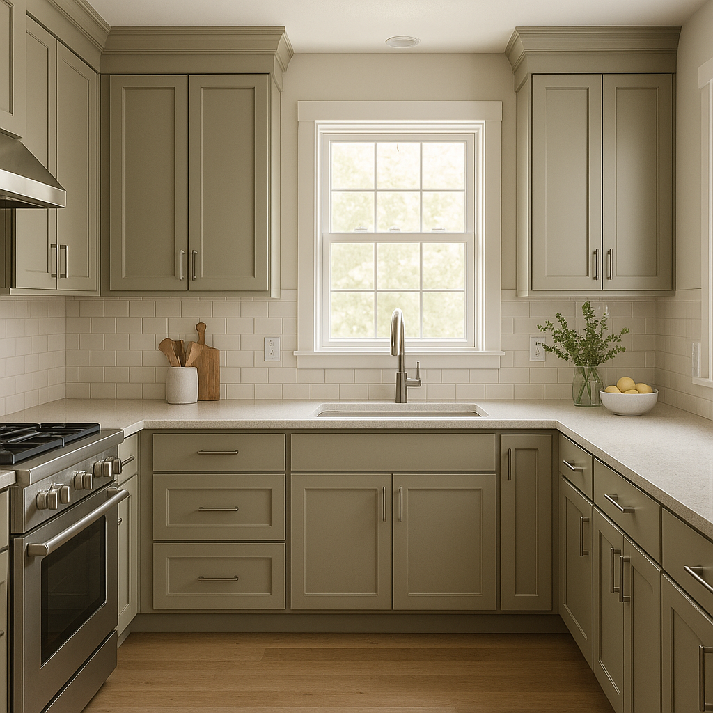
In kitchens, Chatroom acts as a sophisticated backdrop for cabinetry or walls. Pair it with white or off-white countertops and backsplash tiles for a fresh, timeless look. For a bolder statement, opt for dark hardware and accents.
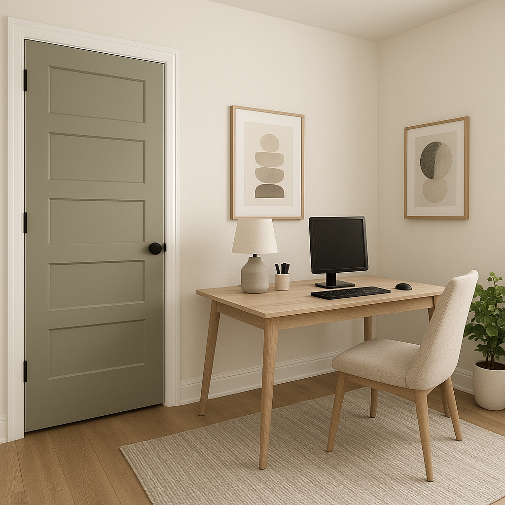
Chatroom’s neutral yet intriguing tone makes it a fantastic choice for offices and workspaces. Its muted green undertones promote focus and calm, while its gray base ensures a professional and polished appearance.
Chatroom isn’t limited to interiors—it’s also a stunning option for exterior siding or trim. Its earthy vibe works beautifully with natural landscaping and architectural elements, creating a harmonious connection to the outdoors.
Chatroom’s appearance can shift based on lighting conditions, so it’s important to test it in your space before committing. In bright, natural light, the green undertones are more pronounced, giving the color a fresh, earthy feel. In dimmer or artificial lighting, the gray aspect may dominate, lending a cooler and more subdued look. This adaptability makes Chatroom a reliable choice for spaces with varying light levels.
Sherwin-Williams Chatroom (SW 6171) is a sophisticated and versatile color that bridges the gap between neutral and earthy. With its soft green-gray undertones, it creates a sense of calm and modernity in any space it graces. Whether you’re looking to enhance your interiors or exteriors, Chatroom’s timeless appeal and adaptability make it a standout choice for a wide range of design styles.
Note: These images were all generated with AI, there may be inaccurate color results. Please only use a general reference to get a rough idea of what a color may look like, we will continue to generate new images to improve accuracy.
View Colors Only by Brand (No Imagery):
Sherwin-Williams
|
Benjamin-Moore
|
Behr
|
Valspar
Live on the Eastern Slope of Colorado and looking for a local painting professional, check out all our painting services and reach out for a free estimate.
Copyright © 2026 : Wild Fox Painting Inc. : 12435 Mead Way, Littleton, CO 80125


