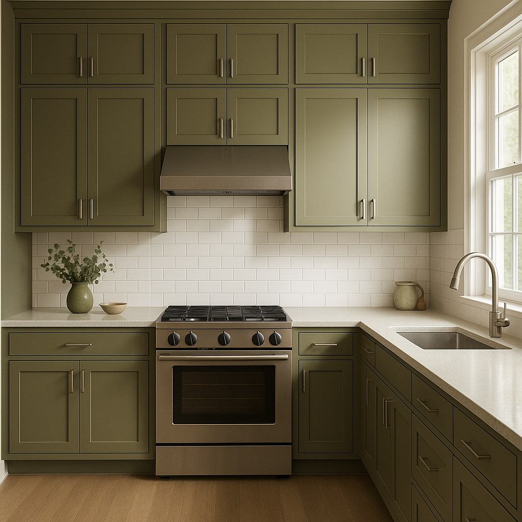
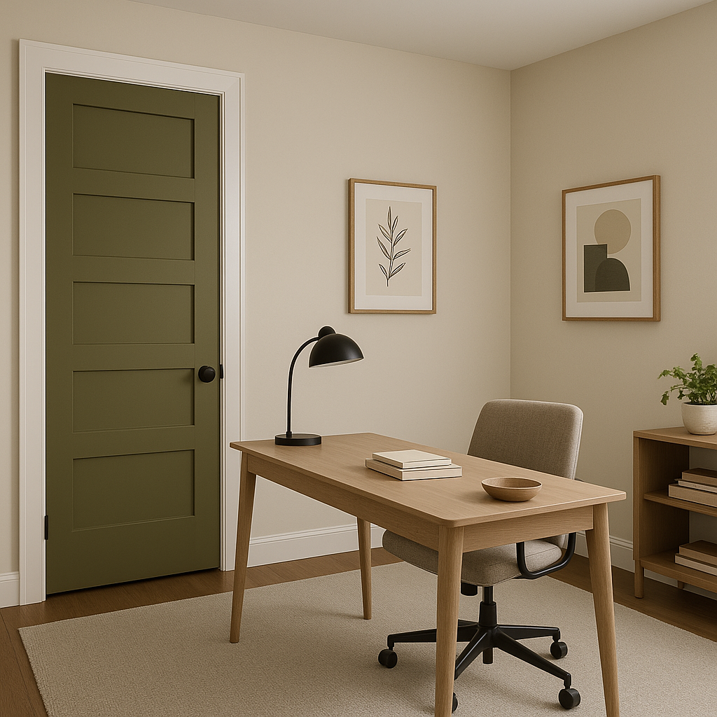
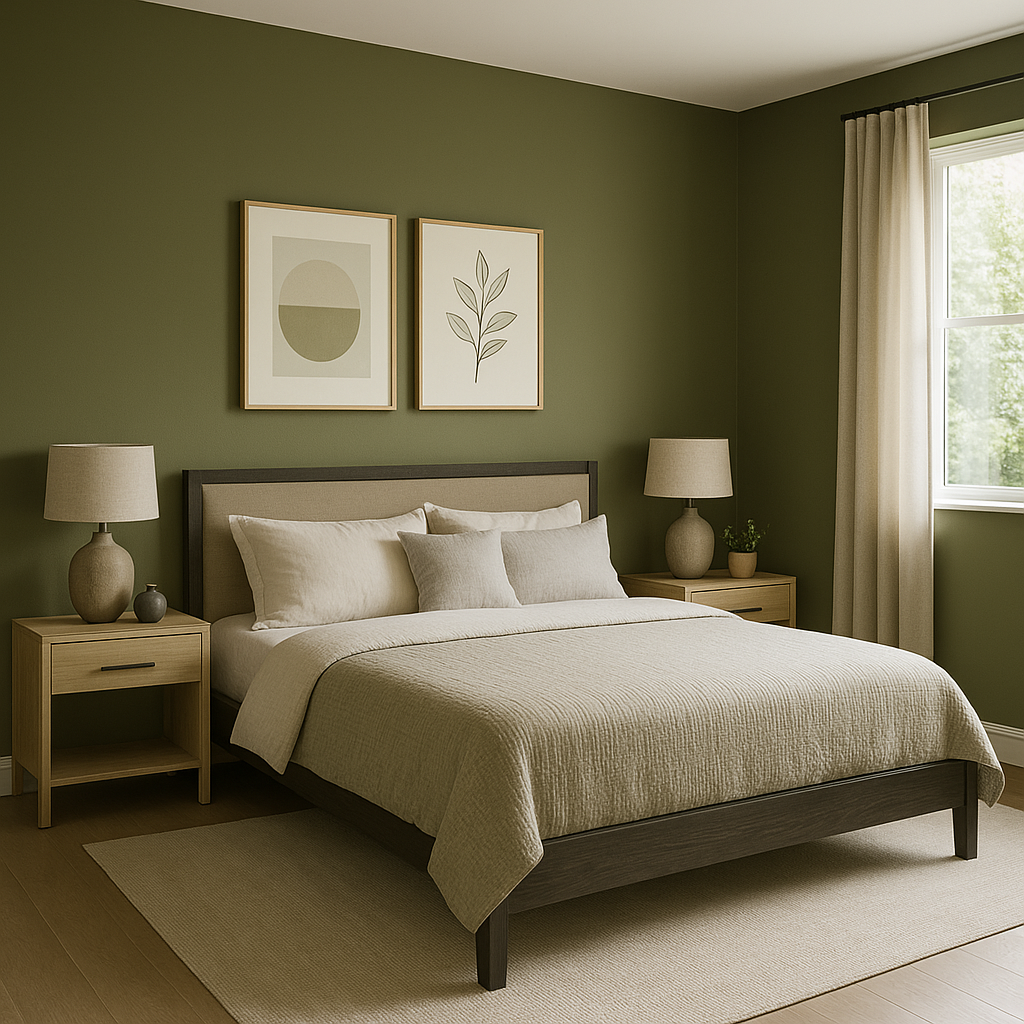
Sherwin-Williams Oakmoss (SW 6180) is a deep, earthy green that exudes warmth and sophistication. Perfect for creating cozy, nature-inspired spaces, this bold yet versatile color brings the outdoors in, offering a grounding and harmonious ambiance. Oakmoss is ideal for homeowners and designers seeking a rich, saturated hue that balances drama with a sense of calm.
Oakmoss is a complex, deep green with subtle yellow undertones. These warm undertones prevent the color from feeling overly cool or harsh, ensuring a welcoming and inviting look. The yellow hints give it a natural, mossy quality reminiscent of lush forest floors. This unique combination of earthy green and golden warmth makes Oakmoss a dynamic choice for both traditional and modern spaces.
Sherwin-Williams Oakmoss pairs beautifully with a wide range of complementary and coordinating colors, allowing you to create cohesive palettes for any room.
Oakmoss is a versatile shade that works beautifully in a variety of spaces, whether you're designing a cozy retreat or an impactful statement room.
Sherwin-Williams Oakmoss (SW 6180) is more than just a paint color—it's a design element that transforms spaces with its rich, earthy depth. Whether you're aiming for traditional charm or modern sophistication, this versatile green adds timeless elegance to any project. Its warm undertones, compatibility with a wide range of colors, and adaptability across various design styles make it a standout choice for interior and exterior use alike.
If you’re looking to create a space that feels grounded, inviting, and effortlessly stylish, Sherwin-Williams Oakmoss is the perfect hue to bring your vision to life.
Note: These images were all generated with AI, there may be inaccurate color results. Please only use a general reference to get a rough idea of what a color may look like, we will continue to generate new images to improve accuracy.
View Colors Only by Brand (No Imagery):
Sherwin-Williams
|
Benjamin-Moore
|
Behr
|
Valspar
Live on the Eastern Slope of Colorado and looking for a local painting professional, check out all our painting services and reach out for a free estimate.
Copyright © 2026 : Wild Fox Painting Inc. : 12435 Mead Way, Littleton, CO 80125


