Sherwin-Williams Austere Gray (SW 6184) is a versatile neutral that strikes the perfect balance between modern sophistication and understated charm. With its soft, muted green undertones, this shade of gray offers a serene and calming presence, making it an excellent choice for a wide range of interior and exterior spaces. Whether you're creating a tranquil retreat or a polished, contemporary look, Austere Gray adapts seamlessly to your design vision.
The beauty of Austere Gray lies in its subtle complexity. While it is predominantly a gray, it carries a hint of green undertones that give it a slightly earthy, organic quality. These green undertones lend warmth and depth to the color, allowing it to harmonize beautifully with both cool and warm palettes. Its undertones are soft and subdued, ensuring the color remains neutral enough to avoid overpowering a space while still offering a distinctive character.
Austere Gray is remarkably versatile, making it an ideal companion to a variety of complementary shades. Here are some coordinating colors that work beautifully with this hue:
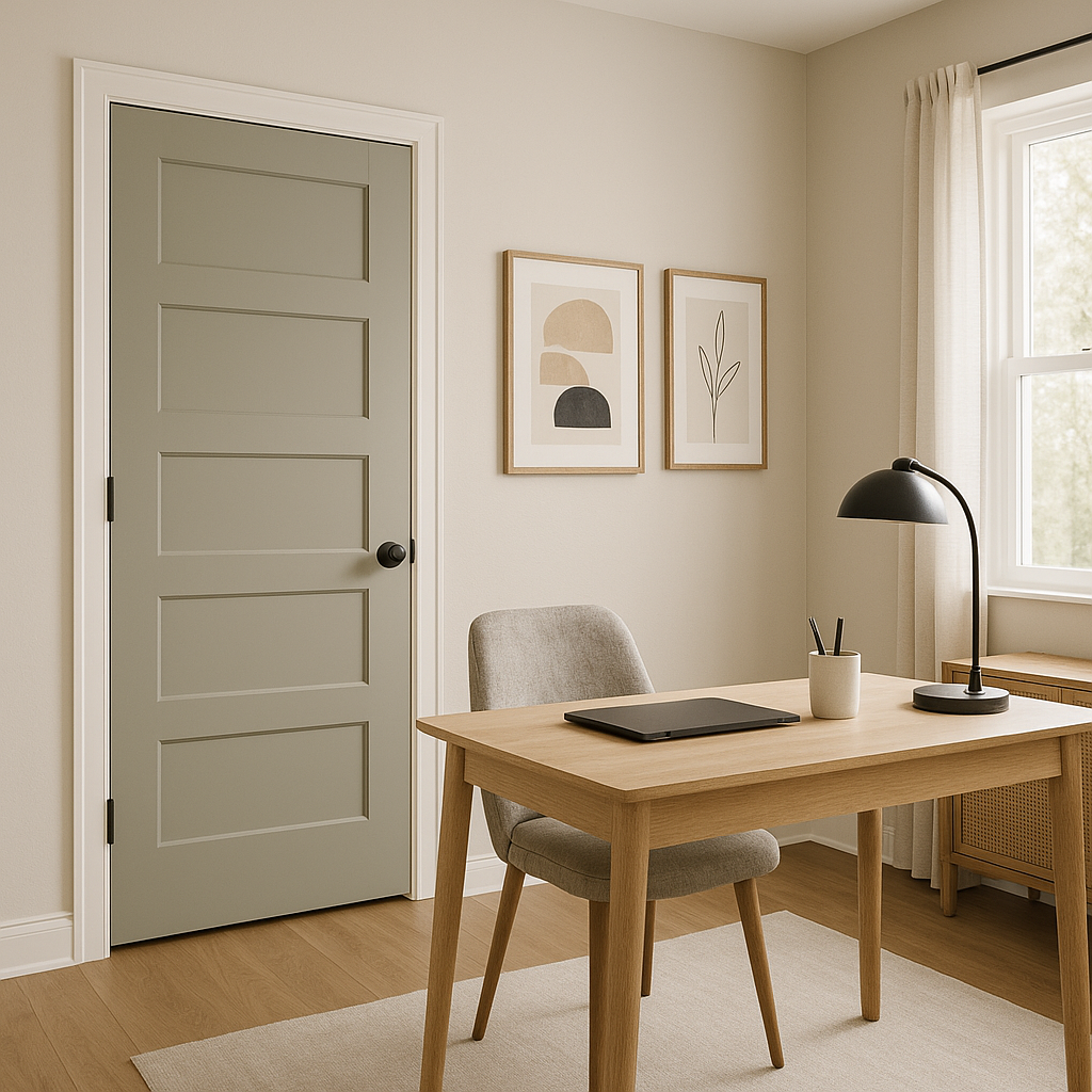
Austere Gray’s adaptability makes it suitable for nearly any space, but there are specific areas where it truly excels:
Create a tranquil, inviting living room by using Austere Gray as the primary wall color. Its muted green undertones bring a sense of calm, while its neutrality makes it easy to layer in furniture and décor of varying styles and colors.
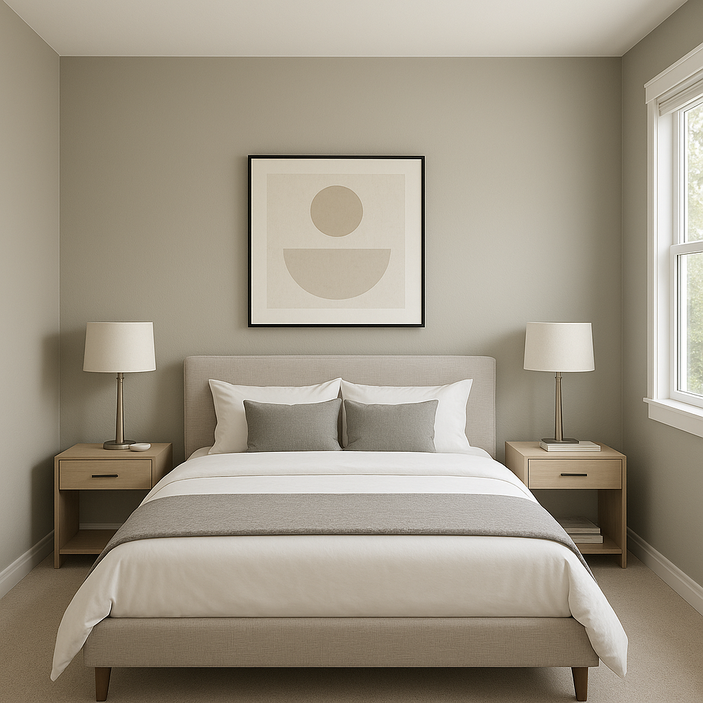
For a restful, spa-like retreat, Austere Gray is an exceptional choice. Pair it with soft linens in whites, creams, or pale blues to enhance its calming effect.
In bathrooms, Austere Gray offers a clean, serene backdrop, especially when paired with white subway tiles, polished chrome fixtures, and natural wood accents.
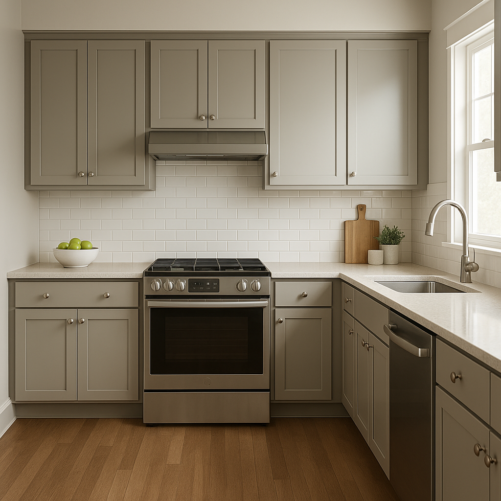
This color works wonderfully in kitchens and dining rooms, particularly when paired with white cabinetry and natural stone countertops. It provides a soft, neutral background that allows other design elements to shine.
Austere Gray’s subtle green undertones make it an excellent choice for exterior siding. Pair it with white trim and black shutters for a timeless and elegant curb appeal.
Like many grays with green undertones, Austere Gray can shift slightly depending on the lighting conditions in your space:
Sherwin-Williams Austere Gray (SW 6184) is a timeless choice for those seeking a neutral color with a subtle twist. Its soft green undertones and incredible versatility make it a favorite among interior designers and homeowners alike. Whether you're transforming a single room or an entire home, Austere Gray delivers a sophisticated yet approachable aesthetic that adapts beautifully to any style.
By thoughtfully pairing it with coordinating colors and considering its lighting effects, Austere Gray can elevate your space into a harmonious and stylish haven.
Note: These images were all generated with AI, there may be inaccurate color results. Please only use a general reference to get a rough idea of what a color may look like, we will continue to generate new images to improve accuracy.
View Colors Only by Brand (No Imagery):
Sherwin-Williams
|
Benjamin-Moore
|
Behr
|
Valspar
Live on the Eastern Slope of Colorado and looking for a local painting professional, check out all our painting services and reach out for a free estimate.
Copyright © 2026 : Wild Fox Painting Inc. : 12435 Mead Way, Littleton, CO 80125


