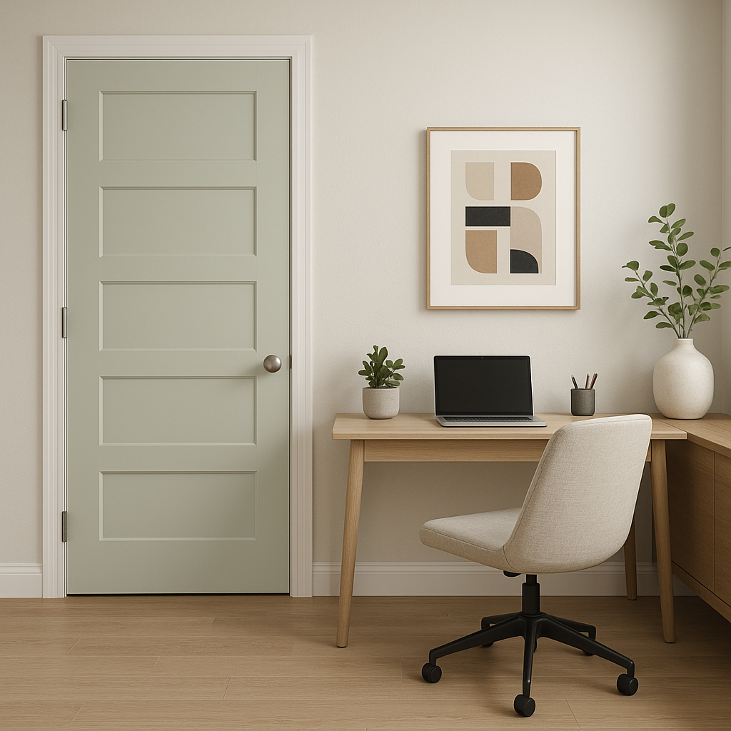
Sherwin-Williams Opaline SW 6189 is a soft, muted green with a delicate gray undertone that exudes a sense of calm and sophistication. This gentle color is perfect for creating a serene atmosphere, making it an excellent choice for spaces designed to relax and rejuvenate. Its understated elegance allows it to work seamlessly in a variety of design styles, from modern farmhouse to minimalist and coastal-inspired interiors.
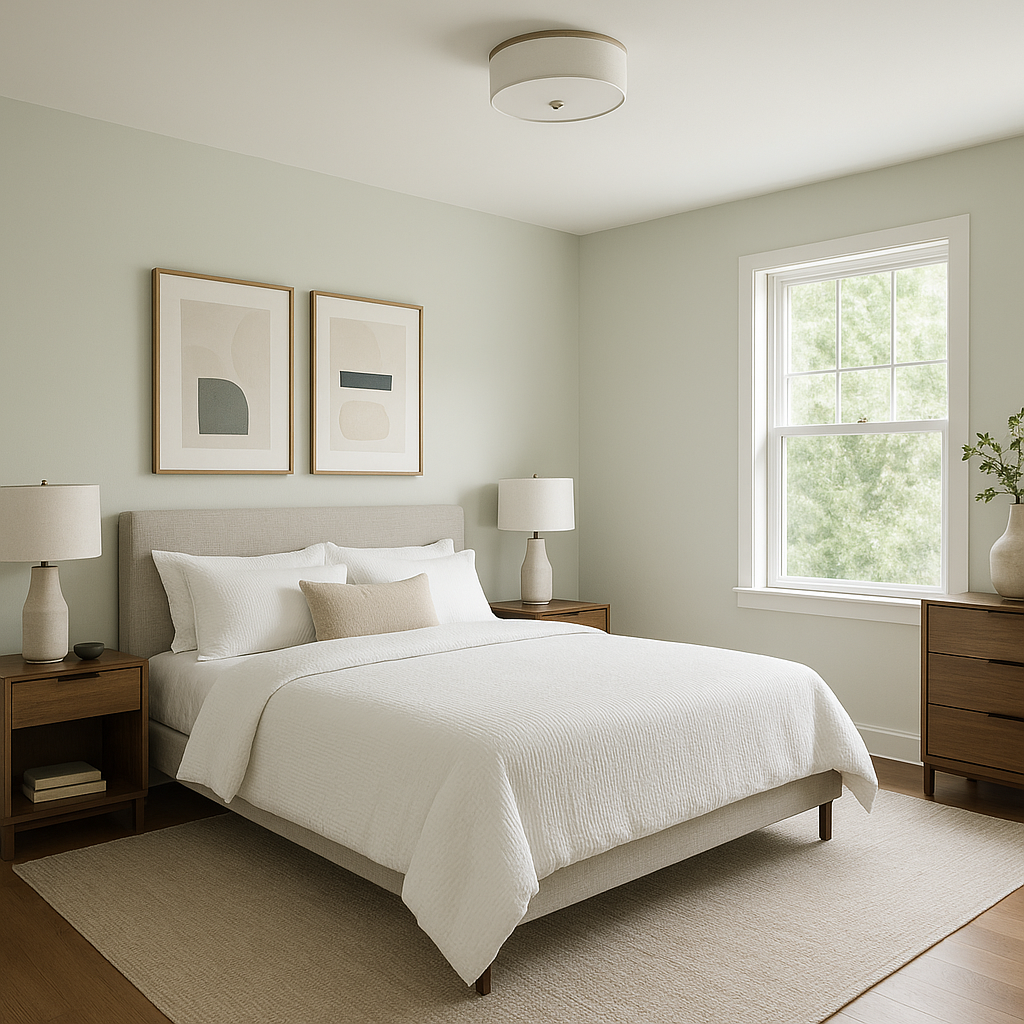
Opaline has a subtle gray base that tempers its green hue, giving it a soft and sophisticated feel. This muted quality prevents it from feeling overly vibrant or bold, making it ideal for those who prefer a more neutral aesthetic with just a hint of color. Depending on the lighting, Opaline can appear slightly cooler in north-facing rooms or take on a warmer, earthy tone in spaces with abundant natural sunlight.
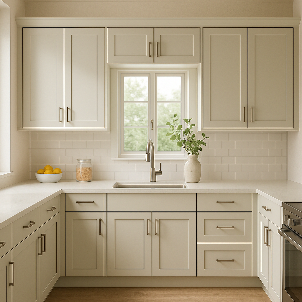
Opaline is a versatile color that can be used in a variety of spaces throughout the home. Its calming green-gray hue makes it particularly well-suited for:
Its neutral undertones make it a versatile option, allowing it to complement both traditional and contemporary furnishings.
To enhance the beauty of Opaline, consider pairing it with these coordinating colors:
These pairings allow you to create a harmonious color palette that works well in both large and small spaces.
As with any paint color, lighting plays a crucial role in how Opaline is perceived. In spaces with ample natural light, the green undertones may appear more pronounced, making the room feel fresh and airy. In dimmer environments, the gray undertones take center stage, creating a cozier and more subdued ambiance. To fully appreciate its versatility, consider testing Opaline in your space with swatches or sample cans before committing.
Opaline is the perfect blend of subtlety and personality. Its muted green-gray tone adds a sense of calm and understated elegance to any room. Whether you're designing a coastal-inspired retreat, a modern minimalist haven, or a cozy traditional space, Opaline provides the perfect backdrop. Its ability to coordinate effortlessly with a range of colors and styles makes it a go-to choice for homeowners and designers alike.
With its serene undertones and versatile applications, Sherwin-Williams Opaline SW 6189 is a timeless choice that transforms any space into a haven of comfort and style.
Note: These images were all generated with AI, there may be inaccurate color results. Please only use a general reference to get a rough idea of what a color may look like, we will continue to generate new images to improve accuracy.
View Colors Only by Brand (No Imagery):
Sherwin-Williams
|
Benjamin-Moore
|
Behr
|
Valspar
Live on the Eastern Slope of Colorado and looking for a local painting professional, check out all our painting services and reach out for a free estimate.
Copyright © 2026 : Wild Fox Painting Inc. : 12435 Mead Way, Littleton, CO 80125


