Sherwin-Williams Privilege Green (SW 6193) is a versatile and elegant green that strikes the perfect balance between richness and subtlety. This medium-toned green has an earthy warmth that feels both grounded and refreshing, making it an excellent choice for a variety of interior design styles, from modern farmhouse to transitional and contemporary aesthetics. Its timeless appeal lies in its ability to evoke a sense of calm and connection to nature while maintaining a refined, sophisticated look.
Privilege Green features subtle undertones that lean toward golden or olive hues, giving it a soft, organic warmth. These undertones make the color feel less stark and more approachable, ensuring it complements a wide range of palettes. Unlike cooler greens that can sometimes feel sharp or sterile, Privilege Green offers a comforting, earthy essence that works beautifully in both residential and commercial spaces.
The golden undertones also mean this shade pairs exceptionally well with both warm and neutral color palettes. Whether you’re looking to create a cozy living room or a serene bedroom retreat, Privilege Green adapts seamlessly to its surroundings.
When designing with Privilege Green, selecting coordinating colors can help you achieve a harmonious and balanced look. Here are a few recommendations for pairing:
By using these coordinating colors, you can create a palette that feels intentional and well-designed.
Privilege Green is remarkably versatile and can be used throughout your home or commercial space to achieve different effects. Here are some ideas for incorporating it into your interiors:
Privilege Green makes a stunning statement on living room walls, especially when paired with light-colored furniture and warm wood tones. Add natural textures like woven rugs or jute baskets to enhance its organic appeal. For a dramatic effect, consider pairing it with dark-stained wood furniture or metallic accents like brass or gold.
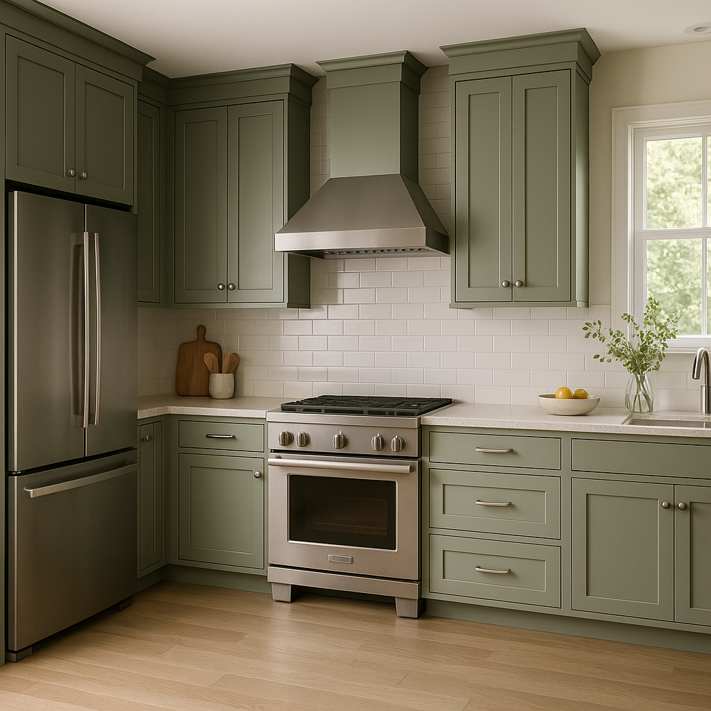
In kitchens, Privilege Green works wonderfully as a cabinet color. Its earthy undertones pair beautifully with white subway tiles, butcher block countertops, or marble surfaces. For a modern twist, incorporate black hardware and matte finishes.
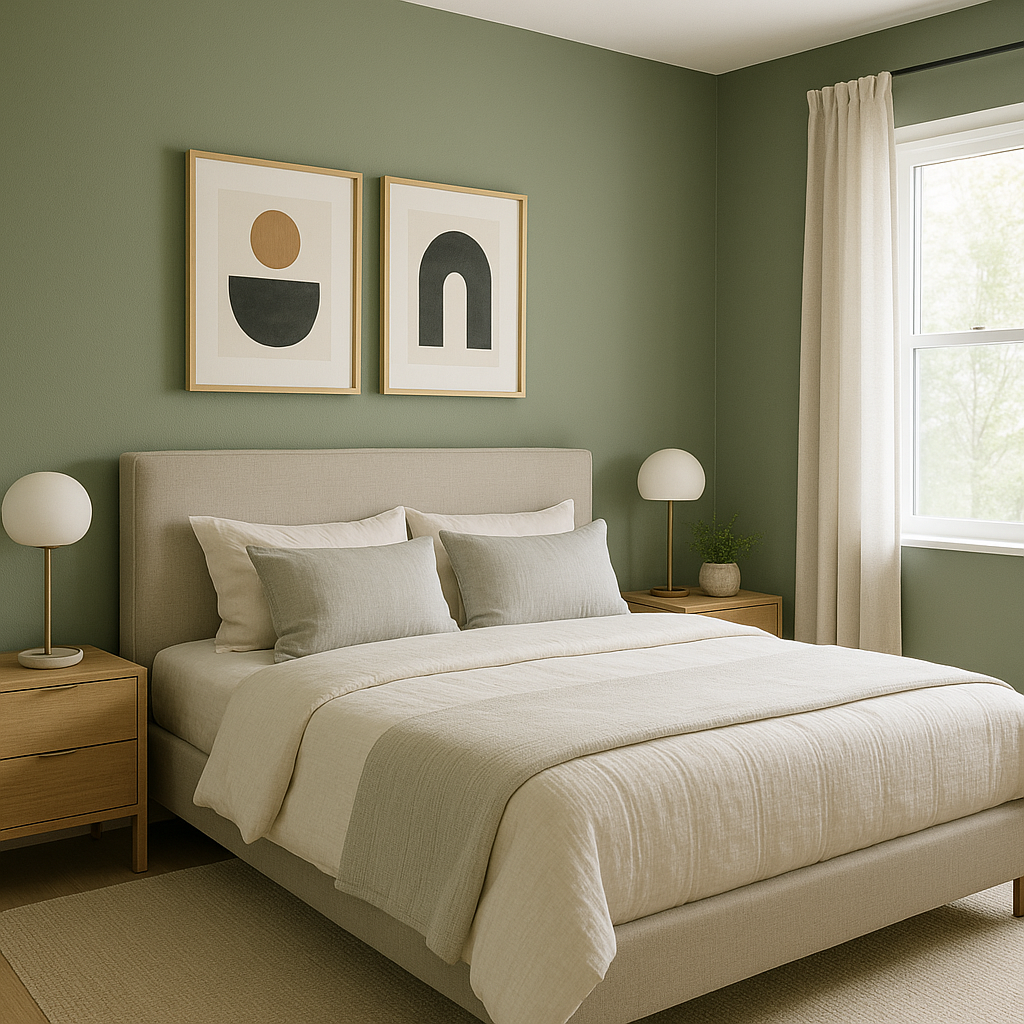
As a bedroom wall color, Privilege Green creates a restful and serene atmosphere. Pair it with crisp white linens and soft beige or taupe accents for a cozy and inviting space. Add greenery or botanical prints to further tie in the natural feel.
Privilege Green can add unexpected charm to bathrooms, whether used on walls or cabinetry. Pair it with light, neutral tiles and fixtures for a spa-like vibe, or use it to make a bold statement alongside darker grout lines and industrial-style lighting.
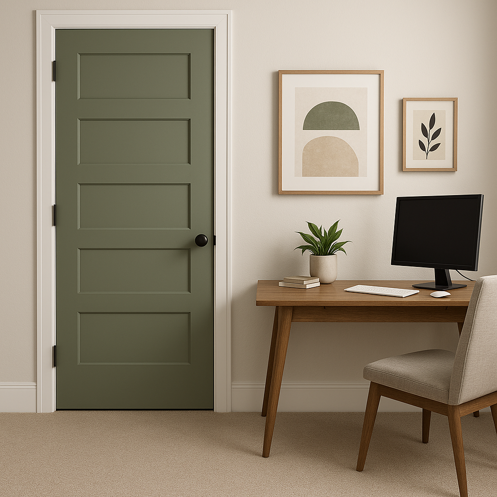
For a home office, Privilege Green fosters focus and creativity. Its grounding tones help reduce distractions, making it ideal for a productive workspace. Combine it with clean-lined furniture and minimal decor for a sophisticated, professional look.
As with any paint color, lighting plays a significant role in how Privilege Green appears in your space. In natural light, the golden undertones become more pronounced, giving the color a soft, sunlit glow. In artificial light—especially warm lighting—it may lean slightly more towards its olive tones, creating a cozier ambiance. For spaces with limited natural light, consider pairing it with lighter colors to keep the room feeling open and airy.
Sherwin-Williams Privilege Green (SW 6193) offers a unique blend of sophistication and versatility. Its earthy, warm undertones make it an excellent choice for a wide range of design styles and applications. Whether used as a main wall color or as an accent, Privilege Green can transform any space into a tranquil, nature-inspired retreat.
Note: These images were all generated with AI, there may be inaccurate color results. Please only use a general reference to get a rough idea of what a color may look like, we will continue to generate new images to improve accuracy.
View Colors Only by Brand (No Imagery):
Sherwin-Williams
|
Benjamin-Moore
|
Behr
|
Valspar
Live on the Eastern Slope of Colorado and looking for a local painting professional, check out all our painting services and reach out for a free estimate.
Copyright © 2026 : Wild Fox Painting Inc. : 12435 Mead Way, Littleton, CO 80125


