Sherwin-Williams Sensible Hue (SW 6198) is a sophisticated and serene shade that effortlessly bridges the gap between a soft gray and a muted green. This color’s understated elegance makes it a popular choice for homeowners and designers seeking a tone that feels grounded yet versatile. With its cool undertones and subtle depth, Sensible Hue is perfect for creating spaces that are both calming and stylish.
Sensible Hue carries delicate undertones of green and gray, lending it a balanced appearance that feels earthy yet modern. The green undertones add a gentle freshness, while the gray base ensures it remains neutral and adaptable. This duality makes Sensible Hue suitable for a wide range of design styles, from contemporary to transitional to coastal-inspired spaces.
When paired with certain lighting conditions, Sensible Hue can lean more green or gray, making it a chameleon-like color that adapts beautifully to its surroundings. In natural light, its green undertones become more pronounced, creating a soft organic vibe. Under artificial or cooler lighting, the gray elements take center stage, delivering a crisp, refined feel.
Sensible Hue’s versatility shines when paired with complementary shades. Here are some ideal coordinating colors to enhance its beauty:
These pairings allow you to create a range of moods, from light and airy to bold and dramatic, depending on your design goals.
Sensible Hue is one of those rare colors that works effortlessly in nearly every room of the home. Its soft sophistication and neutral undertones make it ideal for both main living areas and personal retreats. Here are some ways to incorporate Sensible Hue into your design:
Create a serene and welcoming atmosphere by using Sensible Hue on the walls of your living room. Pair it with warm wood tones, textured fabrics, and crisp white trim for a balanced look that feels cozy yet refined.
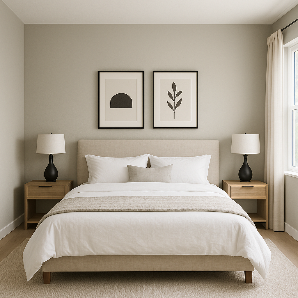
Sensible Hue is the perfect choice for a bedroom, thanks to its calming qualities. Pair it with soft linens in cream or beige and accent with natural greenery to craft a tranquil space where relaxation is effortless.
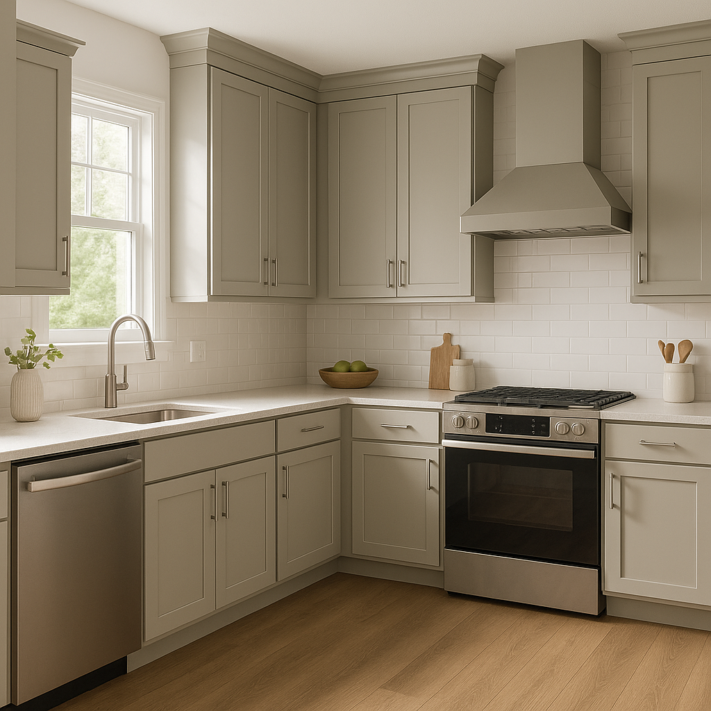
For a fresh, modern kitchen, consider Sensible Hue for cabinetry or walls. It pairs beautifully with white quartz countertops, brushed nickel hardware, and subway tile backsplashes to create a timeless look.
In bathrooms, Sensible Hue brings spa-like tranquility. Combine it with white fixtures, cool marble accents, and polished chrome finishes for an elegant retreat you'll love to unwind in.
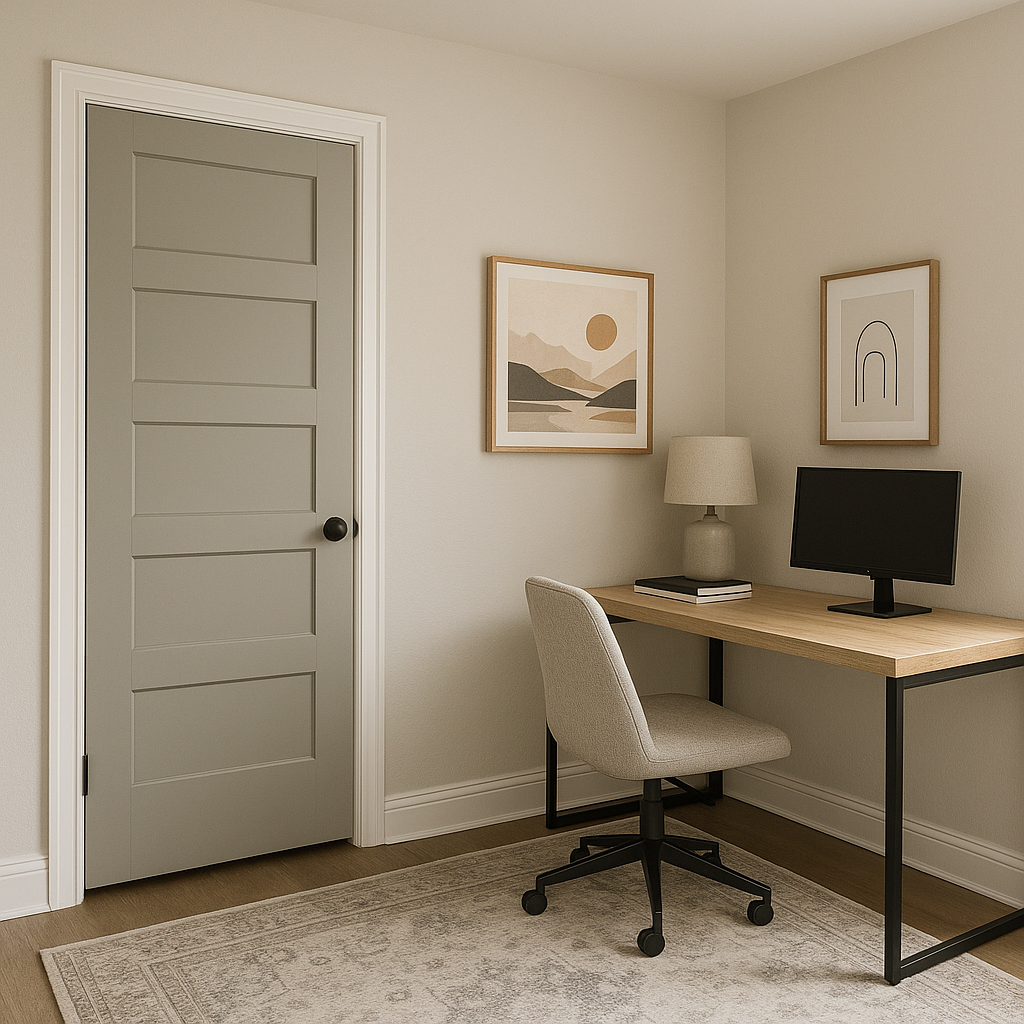
If you’re looking to make a subtle statement, use Sensible Hue as an accent wall color. It pairs beautifully with lighter shades like Sherwin-Williams Pure White or Sea Salt for an understated yet impactful effect.
Sherwin-Williams Sensible Hue (SW 6198) is more than just a paint color; it’s a design tool that allows you to create spaces that feel harmonious, sophisticated, and timeless. Its muted gray-green tones make it adaptable to various design styles, whether you're going for a modern minimalist look or a cozy, nature-inspired retreat. With its ability to shift beautifully between green and gray depending on lighting and pair effortlessly with a variety of coordinating colors, Sensible Hue is a true gem in the world of interior design.
Whether you’re refreshing a single room or embarking on a full home makeover, Sensible Hue is a color that will stand the test of time while bringing effortless elegance to your space.
Note: These images were all generated with AI, there may be inaccurate color results. Please only use a general reference to get a rough idea of what a color may look like, we will continue to generate new images to improve accuracy.
View Colors Only by Brand (No Imagery):
Sherwin-Williams
|
Benjamin-Moore
|
Behr
|
Valspar
Live on the Eastern Slope of Colorado and looking for a local painting professional, check out all our painting services and reach out for a free estimate.
Copyright © 2026 : Wild Fox Painting Inc. : 12435 Mead Way, Littleton, CO 80125


