Sherwin-Williams Quietude (SW 6212) is a tranquil and sophisticated shade that embodies the essence of calm. This nuanced blue-green hue is perfect for creating serene spaces, making it an ideal choice for homeowners and designers who seek a balance of elegance and relaxation. Its soft, muted tone pairs beautifully with both modern and traditional design styles, ensuring versatility for a variety of interior projects.
Quietude is more than just a simple blue-green; its undertones add depth and character to its appearance. It features a subtle gray undertone that helps soften the vibrancy of the blue and green components, making it feel grounded and sophisticated. This gray influence prevents the color from leaning too bright or saturated, ensuring that Quietude maintains its soothing presence in any lighting condition.
In cooler light, the blue undertones may stand out more prominently, evoking a refreshing and airy ambiance. In warmer light, the green undertones come to the forefront, adding a cozy and natural feel to the space. This chameleon-like quality makes Quietude a versatile choice for rooms with varying light exposure throughout the day.
Sherwin-Williams Quietude pairs effortlessly with a wide range of complementary colors, creating harmonious palettes that enhance its serene aesthetic. Some of the best coordinating colors include:
Quietude works beautifully with natural wood finishes, from light oak to rich walnut. Its organic undertones pair seamlessly with earthy textures, making it a favorite for creating warm yet modern interiors.
Quietude is a go-to color for spaces where serenity is key. Its calming qualities make it an ideal choice for bedrooms, bathrooms, and living rooms, but its versatility also extends to other areas of the home. Here are a few suggestions for incorporating Quietude into your design:
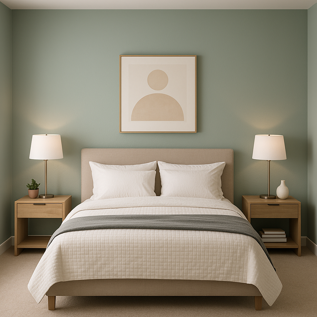
Create a restful retreat by pairing Quietude with crisp white linens, soft gray accents, and natural wood furniture. Its calming presence promotes relaxation and peaceful sleep.
Quietude is the quintessential spa color, perfect for bathrooms. Pair it with white subway tiles, polished chrome fixtures, and fluffy white towels to create a luxurious, Zen-inspired oasis.
For living spaces, Quietude serves as a beautiful backdrop for eclectic or coastal-inspired designs. Combine it with textured rugs, woven baskets, and pops of coral or navy for a balanced and inviting ambiance.
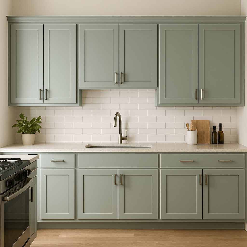
Bring a refreshing element to your kitchen by using Quietude on cabinetry or walls. Pair it with white countertops, brushed nickel hardware, and natural wood accents for a timeless and sophisticated look.
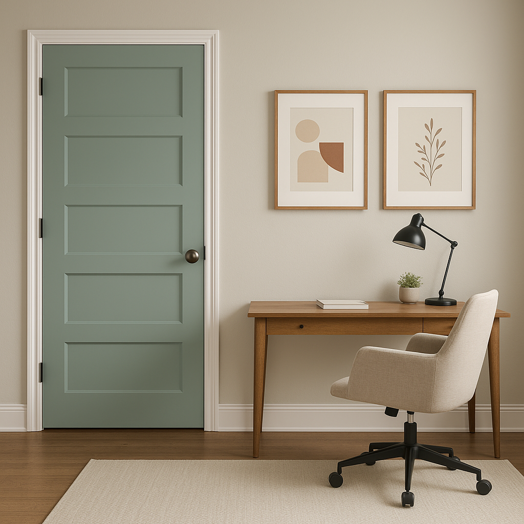
Quietude's tranquil vibe fosters focus and creativity, making it an excellent choice for a home office space. Pair it with minimalist furniture and neutral accents for a productive yet calming environment.
To fully appreciate Quietude's dynamic undertones, lighting plays a crucial role. In spaces with abundant natural light, Quietude takes on an airy and refreshing quality, while in dimly lit areas, its gray undertones provide a cozy and grounded feel. Complementing the color with appropriate artificial lighting—such as soft white or warm bulbs—can further enhance its calming charm.
Sherwin-Williams Quietude (SW 6212) is a timeless choice for those who seek a soothing and versatile color that transforms any space into a sanctuary. With its balanced undertones, coordinating hues, and adaptability, this serene blue-green is sure to inspire elegant and relaxing interiors for years to come.
Note: These images were all generated with AI, there may be inaccurate color results. Please only use a general reference to get a rough idea of what a color may look like, we will continue to generate new images to improve accuracy.
View Colors Only by Brand (No Imagery):
Sherwin-Williams
|
Benjamin-Moore
|
Behr
|
Valspar
Live on the Eastern Slope of Colorado and looking for a local painting professional, check out all our painting services and reach out for a free estimate.
Copyright © 2026 : Wild Fox Painting Inc. : 12435 Mead Way, Littleton, CO 80125


