Sherwin-Williams Jasper SW 6216 is an arresting, deep green hue that exudes depth, richness, and mystery. This color is a perfect choice for anyone looking to create a statement-making space that feels both grounding and luxurious. Its dark, moody tone makes it a versatile option for a variety of design styles, from modern minimalism to traditional elegance. Jasper’s timeless appeal ensures it remains relevant across trends, making it a reliable choice for both contemporary and classic interiors.
Jasper is a rich, dark green with deep blue undertones. These subtle blue undertones add complexity and balance to the color, preventing it from feeling too earthy or overly warm. Instead, the undertones lend a slightly cool sophistication to the shade, making it feel modern and chic. Depending on the lighting in your space, Jasper can lean more toward green in warmer light or exhibit a stronger blue undertone in cooler lighting. This dynamic quality makes it an intriguing choice for spaces that evolve throughout the day.
Sherwin-Williams Jasper pairs beautifully with an array of complementary and contrasting colors. For a harmonious palette, consider these coordinating colors:
Neutral Pairings:
Accent Colors:
Dramatic Contrast:
Jasper’s bold personality makes it ideal for spaces designed to make a statement or evoke a sense of intimacy and refinement. Here are some ideas for incorporating Jasper into your home or workspace:
Use Jasper as an accent wall color to create a dramatic focal point in living rooms, dining areas, or bedrooms. Pair it with lighter neutrals for balance or metallic accents like brass and gold for added luxury.
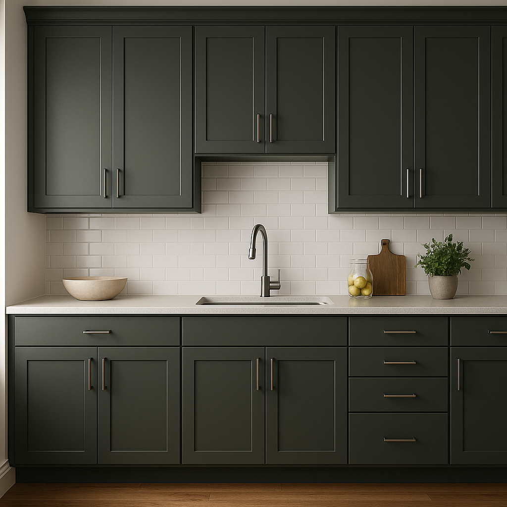
Jasper is a stunning choice for cabinetry, especially in kitchens and bathrooms. Its rich tone pairs beautifully with marble or quartz countertops, as well as brass or matte black hardware, giving the space a high-end, custom feel.
This deep green is ideal for home offices or libraries, where it can create a sophisticated, focused atmosphere. Pair it with dark wood furniture and leather for a classic, timeless design.
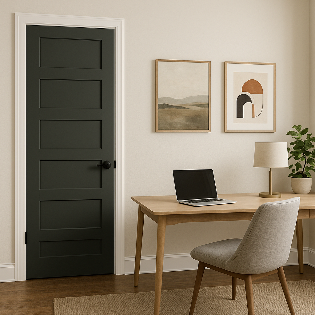
Jasper works exceptionally well for front doors, shutters, or exterior accents, providing a bold yet elegant curb appeal. It pairs wonderfully with neutral exteriors like stone or white siding.
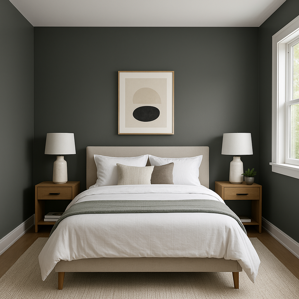
For those who love dark, moody bedrooms, Jasper is a perfect choice. It creates a cocoon-like environment, ideal for restful evenings. Add plush textiles in lighter tones for contrast and warmth.
Jasper SW 6216’s appearance can vary significantly depending on the lighting in your space. In rooms with ample natural light, the green will appear more vibrant, while in dimly lit spaces, the color takes on a deeper and more muted tone.
Note: These images were all generated with AI, there may be inaccurate color results. Please only use a general reference to get a rough idea of what a color may look like, we will continue to generate new images to improve accuracy.
View Colors Only by Brand (No Imagery):
Sherwin-Williams
|
Benjamin-Moore
|
Behr
|
Valspar
Live on the Eastern Slope of Colorado and looking for a local painting professional, check out all our painting services and reach out for a free estimate.
Copyright © 2026 : Wild Fox Painting Inc. : 12435 Mead Way, Littleton, CO 80125


