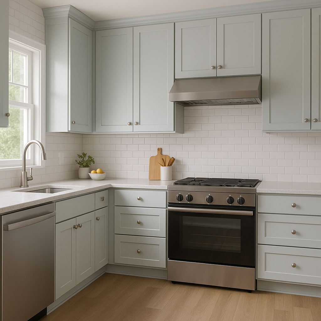
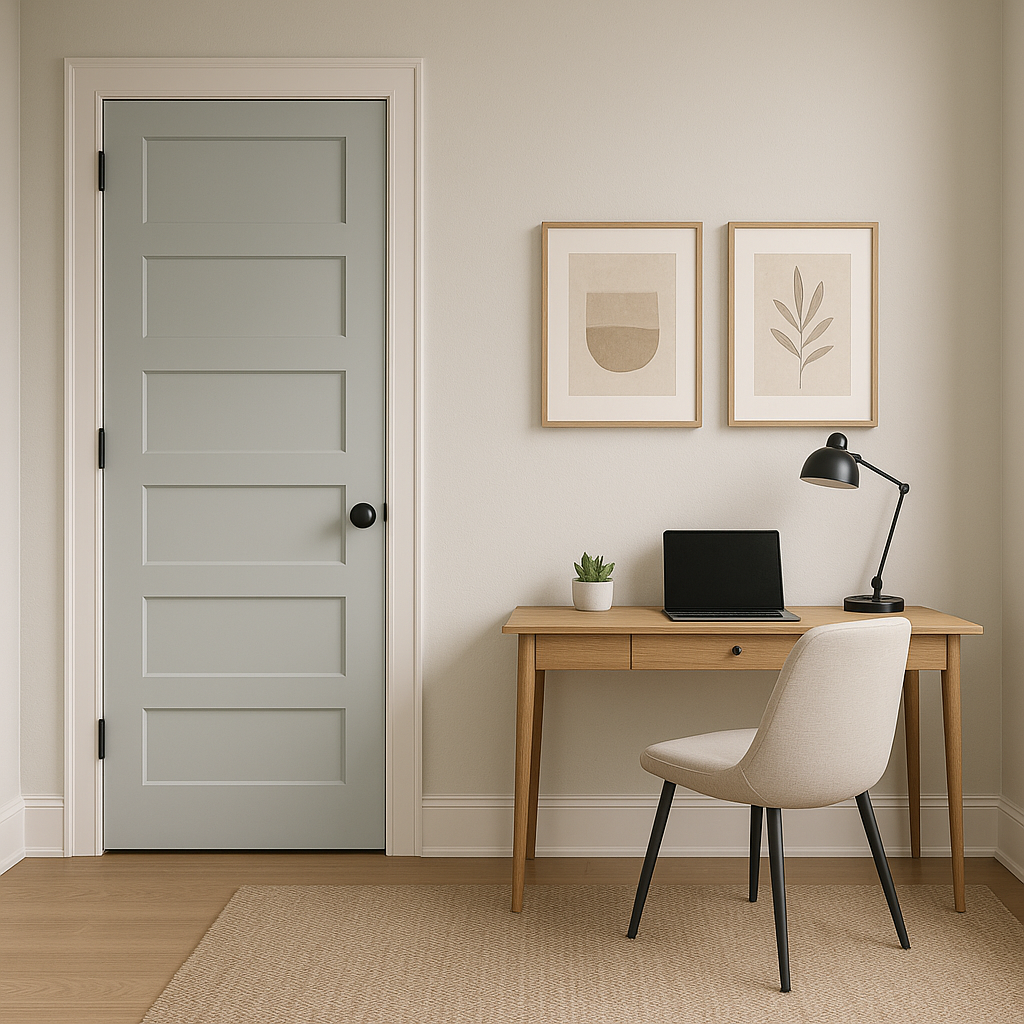
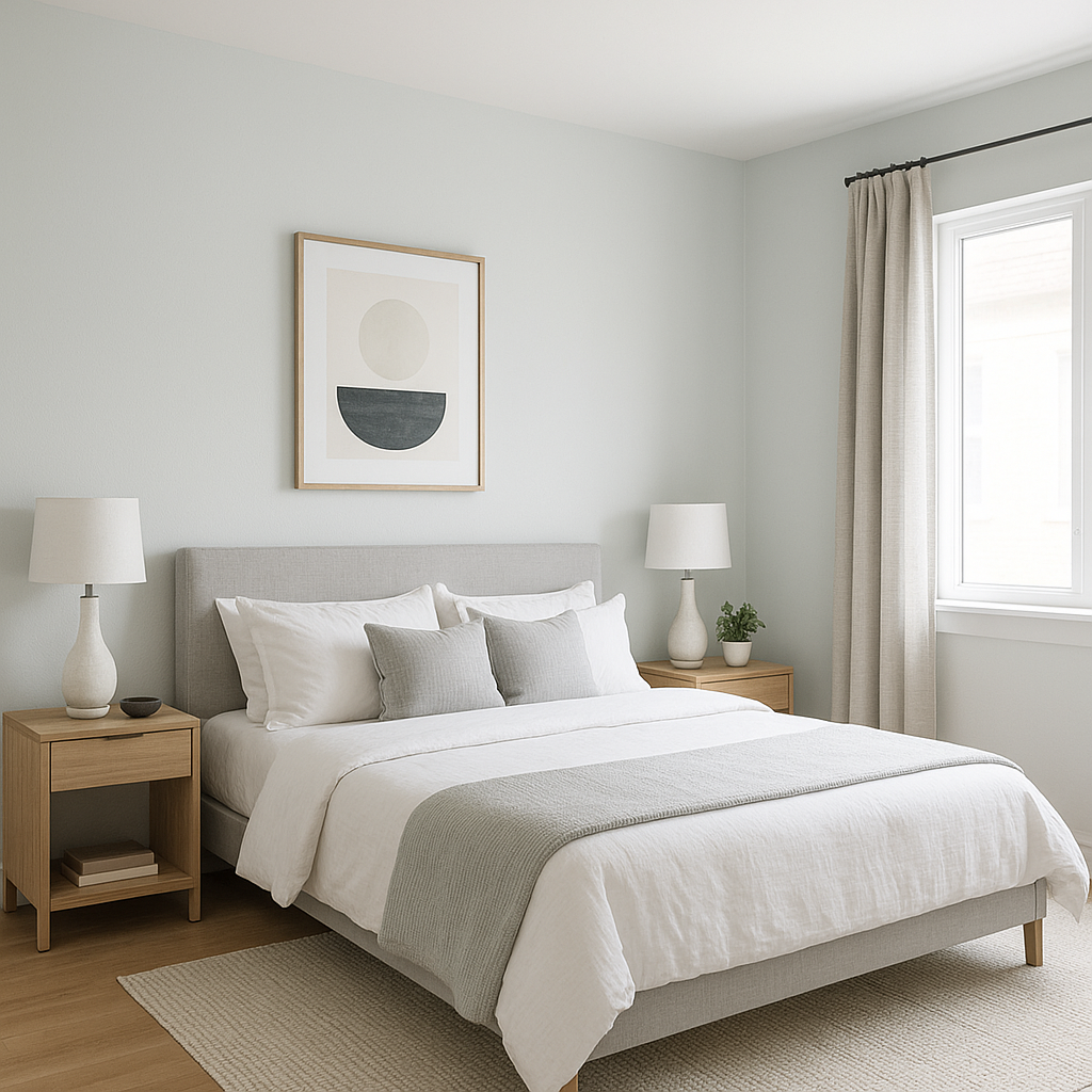
Sherwin-Williams Topsail SW 6217 is a soft, breezy light blue that evokes the tranquility of coastal living. This versatile shade is perfect for creating a serene and inviting atmosphere in both modern and traditional interiors. Its delicate balance of color and neutrality makes it a timeless choice for homeowners and designers alike.
Topsail is a light blue with subtle gray and green undertones, making it a chameleon-like color that adapts beautifully to different lighting conditions. In natural daylight, it leans more toward a soft, airy blue, reminiscent of a clear sky or calm ocean. Under artificial or warmer lighting, the green undertones may emerge, giving it a slightly aqua-like appearance.
The muted gray undertone adds depth and sophistication, ensuring the color doesn’t feel overly pastel or juvenile. This balance between blue, green, and gray makes Topsail an excellent choice for spaces aiming to feel fresh, open, and serene.
One of the standout features of Topsail is its flexibility to pair with a variety of colors. Whether you’re designing a coastal-inspired retreat, a modern minimalist space, or a farmhouse-style home, Topsail can work seamlessly with complementary shades. Here are some carefully curated suggestions:
Whites and Neutrals: Pair Topsail with crisp whites like Sherwin-Williams Extra White (SW 7006) or Pure White (SW 7005) for a clean and airy look. These shades enhance the brightness of Topsail and amplify its coastal vibe. For a warmer neutral, try Accessible Beige (SW 7036) or Alabaster (SW 7008).
Deep Blues and Navy Tones: To create contrast and add depth, pair Topsail with rich blues like Naval (SW 6244) or Indigo Batik (SW 7602). These combinations evoke a sense of classic nautical style.
Soft Greens and Aquas: For a harmonious and cohesive look, coordinate Topsail with soft greens like Sea Salt (SW 6204) or Comfort Gray (SW 6205). These shades share similar undertones and create a soothing, nature-inspired palette.
Warm Grays and Taupes: Balance Topsail’s cool tones with warm grays like Repose Gray (SW 7015) or Greige tones like Agreeable Gray (SW 7029).
Accent Colors: Add a pop of energy with coral, blush pink, or sunny yellow accents. These vibrant hues complement Topsail’s cool undertones while creating a cheerful contrast.
Topsail is a versatile color that can be used across a variety of spaces and design styles. Its light, breezy feel makes it ideal for creating calm and inviting environments. Here are some ways to incorporate this shade into your home:
Topsail’s soothing qualities make it a favorite choice for bedrooms and nurseries. Its soft blue tone promotes relaxation and tranquility, creating the perfect setting for restful sleep. Pair it with white bedding and natural textures like linen or rattan for a breezy, coastal-inspired look.
For a spa-like retreat, use Topsail in your bathroom. Its cool undertones evoke the calming essence of water, making it ideal for bathrooms with white tile, marble, or chrome fixtures. Add sea-inspired décor elements like driftwood accents or seashell-inspired accessories to complete the look.
Topsail works wonderfully in living rooms that aim to feel open, airy, and welcoming. It pairs beautifully with light hardwood floors, neutral furniture, and coastal-inspired art or textiles.
Note: These images were all generated with AI, there may be inaccurate color results. Please only use a general reference to get a rough idea of what a color may look like, we will continue to generate new images to improve accuracy.
View Colors Only by Brand (No Imagery):
Sherwin-Williams
|
Benjamin-Moore
|
Behr
|
Valspar
Live on the Eastern Slope of Colorado and looking for a local painting professional, check out all our painting services and reach out for a free estimate.
Copyright © 2026 : Wild Fox Painting Inc. : 12435 Mead Way, Littleton, CO 80125


