Sherwin-Williams Interesting Aqua (SW 6220) is a captivating paint color that brings a refreshing sense of calm and vibrancy to any space. This soft, mid-tone aqua has an inherent ability to create interiors that feel both peaceful and invigorating, making it a favorite among homeowners and interior designers alike. Whether you're crafting a serene coastal retreat or adding a pop of color to a modern urban space, Interesting Aqua is a versatile choice that fits a variety of design aesthetics.
Interesting Aqua is a cool-toned color with subtle green and blue undertones that lean slightly toward teal. These undertones make it an ideal choice for evoking a sense of tranquility while maintaining a fresh and crisp appearance. The green undertones lend a natural, earthy vibe, while the blue accents add a soothing depth that makes the color feel welcoming and timeless.
Its balanced saturation ensures it doesn't feel overwhelming or overly vibrant, making it suitable for both large, open spaces and smaller, more intimate areas. The undertones shift slightly depending on the lighting in the room, appearing more blue in cooler light and leaning greener in warmer light, giving it a dynamic quality that adapts beautifully to its surroundings.
Sherwin-Williams Interesting Aqua pairs effortlessly with a range of complementary colors, making it easy to incorporate into various design schemes. Here are some coordinating options to consider:
Neutral Pairings:
To create a balanced and sophisticated look, pair Interesting Aqua with soft, warm neutrals such as Sherwin-Williams Alabaster (SW 7008) or Shoji White (SW 7042). These creamy whites enhance the airy quality of the aqua while providing a neutral backdrop that allows the color to shine.
Accent Colors:
For a bold and dynamic palette, incorporate deeper tones like Naval (SW 6244) or Charcoal Blue (SW 2739). These rich navy and charcoal hues add contrast and depth, creating a layered and visually striking design.
Earthy Tones:
To amplify the green undertones of Interesting Aqua, pair it with muted greens such as Clary Sage (SW 6178) or warm browns like Accessible Beige (SW 7036). These pairings lend a natural, grounded feel to the space, ideal for rustic or bohemian-inspired interiors.
Bright Accents:
For a playful, vibrant look, complement Interesting Aqua with sunny yellow shades like Bee (SW 6683) or coral tones such as Lei Flower (SW 6613). These bright accents create a cheerful, energetic atmosphere perfect for eclectic or tropical designs.
Interesting Aqua is a versatile color that works beautifully in a variety of spaces and design styles. Here are some creative ways to use it:
Living Rooms:
This soft aqua is an excellent choice for living rooms, especially in coastal or contemporary homes. Pair it with natural textures like rattan furniture, sisal rugs, and linen curtains to enhance its breezy charm.
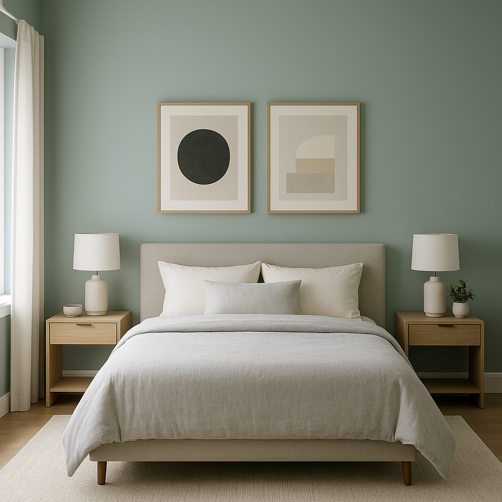
Bedrooms:
Create a calming retreat by using Interesting Aqua in bedrooms. Its soothing undertones promote relaxation, making it ideal for restful spaces. Combine it with crisp white bedding and light gray accents for an elegant, spa-like ambiance.
Bathrooms:
Interesting Aqua brings a fresh, clean feel to bathrooms. Use it on walls or cabinetry and pair it with polished chrome or brushed nickel fixtures for a timeless look. Add marble or white subway tile for a sophisticated finish.
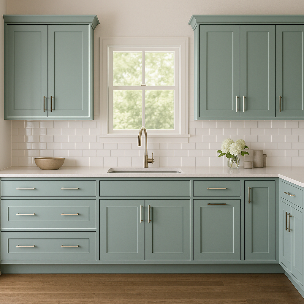
Kitchens:
Add a pop of color to your kitchen by using Interesting Aqua on cabinets or as a feature wall. Pair it with white or gray countertops and backsplash materials for a modern yet inviting space.
Children's Rooms or Playrooms:
Its playful yet serene nature makes Interesting Aqua a fantastic choice for kids' spaces. Combine it with colorful accents and whimsical patterns to create a fun, imaginative environment.
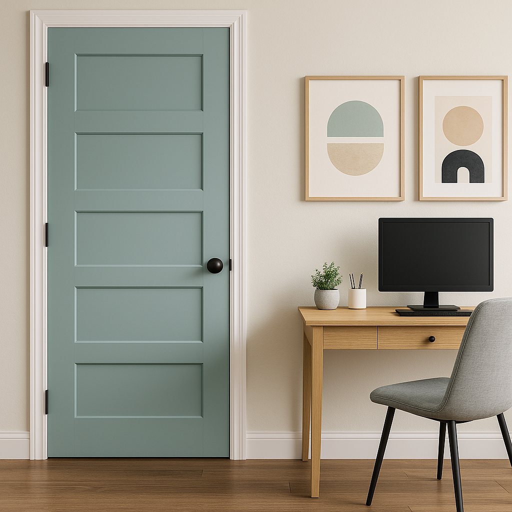
Exterior Applications:
Interesting Aqua can also be used effectively on exteriors, such as front doors, shutters, or porch ceilings, adding a touch of personality and charm to your home's curb appeal.
As with many paint colors, lighting plays a significant role in how Interesting Aqua appears in a space. In rooms with abundant natural light, the color may appear brighter and lean more toward its blue undertones. In spaces with artificial, warm lighting, the green elements become more prominent, creating a cozier vibe. Testing a sample in your space before committing to the color can help you understand how it interacts with your specific lighting conditions.
Sherwin-Williams Interesting Aqua is a versatile, timeless color that effortlessly bridges the gap between soothing tranquility and vibrant energy. Its dynamic undertones, wide range of coordinating color options, and adaptability across various rooms and design styles make it a go-to choice for anyone looking to breathe new life into their home.
Note: These images were all generated with AI, there may be inaccurate color results. Please only use a general reference to get a rough idea of what a color may look like, we will continue to generate new images to improve accuracy.
View Colors Only by Brand (No Imagery):
Sherwin-Williams
|
Benjamin-Moore
|
Behr
|
Valspar
Live on the Eastern Slope of Colorado and looking for a local painting professional, check out all our painting services and reach out for a free estimate.
Copyright © 2026 : Wild Fox Painting Inc. : 12435 Mead Way, Littleton, CO 80125


