
Sherwin-Williams Grays Harbor (SW 6236) is a rich and timeless charcoal gray that exudes sophistication, versatility, and warmth. This striking shade balances depth and softness, making it an exceptional choice for creating dramatic accents or grounding a space with understated elegance. Its adaptability and nuanced undertones make it a favorite among interior designers who are looking for a refined gray that works in both contemporary and classic settings.
Grays Harbor has a subtle blue undertone that gives it a cool, moody edge while maintaining a sense of warmth and approachability. This delicate interplay of gray and blue makes it an excellent choice for creating a serene, calming atmosphere without feeling overly cold or stark. At certain times of day, depending on the lighting, you may notice hints of green, which further enrich its complexity and depth. These undertones allow Grays Harbor to pair beautifully with a wide range of complementary colors and textures.
Sherwin-Williams Grays Harbor is incredibly versatile and pairs well with both soft neutrals and bold accent shades. Here are some coordinating colors that work harmoniously with this elegant gray:
Grays Harbor pairs beautifully with natural wood tones, from light oak to dark walnut, lending an organic touch to its cool sophistication. Metallics like brushed nickel, matte black, or antique brass provide striking accents, adding a layer of modernity or vintage charm depending on the desired aesthetic.
Grays Harbor is highly versatile and can be used in various spaces and design styles. Whether you’re looking for a dramatic statement or a soothing backdrop, this color delivers.
Use Grays Harbor on walls to create a cozy and elegant ambiance. Pair it with light-colored furniture and textured fabrics like linen or velvet for added visual interest. Add metallic accents or wood furniture to bring warmth and balance to the space.
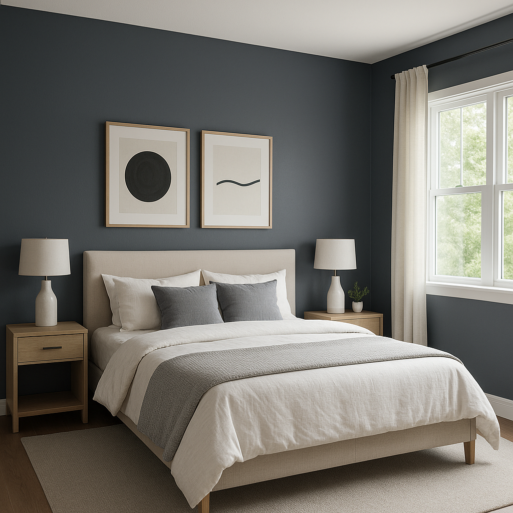
Grays Harbor works beautifully in bedrooms, providing a serene and restful environment. Pair it with soft bedding in whites or pastels to create a tranquil retreat. Consider using it on an accent wall behind the bed for a bold focal point.
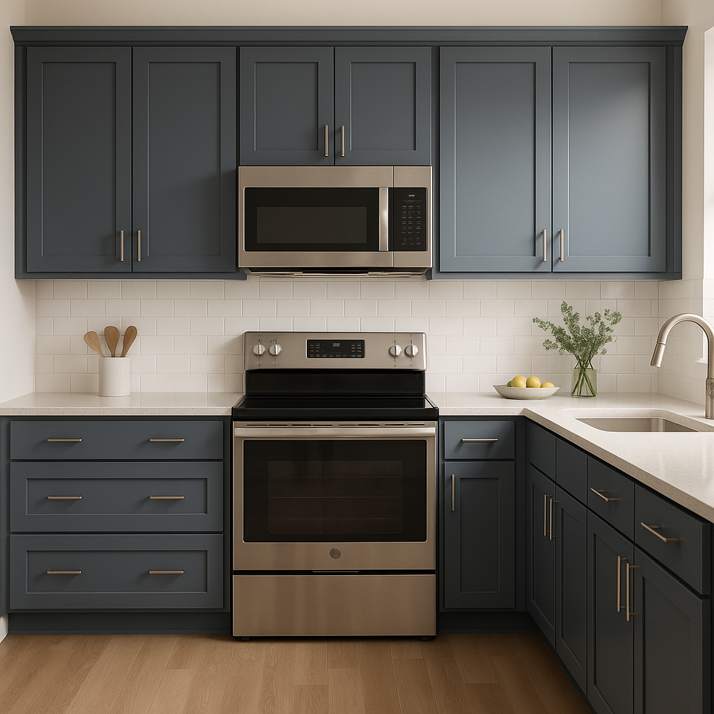
For a modern and sophisticated kitchen, use Grays Harbor on cabinetry or as a backsplash color. Pair it with crisp white countertops and brushed nickel hardware for a clean, polished look.
Grays Harbor can transform a bathroom into a spa-like sanctuary. Use it on walls or vanities and pair it with marble accents and chrome fixtures for a luxurious aesthetic.
Grays Harbor is also an excellent choice for exterior applications. It looks stunning on siding, shutters, or front doors, offering a timeless curb appeal. Pair it with white trim or natural stone for a classic and inviting look.
Lighting plays a crucial role in how Grays Harbor appears in a space. In natural daylight, its blue undertones are more pronounced, lending a cool and crisp feel. Under warm artificial light, it takes on a softer, more neutral gray appearance. Be sure to test Grays Harbor in your space before committing, as its undertones may shift depending on the time of day and surrounding elements.
Sherwin-Williams Grays Harbor (SW 6236) is a masterful gray that can elevate any room, bringing depth, sophistication, and versatility. Whether you’re designing a minimalist modern space or a cozy traditional home, this nuanced charcoal gray will provide the perfect foundation for your vision.
Note: These images were all generated with AI, there may be inaccurate color results. Please only use a general reference to get a rough idea of what a color may look like, we will continue to generate new images to improve accuracy.
View Colors Only by Brand (No Imagery):
Sherwin-Williams
|
Benjamin-Moore
|
Behr
|
Valspar
Live on the Eastern Slope of Colorado and looking for a local painting professional, check out all our painting services and reach out for a free estimate.
Copyright © 2026 : Wild Fox Painting Inc. : 12435 Mead Way, Littleton, CO 80125


