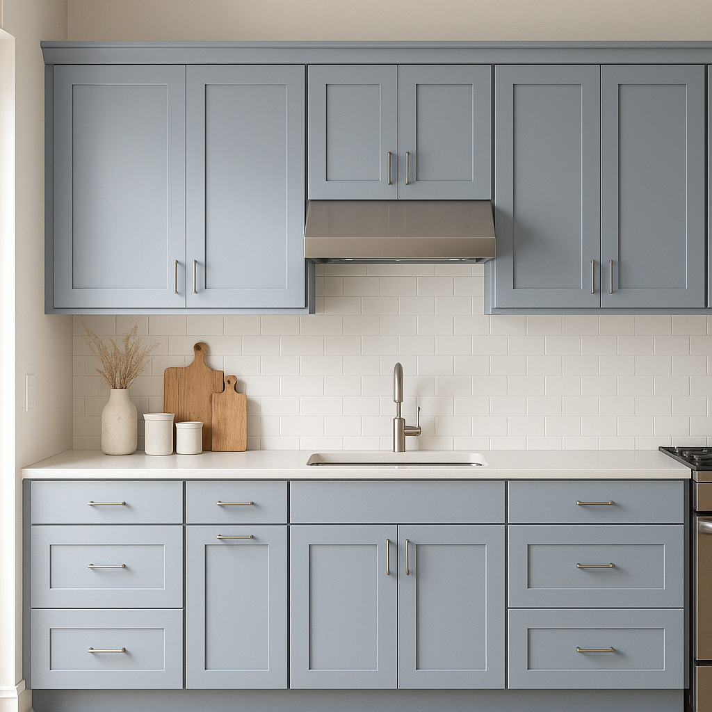
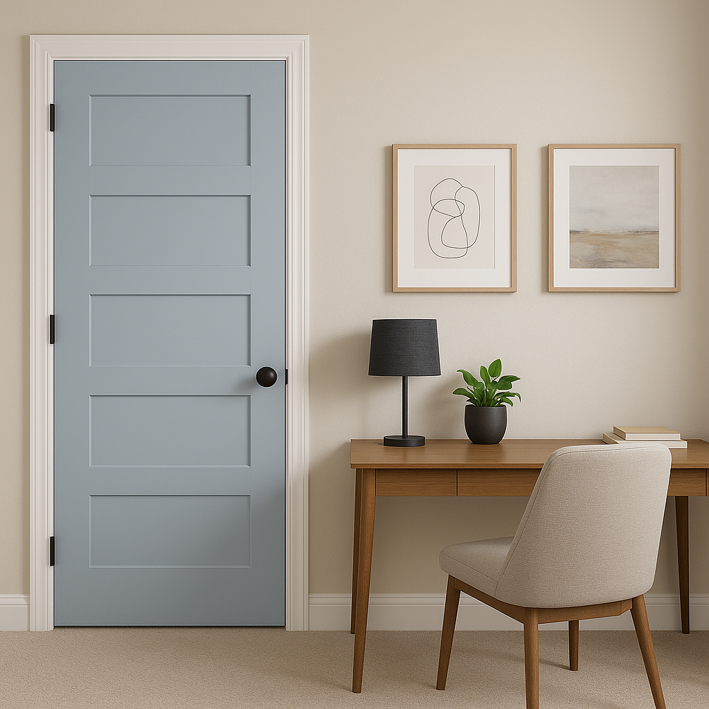
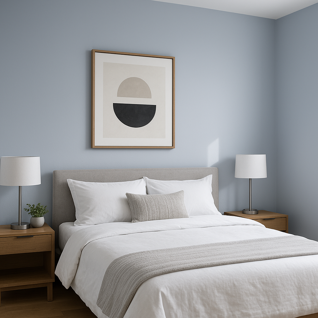
Sherwin-Williams Upward (SW 6239) is a versatile, calming mid-tone blue that evokes a sense of serenity and tranquility. This soft blue shade is perfect for creating soothing spaces where relaxation and peacefulness are key. Whether you're designing a cozy bedroom, a spa-like bathroom, or an inviting living room, Upward brings subtle sophistication with just the right amount of color.
The beauty of Upward lies in its subtle undertones. This shade features cool gray undertones that temper its blue base, making it feel more grounded and versatile. The gray undertones prevent it from being overly bright or juvenile, giving it an elevated, timeless quality. This makes Upward a fantastic choice for homeowners and designers looking for a blue that's neither too vibrant nor too muted. It also adapts well to different lighting conditions, shifting slightly in tone depending on the amount of natural or artificial light present.
To curate a cohesive and balanced color scheme, pair Sherwin-Williams Upward with complementary and coordinating hues. Its cool undertones work beautifully with both neutral and bold colors. Here are some excellent options to consider:
Neutral Pairings:
Accent Colors:
Earthy Tones:
Upward's versatility makes it suitable for virtually any room in your home, as well as commercial spaces like offices or wellness centers.
Upward’s appearance can shift depending on lighting conditions, so it’s crucial to test it in your space before committing. In rooms with ample natural light, Upward leans more toward its soft blue hue, creating an uplifting and airy ambiance. In spaces with limited light or artificial lighting, its cool gray undertones may become more prominent, lending a cozier and subdued feel.
Sherwin-Williams Upward combines the best of blue and gray tones to deliver a color that’s both timeless and contemporary. Its ability to balance tranquility with sophistication makes it an excellent choice for a wide range of design styles, from coastal-inspired interiors to modern minimalist spaces. Whether you’re looking to create a relaxing retreat or add a touch of subtle color to your walls, Upward is a reliable and stylish option that harmonizes beautifully with other hues.
Transform your home into a haven of calm with Sherwin-Williams Upward, a color that invites serenity while offering endless possibilities for creative design.
Note: These images were all generated with AI, there may be inaccurate color results. Please only use a general reference to get a rough idea of what a color may look like, we will continue to generate new images to improve accuracy.
View Colors Only by Brand (No Imagery):
Sherwin-Williams
|
Benjamin-Moore
|
Behr
|
Valspar
Live on the Eastern Slope of Colorado and looking for a local painting professional, check out all our painting services and reach out for a free estimate.
Copyright © 2026 : Wild Fox Painting Inc. : 12435 Mead Way, Littleton, CO 80125


