Sherwin-Williams Distance (SW 6243) is a striking, deep blue that effortlessly balances sophistication with serenity. Its bold hue brings an undeniable sense of drama to any space while maintaining a grounding presence, making it an ideal choice for those seeking a color that commands attention without overwhelming the room. Offering versatility and richness, Distance is perfect for creating a sense of intimacy, depth, and elegance in your home.
Distance is a complex shade with subtle undertones that reveal its unique character. It carries cool gray undertones, lending it a soft, moody quality that tempers the boldness of the blue. These undertones make Distance a perfect choice for spaces where you want to evoke a calm yet confident atmosphere. The combination of blue and gray undertones allows this paint color to adapt beautifully to varying lighting conditions, appearing cooler in bright, natural light and warmer in dim, artificial lighting.
Pairing Sherwin-Williams Distance with complementary colors can elevate its impact while fostering a harmonious aesthetic. Here are a few coordinating options:
For an adventurous contrast, consider pairing Distance with vibrant accents like mustard yellows, burnt oranges, or earthy greens to add energy and personality to your space.
Sherwin-Williams Distance is versatile enough to thrive in both residential and commercial settings, offering endless possibilities for creating impactful designs. Here are some creative ways to incorporate Distance into your interiors:
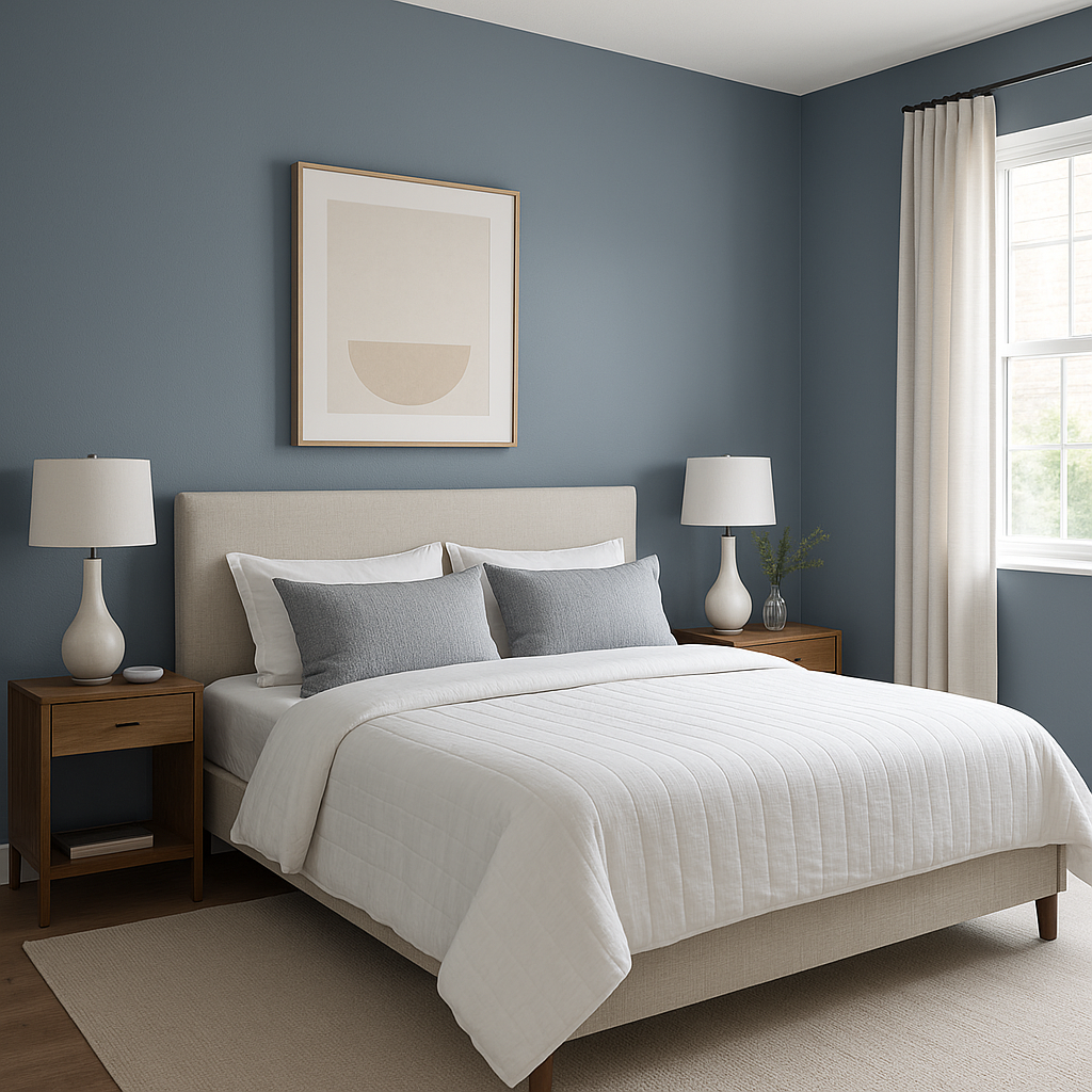
Distance makes for a phenomenal accent wall. Its bold yet calming hue can anchor a room, drawing the eye and creating visual interest. Try it in a living room, behind a bed in the master suite, or in a dining area for a dramatic focal point.
The calming yet sophisticated qualities of Distance make it an excellent choice for home offices or libraries. The deep blue fosters focus and creativity, making your workspace feel both productive and inspiring.
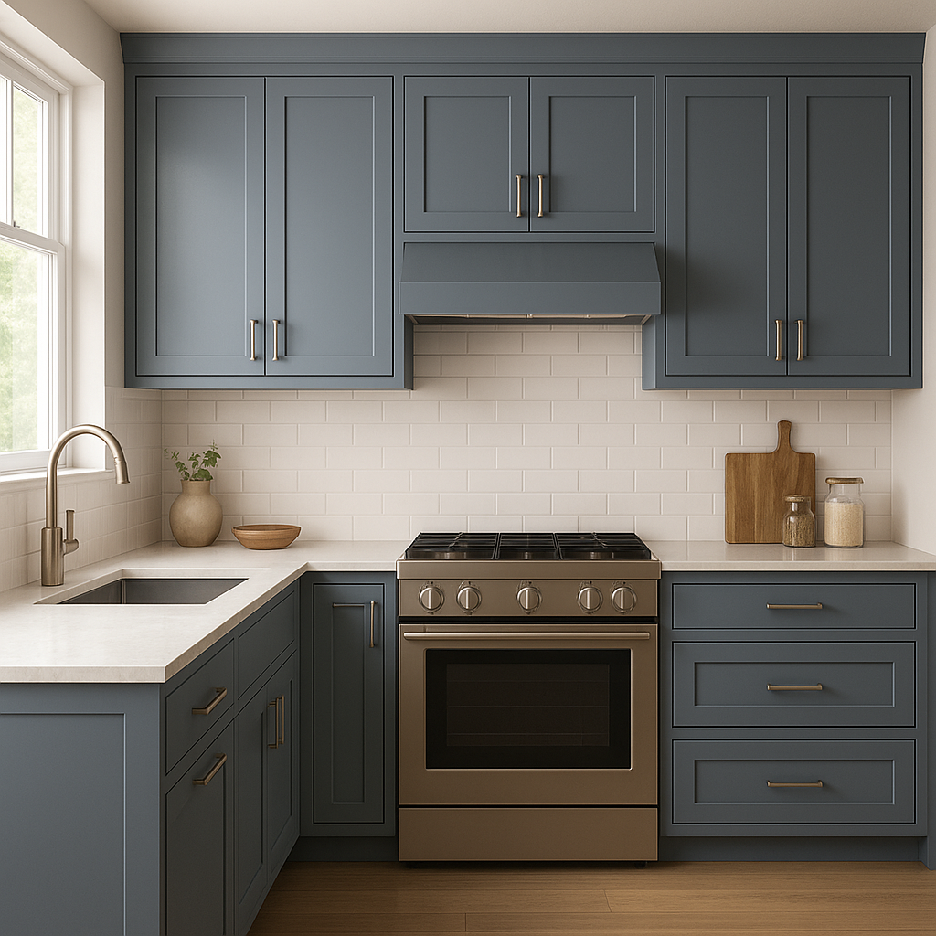
Distance exudes a timeless charm in kitchens and bathrooms. Pair it with white cabinetry, brushed nickel hardware, and marble countertops for a luxe, high-end look. Alternatively, use it on cabinetry to create a bold and elegant statement.
Welcome guests with a sense of refined drama by using Distance in the entryway. Its rich hue sets the tone for a stylish home while offering a warm, inviting vibe.
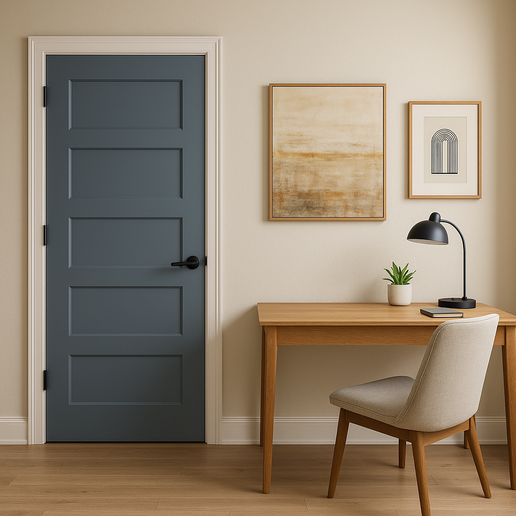
For smaller pops of color, Distance can be used on furniture pieces like accent chairs, built-ins, or even painted shelving. Its versatility ensures it can complement a wide range of design styles, from modern to coastal to traditional.
Lighting plays a crucial role in how Sherwin-Williams Distance appears in your space. In bright, natural light, its gray undertones become more pronounced, lending it a cooler appearance. In dim lighting, the blue deepens, creating a moody, intimate ambiance. To ensure this color works beautifully in your room, test it with swatches in different lighting conditions throughout the day.
Sherwin-Williams Distance (SW 6243) is the perfect choice for anyone seeking a bold yet versatile shade of blue. Its rich depth, balanced undertones, and ability to coordinate effortlessly with other colors make it a designer favorite. Whether you're creating a dramatic accent wall, refreshing cabinetry, or crafting a serene bedroom retreat, Distance is sure to elevate your interiors with timeless elegance.
Note: These images were all generated with AI, there may be inaccurate color results. Please only use a general reference to get a rough idea of what a color may look like, we will continue to generate new images to improve accuracy.
View Colors Only by Brand (No Imagery):
Sherwin-Williams
|
Benjamin-Moore
|
Behr
|
Valspar
Live on the Eastern Slope of Colorado and looking for a local painting professional, check out all our painting services and reach out for a free estimate.
Copyright © 2026 : Wild Fox Painting Inc. : 12435 Mead Way, Littleton, CO 80125


