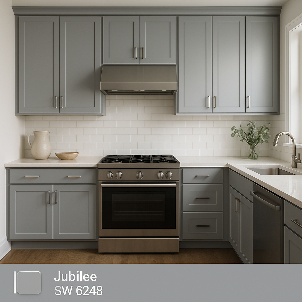
Sherwin-Williams Jubilee (SW 6248) is an elegant and versatile cool gray paint color that effortlessly balances sophistication and serenity. Perfect for creating a calming atmosphere, Jubilee is a shade that speaks to modern design trends while remaining timeless in its appeal. Its subtle undertones and adaptability allow it to complement a variety of interior styles, making it a favorite among homeowners and designers alike.
Jubilee is more than just a standard gray—it has delicate blue undertones that add depth and character to the hue. These cool undertones give the color a soft, airy feel, making it an ideal choice for spaces where tranquility and lightness are desired. Whether paired with crisp whites or darker accent tones, Jubilee’s blue undertones shine through in natural and artificial lighting, giving the space a refined charm.
One important note when choosing Jubilee is the way lighting can affect its appearance. In spaces with ample natural light, Jubilee appears brighter and more silvery, while in rooms with limited lighting or warm artificial light, the blue undertones become more pronounced. This makes it a versatile color, but testing it in your specific environment is key.
Sherwin-Williams Jubilee pairs beautifully with a variety of complementary colors, making it easy to incorporate into a cohesive design scheme. Here are some coordinating colors to consider:
Whites: For a clean, modern look, pair Jubilee with crisp whites like Sherwin-Williams Pure White (SW 7005) or Extra White (SW 7006). These whites enhance Jubilee’s cool undertones, creating a bright and refreshing space.
Blues: Enhance the subtle blue undertones by pairing Jubilee with deeper blues such as Naval (SW 6244) or Indigo Batik (SW 7602). This combination creates a layered, monochromatic effect that's perfect for coastal or contemporary designs.
Greens: Bring a touch of nature indoors by coordinating Jubilee with muted greens like Sea Salt (SW 6204) or Comfort Gray (SW 6205). These earthy tones complement its blue undertones while adding warmth and softness to the space.
Charcoal and Black: For a dramatic contrast, pair Jubilee with darker colors like Peppercorn (SW 7674) or Tricorn Black (SW 6258). This combination is ideal for creating bold accent walls or adding sophistication to a space.
Warm Metallics: Incorporate warm metallic accents like brass or gold to balance Jubilee’s cool undertones. This pairing creates an elegant juxtaposition perfect for luxurious, modern interiors.
Sherwin-Williams Jubilee is a versatile shade that can be used in virtually any room of the home. Its calming nature and cool undertones make it particularly well-suited for spaces where relaxation is the ultimate goal. Here are some ideas for incorporating Jubilee into your interior design:
Jubilee is an excellent choice for living rooms, especially in homes with an open-concept layout. Its neutral base allows it to tie together different elements of the space while maintaining a sophisticated aesthetic. Pair it with soft furnishings in whites and muted blues for a serene look, or layer it with darker accents for added drama.
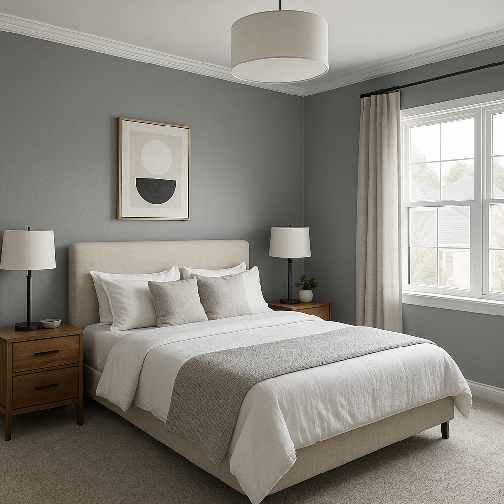
The cool and calming characteristics of Jubilee make it a perfect color for bedrooms. Use it as the main wall color to create a peaceful retreat, and pair it with cozy textiles in complementary shades like soft whites or muted greens. The subtle blue undertones promote relaxation, helping you wind down at the end of the day.
In bathrooms, Jubilee offers a spa-like feel that is both clean and refreshing. Combine it with white tiles, chrome fixtures, and pops of navy or teal for a polished, coastal-inspired design. Its versatility ensures it will work beautifully in both small powder rooms and larger master bathrooms.
Jubilee is a fantastic choice for modern kitchens, especially when paired with sleek white cabinetry and stainless-steel appliances. Use it as a wall color or even as an accent on kitchen islands to add a subtle, sophisticated touch of color.
Create a focused and calming workspace by using Jubilee in your home office. Its blue undertones encourage productivity and focus while maintaining a polished and professional appearance.
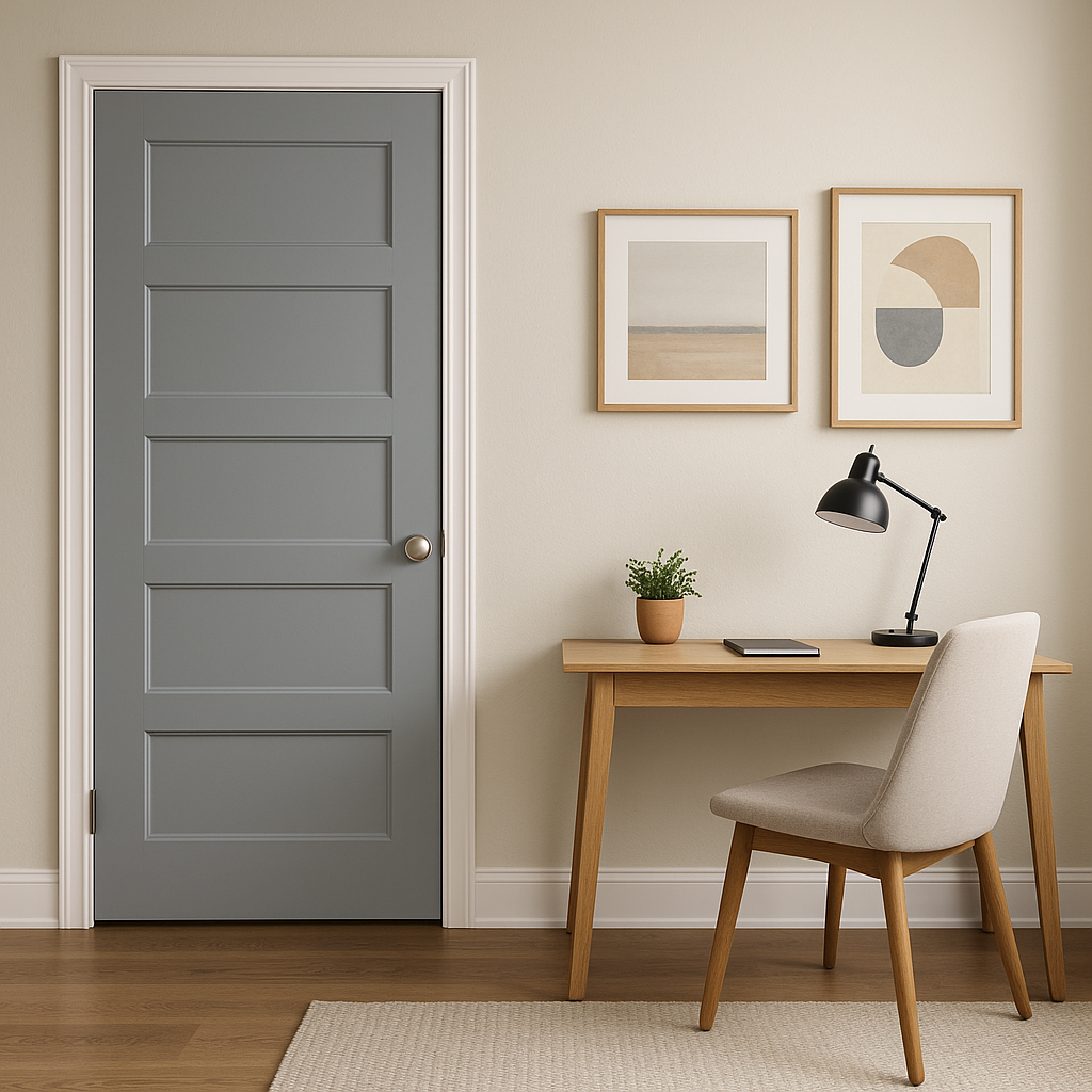
While Jubilee works wonderfully as a main wall color, it can also shine as an accent color. Use it to highlight architectural features or create a focal point in any room. Pair it with lighter grays or whites to make the accent wall stand out without overpowering the space.
Sherwin-Williams Jubilee (SW 6248) is a cool gray with subtle blue undertones that offers versatility and timeless appeal. Whether you're designing a contemporary living room, a serene bedroom, or a sophisticated kitchen, Jubilee provides the perfect base for creativity. Its ability to pair seamlessly with a wide range of coordinating colors and its adaptability to different lighting conditions make it a go-to choice for interior designers and homeowners looking to create stylish, welcoming spaces.
With Jubilee, you’re not just choosing a paint color—you’re setting the tone for a home that feels calm, cohesive, and effortlessly beautiful.
Note: These images were all generated with AI, there may be inaccurate color results. Please only use a general reference to get a rough idea of what a color may look like, we will continue to generate new images to improve accuracy.
View Colors Only by Brand (No Imagery):
Sherwin-Williams
|
Benjamin-Moore
|
Behr
|
Valspar
Live on the Eastern Slope of Colorado and looking for a local painting professional, check out all our painting services and reach out for a free estimate.
Copyright © 2026 : Wild Fox Painting Inc. : 12435 Mead Way, Littleton, CO 80125


