Sherwin-Williams Quixotic Plum (SW 6265) is a captivating shade that brings depth, drama, and sophistication to any space. This rich, velvety hue is a blend of warm purple and brown undertones, making it an inviting yet opulent choice for interior design. Whether you’re aiming for a refined aesthetic or a cozy atmosphere, Quixotic Plum offers versatility and creativity in its application.
Quixotic Plum carries warm undertones of brown and subtle hints of red, which soften its deep purple base. These undertones make the color feel grounded and approachable, avoiding the overly cool or stark appearance that some purples can have. The earthy warmth gives it a timeless quality, making it suitable for both modern and traditional spaces.
Its muted richness allows Quixotic Plum to play beautifully with natural light, shifting between a deep plum in dim settings and a softer, warmer hue in brighter spaces. This dynamic quality adds character and intrigue to any room.
Sherwin-Williams Quixotic Plum pairs wonderfully with a range of complementary and accent colors, allowing you to craft a cohesive and stylish palette. Here are some ideas for coordinating colors:
Neutrals:
Accent Colors:
Complementary Colors:
Quixotic Plum is exceptionally versatile and can be used across various spaces to achieve different moods and aesthetics. Here are some ideas for incorporating this sophisticated shade into your home:
For those who want to make a statement without overwhelming a space, Quixotic Plum is an excellent choice for an accent wall. Pair it with neutral walls in shades like Alabaster or Repose Gray to create a sophisticated focal point. An accent wall in this hue works beautifully in living rooms, dining areas, or even bedrooms.
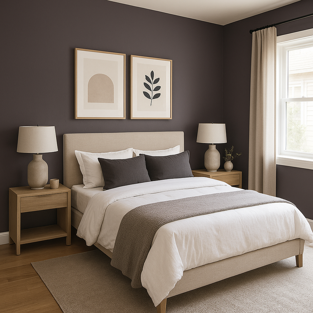
If you're looking to design a cozy and intimate bedroom, Quixotic Plum is a perfect choice. Its warm undertones create a sense of comfort and relaxation. Pair it with soft bedding in neutral tones or muted jewel tones for a luxurious retreat.
Deep, saturated colors like Quixotic Plum are ideal for dining rooms, where they can add a sense of drama and opulence. Pair it with metallic accents like brushed gold or copper fixtures for an upscale, elegant look.
For a spa-like setting, use Quixotic Plum alongside crisp white tiles and fixtures. Add accents like plush towels in soft gray or mauve tones to create a serene yet sophisticated atmosphere.
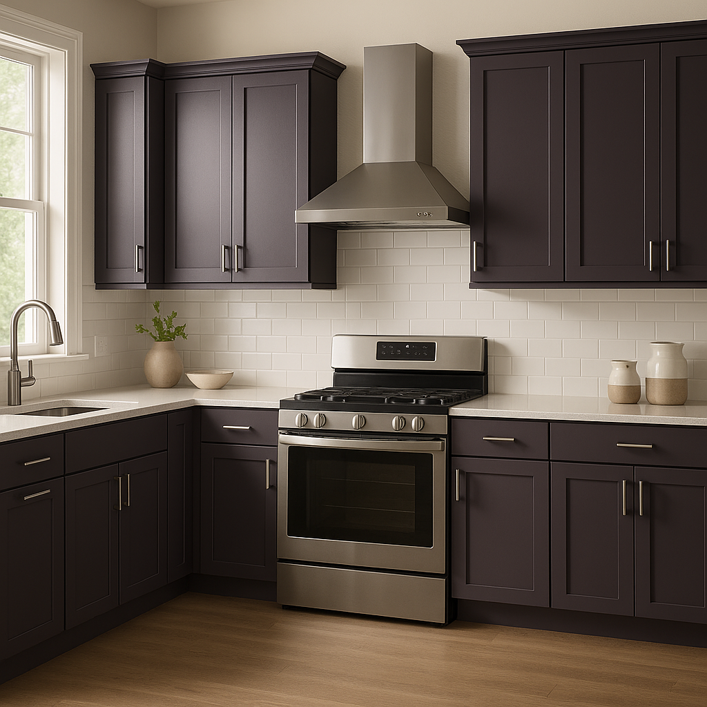
Quixotic Plum isn't limited to walls. Consider incorporating this hue into furniture pieces, cabinetry, or decor such as throw pillows, curtains, or rugs. It works beautifully with wood finishes like mahogany, walnut, or oak, enhancing its earthy elegance.
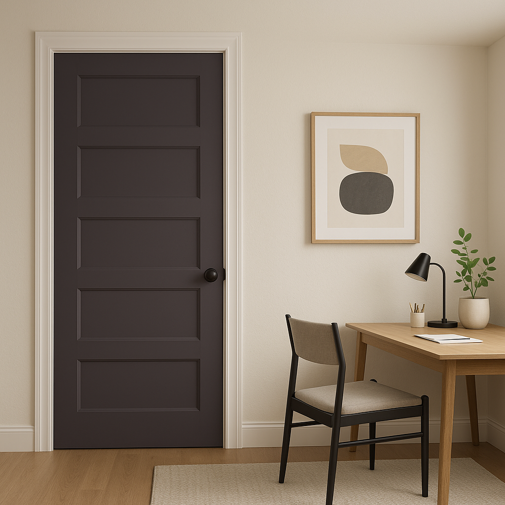
For a refined and inspiring workspace, Quixotic Plum provides the perfect backdrop. Pair it with rich wood finishes and metallic accents to create a studious and sophisticated ambiance.
Sherwin-Williams Quixotic Plum is more than just a paint color—it’s a design statement. Its rich depth and warm undertones make it an adaptable choice for creating spaces that feel elegant, cozy, and timeless. Whether used sparingly as an accent or boldly across an entire room, this shade elevates your interior design to new levels of sophistication.
By pairing Quixotic Plum with carefully selected coordinating colors, textures, and finishes, you can craft a space that feels balanced and harmonious while showcasing your personal style. If you're seeking a hue that evokes luxury and warmth with a touch of drama, Quixotic Plum is a color that will not disappoint.
Note: These images were all generated with AI, there may be inaccurate color results. Please only use a general reference to get a rough idea of what a color may look like, we will continue to generate new images to improve accuracy.
View Colors Only by Brand (No Imagery):
Sherwin-Williams
|
Benjamin-Moore
|
Behr
|
Valspar
Live on the Eastern Slope of Colorado and looking for a local painting professional, check out all our painting services and reach out for a free estimate.
Copyright © 2026 : Wild Fox Painting Inc. : 12435 Mead Way, Littleton, CO 80125


