Sherwin-Williams Sensitive Tint (SW 6267) is a soft, ethereal gray-violet that adds an understated sense of sophistication to any space. This versatile hue is the perfect balance between cool and warm tones, offering a refined backdrop that works beautifully in a wide range of interior styles, from modern minimalism to classic elegance. Its delicate nature evokes feelings of calm and serenity, making it an ideal choice for creating soothing environments.
Sensitive Tint is a masterful blend of gray with gentle lavender undertones, giving it a barely-there whisper of color that feels neutral yet nuanced. The subtle violet undertones lend a soft warmth to the gray base, preventing it from appearing overly cool or stark. This color shifts slightly depending on lighting conditions, appearing more gray in rooms with cooler natural light and revealing its lavender essence in warmer, incandescent lighting.
Sensitive Tint pairs beautifully with both complementary and contrasting colors, making it easy to incorporate into a cohesive color palette. Here are a few stunning options to consider when coordinating with Sensitive Tint:
Sensitive Tint is an incredibly versatile paint color that can transform a variety of spaces. Here are some creative ways to incorporate this lovely hue into your interiors:
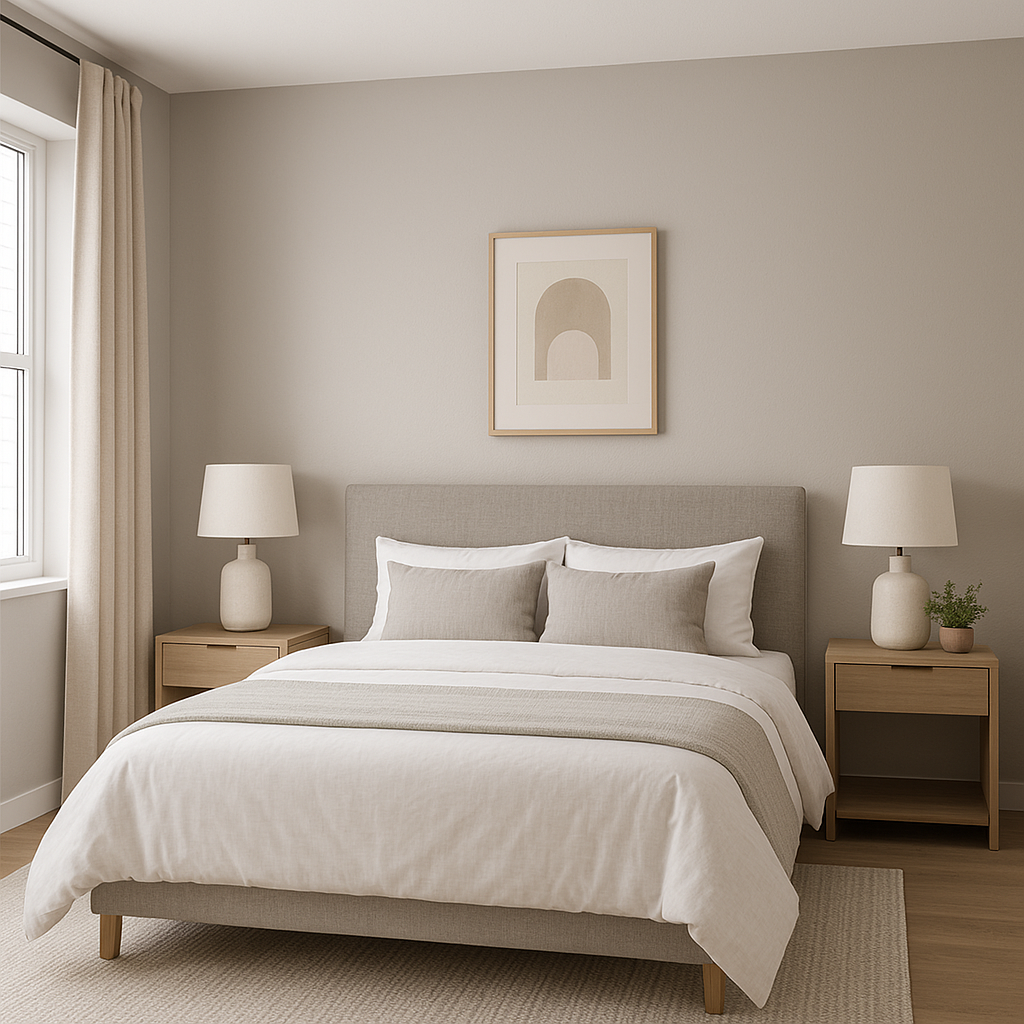
Sensitive Tint is a natural choice for bedrooms, where its soothing undertones promote relaxation and restful sleep. Pair it with soft linens and plush textiles in neutral or pastel tones for an inviting retreat that feels tranquil yet stylish.
Create a spa-like atmosphere in your bathroom by using Sensitive Tint on the walls. Its subtle lavender undertones work beautifully with white and chrome fixtures, while coordinating with natural stone or marble accents for a luxurious finish.
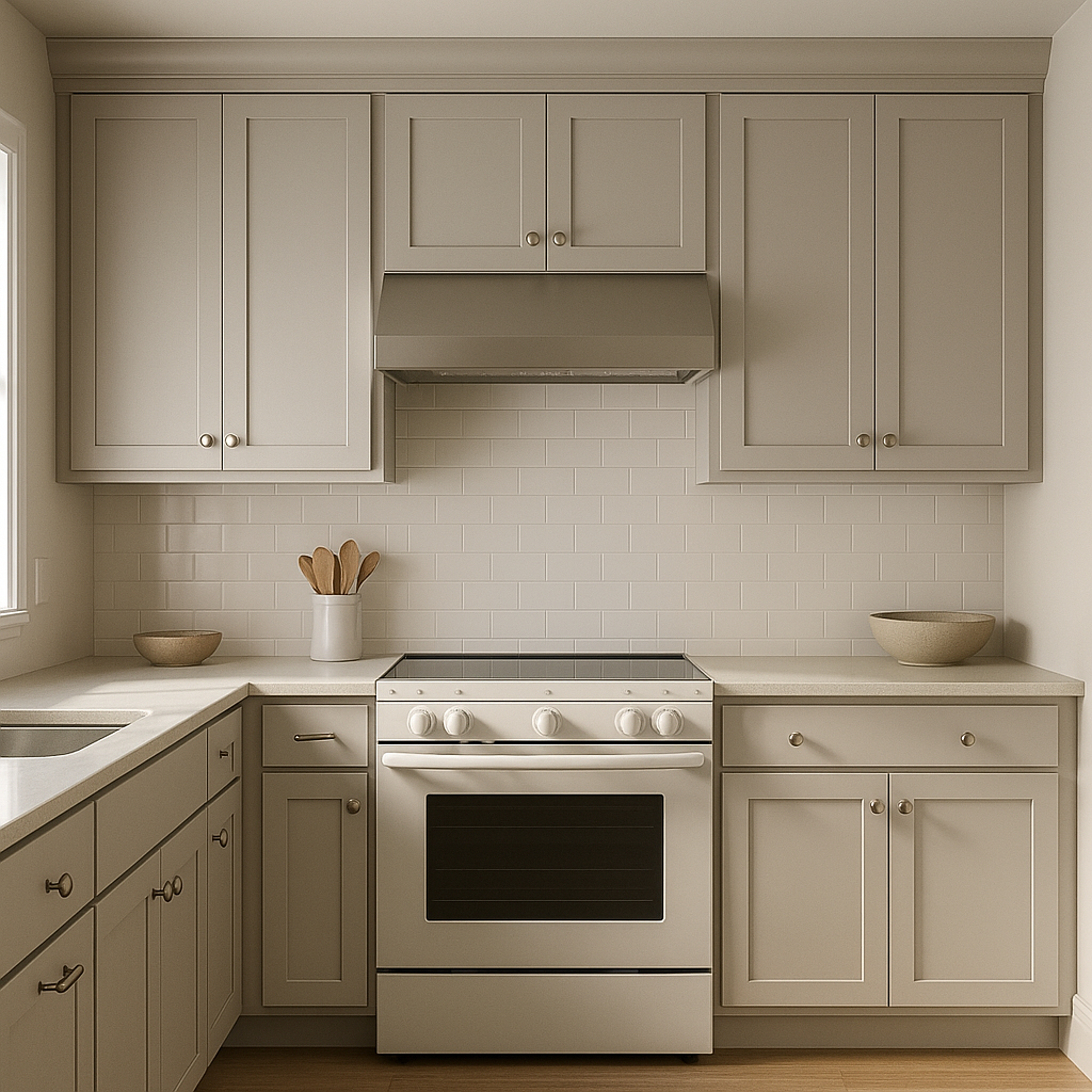
In living rooms, Sensitive Tint serves as a refined backdrop for layering textures and patterns. Pair it with warm woods, metallic finishes, and cozy textiles to create a space that feels both sophisticated and inviting.
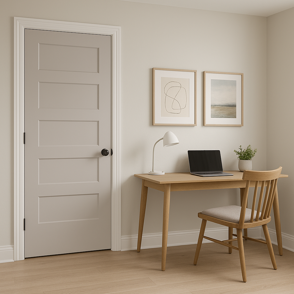
Sensitive Tint’s calming presence makes it an excellent choice for home offices or creative spaces. Its subtle gray-violet tone encourages focus and productivity while maintaining a sense of serenity.
For transitional spaces like hallways and foyers, Sensitive Tint provides a neutral yet elegant base that enhances the flow of your home. Pair it with crisp white trim for a clean and polished look.
The way Sensitive Tint interacts with light is a key element to consider when choosing this color. In spaces with ample natural light, its gray base takes center stage, while the lavender undertones become more prominent in dimmer or warmer artificial lighting. To ensure Sensitive Tint complements your room’s ambiance, test the color in different lighting conditions before committing.
Sherwin-Williams Sensitive Tint is a timeless option for those who want a neutral color with a touch of personality. Its delicate balance of gray and lavender undertones creates a soothing atmosphere while offering versatility for a wide range of styles and palettes. Whether you’re designing a cozy sanctuary or a chic gathering space, Sensitive Tint is sure to bring elegance and serenity to your interiors.
With its softness and adaptability, Sensitive Tint is a perfect choice for those searching for a color that blends effortlessly with other hues while adding a whisper of charm to any room.
Note: These images were all generated with AI, there may be inaccurate color results. Please only use a general reference to get a rough idea of what a color may look like, we will continue to generate new images to improve accuracy.
View Colors Only by Brand (No Imagery):
Sherwin-Williams
|
Benjamin-Moore
|
Behr
|
Valspar
Live on the Eastern Slope of Colorado and looking for a local painting professional, check out all our painting services and reach out for a free estimate.
Copyright © 2026 : Wild Fox Painting Inc. : 12435 Mead Way, Littleton, CO 80125


