Sherwin-Williams Mauve Finery (SW 6282) is a sophisticated, muted mauve that exudes a sense of refined charm and understated elegance. This versatile shade is perfect for creating serene and welcoming spaces, making it a favorite among interior designers seeking to balance warmth and subtlety. Its delicate balance of pink and purple tones offers a versatile foundational hue for a variety of design styles, from modern minimalism to vintage-inspired settings.
Mauve Finery has distinct warm undertones that lean toward a soft lavender-pink, infused with hints of gray. These undertones give the color depth and versatility, allowing it to adapt beautifully to both cool and warm palettes. The gray undertones ensure that the mauve never feels overly sweet or saturated, making it an excellent choice for creating sophisticated environments.
The muted nature of Mauve Finery allows it to shift subtly depending on lighting conditions. In spaces with natural light, it can appear lighter and more ethereal, while in dimmed artificial light, the gray undertones become more pronounced, lending the color a moody and grounded feel.
Sherwin-Williams Mauve Finery pairs beautifully with a variety of coordinating colors, depending on the desired mood and style:
Neutral Complements:
Pair Mauve Finery with soft neutrals like Snowbound (SW 7004) or Repose Gray (SW 7015) for a timeless, airy look. These lighter tones enhance Mauve Finery's elegance and create a calm, cohesive space.
Deep and Dramatic:
For a more dramatic vibe, consider pairing it with Iron Ore (SW 7069) or Naval (SW 6244). These darker hues provide a striking contrast, making Mauve Finery pop while adding depth and sophistication.
Earthy and Warm:
If you're aiming for a warm and cozy aesthetic, pair Mauve Finery with earthy tones like Accessible Beige (SW 7036) or Cavern Clay (SW 7701). These colors echo the subtle warmth of Mauve Finery, creating a harmonious and inviting environment.
Accents and Pops of Color:
Add playful accents with complementary colors like Rosebud (SW 6292) or soft greens like Sea Salt (SW 6204) for a fresh and lively look.
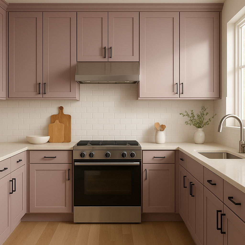
Sherwin-Williams Mauve Finery is a versatile hue that works beautifully across a wide range of interior spaces:
Living Rooms:
Create an inviting and relaxed living area by using Mauve Finery on the walls. Pair it with plush textiles and neutral furniture for a cozy, sophisticated atmosphere.
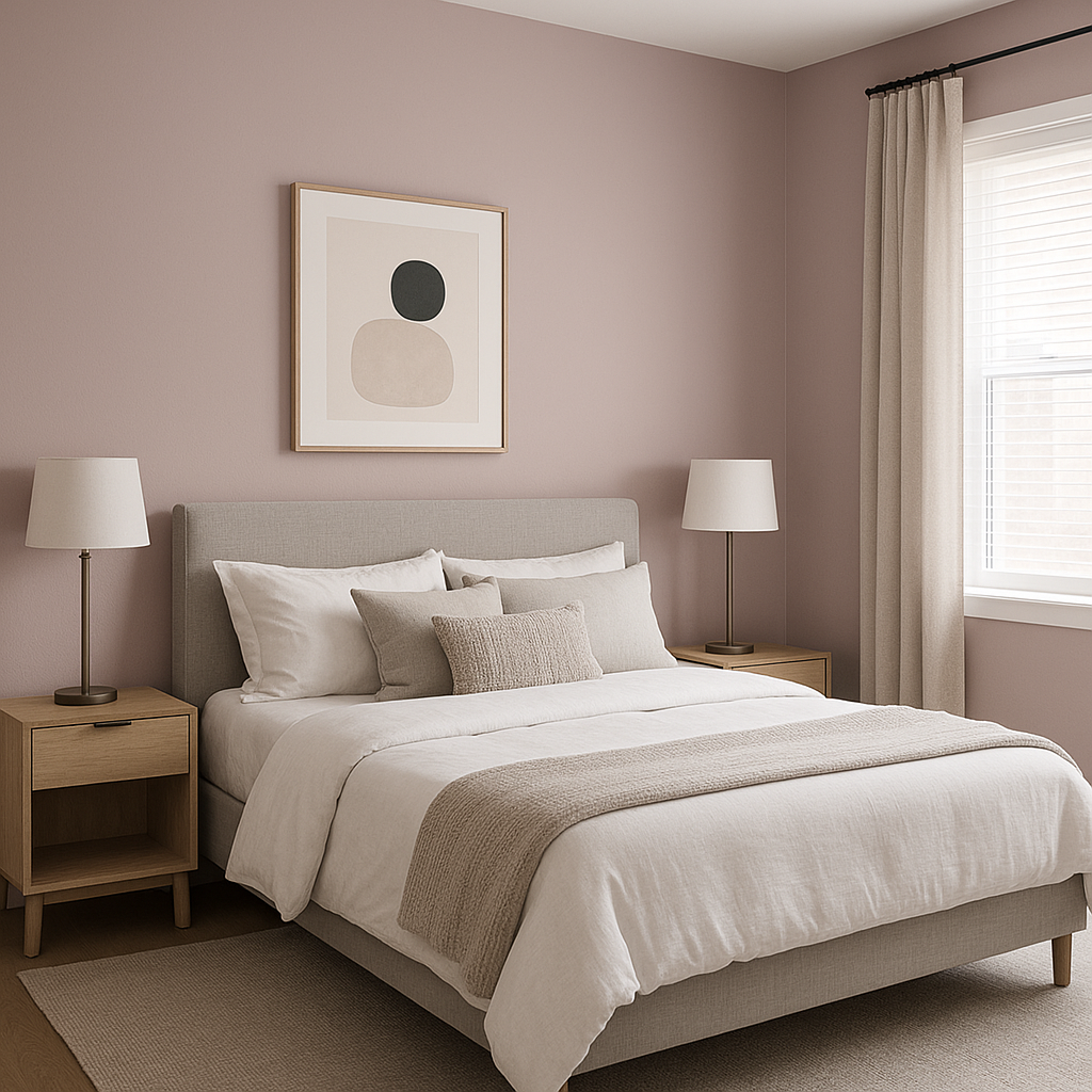
Bedrooms:
Mauve Finery's soothing qualities make it an excellent choice for bedrooms. Its soft undertones foster a relaxing environment, perfect for unwinding after a long day.
Bathrooms:
Transform your bathroom into a spa-like retreat by incorporating Mauve Finery. Pair it with crisp white trim and chrome fixtures for a clean and elegant look.
Dining Rooms:
Elevate your dining room with Mauve Finery, creating a backdrop that feels both inviting and refined. Pair it with darker wood tones and metallic accents for added richness.
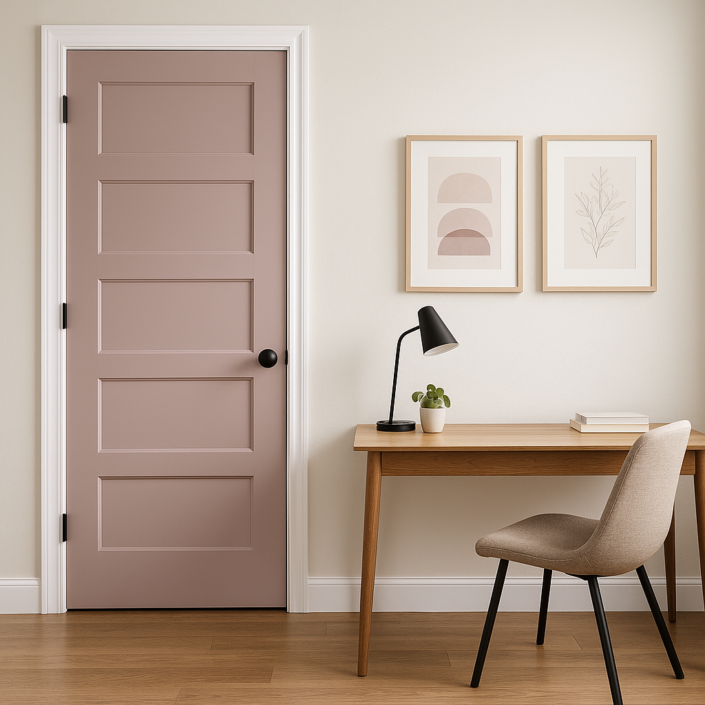
Accent Walls:
Use Mauve Finery as an accent color to highlight architectural features, such as built-in shelving or a fireplace. Its muted tone adds interest without overwhelming the space.
Offices:
Mauve Finery is a great choice for home offices. Its calming qualities promote focus and creativity while maintaining a professional and polished appearance.
To maximize the beauty of Mauve Finery, consider the lighting in your space. In rooms with natural sunlight, the color will appear lighter and more ethereal. In dimly lit areas or spaces with warm artificial light, the gray undertones will become more pronounced, adding depth and a moody sophistication.
Whether you're looking to create a serene retreat or add a touch of elegance to a common area, Sherwin-Williams Mauve Finery (SW 6282) offers a versatile solution. Its muted mauve tone, balanced with gray undertones, makes it an ideal choice for a wide range of design styles. From pairing it with neutrals for a classic look to adding dramatic contrast with darker hues, Mauve Finery provides endless opportunities to craft spaces that feel both timeless and unique.
Note: These images were all generated with AI, there may be inaccurate color results. Please only use a general reference to get a rough idea of what a color may look like, we will continue to generate new images to improve accuracy.
View Colors Only by Brand (No Imagery):
Sherwin-Williams
|
Benjamin-Moore
|
Behr
|
Valspar
Live on the Eastern Slope of Colorado and looking for a local painting professional, check out all our painting services and reach out for a free estimate.
Copyright © 2026 : Wild Fox Painting Inc. : 12435 Mead Way, Littleton, CO 80125


