Sherwin-Williams Demure (SW 6295) is a delicate and refined lavender-gray that effortlessly evokes a sense of calm and understated elegance. This muted yet versatile color bridges the gap between soft pastels and sophisticated neutrals, making it a perfect choice for those seeking a tranquil yet stylish environment. Its subtle charm lies in its ability to harmonize with a wide range of design styles, from contemporary to traditional and even transitional interiors.
Demure is a lavender-gray with cool undertones that lean slightly blue. The hint of lavender adds a gentle warmth, ensuring the shade doesn’t feel too cold or sterile, while the gray base grounds the color, giving it a sophisticated and modern edge. In certain lighting, especially natural daylight, the lavender nuances become more pronounced, while artificial lighting may emphasize its gray undertones, creating a versatile and adaptable look.
This duality makes Demure an excellent choice for spaces where you want to strike a perfect balance between soothing softness and contemporary refinement.
Sherwin-Williams Demure pairs beautifully with an array of colors, allowing you to create a cohesive and versatile palette. Whether you aim for a monochromatic scheme or prefer complementary contrasts, this shade can serve as a grounding backdrop or a focal point.
Here are some coordinating colors to complement Demure:
For accents and furnishings, metallic finishes like brushed silver or polished nickel work exquisitely, while warm woods and natural textures provide a grounded contrast that keeps Demure feeling inviting.
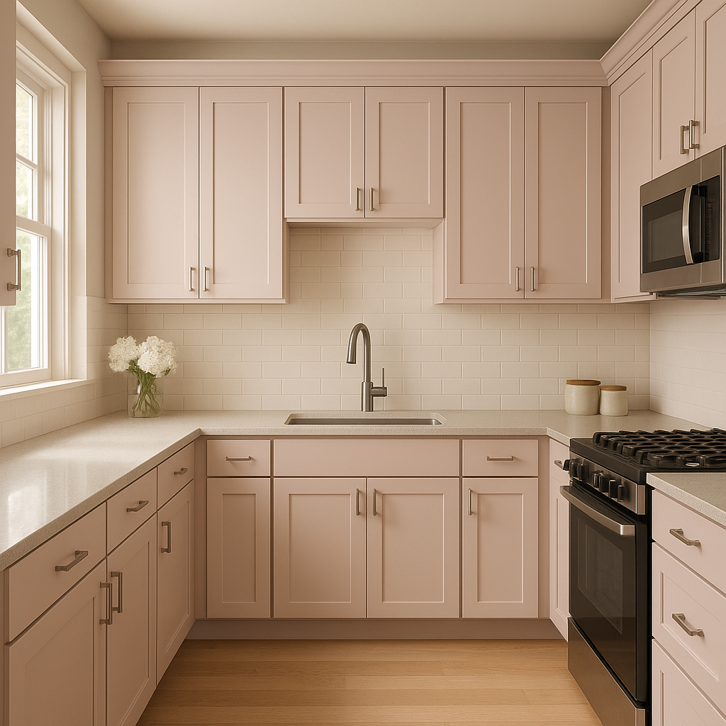
Demure’s versatility makes it an ideal choice for a variety of spaces, from bedrooms and bathrooms to living rooms and dining areas. Its calming nature lends itself well to environments where relaxation and comfort are prioritized. Here are some ideas for integrating Demure into your home or design project:
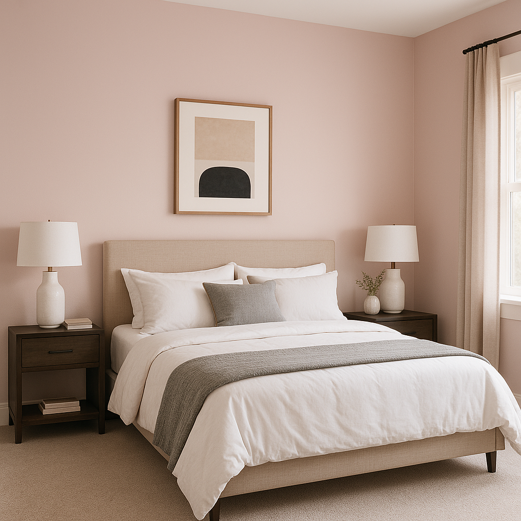
Demure is a perfect choice for creating serene and tranquil bedrooms. Pair it with soft white linens, plush textures, and touches of metallic accents to create a luxurious yet cozy retreat. The lavender undertones promote calmness, making it an excellent backdrop for restful nights.
Transform your bathroom into a spa-like space by using Demure on the walls. Pair it with crisp whites for cabinetry and fixtures, and incorporate natural elements like marble countertops or wooden accessories to create a harmonious and soothing atmosphere.
In living spaces, Demure can serve as a grounding neutral or a focal point. Pair it with deep jewel tones like navy or emerald green for a dramatic contrast, or create a monochromatic palette with varying shades of gray, lavender, and white for a modern, layered look.
For dining rooms, Demure provides a sophisticated backdrop that enhances the ambiance. Add bold accents like gold or bronze finishes in lighting and decor to elevate the space and create an inviting environment for entertaining guests.
Demure’s soft lavender undertones add a playful yet elegant touch to nurseries or children’s rooms. Pair it with pastel accents such as soft blues, greens, or pinks for a whimsical and dreamy space.
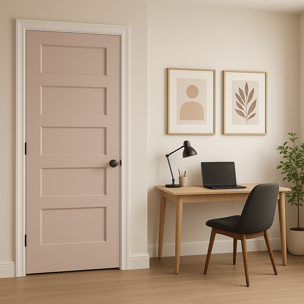
In workspaces, Demure promotes a sense of calm and focus. Combine it with sleek furniture, minimalist decor, and complementary cool tones to create a productive yet stylish environment.
The appearance of Sherwin-Williams Demure can vary based on lighting conditions. In rooms with abundant natural light, the lavender undertones will be more pronounced, creating a soft and airy feel. In spaces with artificial or low lighting, the gray base may take center stage, lending a more grounded and neutral look. Be sure to test the color in your specific space and under various lighting conditions to ensure it achieves the desired effect.
Sherwin-Williams Demure (SW 6295) is a graceful and sophisticated hue that offers endless possibilities for creating timeless interiors. With its calming undertones, versatile pairings, and ability to adapt to different spaces, it’s a color that promises to elevate your home’s aesthetic while maintaining a sense of serenity. Whether you’re designing a restful retreat, a chic living space, or a stylish workspace, Demure is a shade that will inspire and delight.
Note: These images were all generated with AI, there may be inaccurate color results. Please only use a general reference to get a rough idea of what a color may look like, we will continue to generate new images to improve accuracy.
View Colors Only by Brand (No Imagery):
Sherwin-Williams
|
Benjamin-Moore
|
Behr
|
Valspar
Live on the Eastern Slope of Colorado and looking for a local painting professional, check out all our painting services and reach out for a free estimate.
Copyright © 2026 : Wild Fox Painting Inc. : 12435 Mead Way, Littleton, CO 80125


