Sherwin-Williams Concerto 6298 is a captivating hue that resonates with elegance and versatility. This rich, muted purple is a part of the Sherwin-Williams Color Collections, embodying both modern sophistication and timeless charm. Whether you're looking to create a cozy, intimate atmosphere or add a refined touch to a space, Concerto 6298 delivers a harmonious balance that feels both grounding and luxurious.
Concerto 6298 is a medium-toned purple with subtle blue and gray undertones. These cool undertones give the color a calming presence, steering it away from overly warm or vibrant purples. The gray undertones provide a soft, muted effect, making it an excellent choice for those who want the richness of purple without it feeling overwhelming or loud.
The blue undertones add depth, enhancing the hue’s ability to pair beautifully with a variety of cool and neutral palettes. This complexity in its undertones allows Concerto 6298 to adapt to different lighting conditions. In natural daylight, the color leans more toward a gentle lavender, while in dimmer, artificial lighting, the gray undertones become more pronounced, lending a smoky sophistication.
Sherwin-Williams Concerto 6298 is a versatile shade that pairs well with a range of coordinating colors. Here are some thoughtfully curated combinations to elevate your design:
Neutrals:
Cool Tones:
Accent Colors:
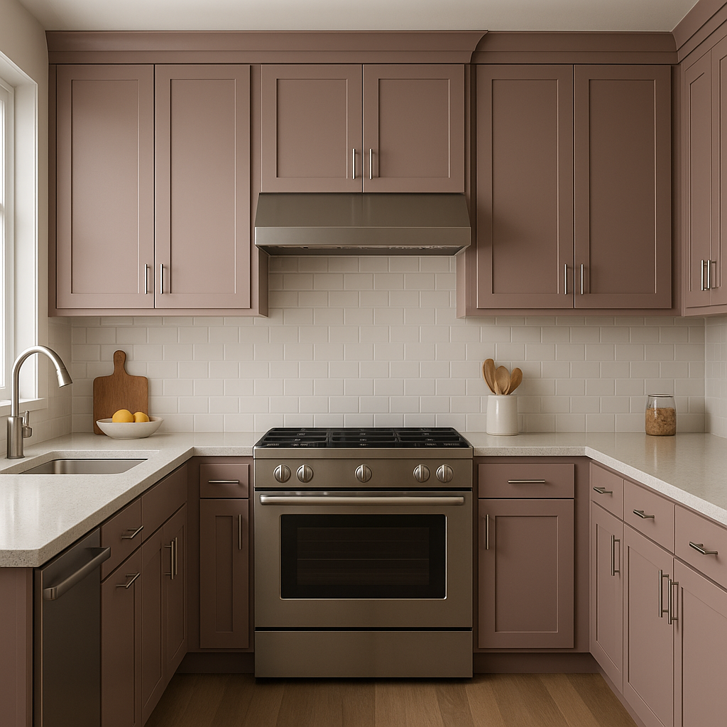
The versatility of Concerto 6298 also makes it an ideal companion for metallic accents, such as brushed nickel, pewter, or even rose gold, for a touch of modern glamour.
Sherwin-Williams Concerto 6298 is a sophisticated color that works beautifully in a variety of spaces and design styles. Here are some inspiring applications:
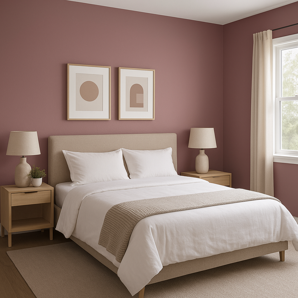
The serene and soothing qualities of Concerto 6298 make it an excellent choice for bedrooms. Its cool undertones create a restful environment, perfect for unwinding at the end of the day. Pair it with soft linens in whites or grays for a tranquil retreat.
For a living room that feels both cozy and elegant, use Concerto 6298 as either a primary wall color or an accent wall. Pair it with plush furniture in neutral tones and metallic decor accents to enhance the space's sophistication.
Concerto 6298’s calming blue undertones make it a fantastic option for a spa-like bathroom. Use it alongside white tile, chrome fixtures, and soft gray towels to create a space that feels refreshing and luxurious.
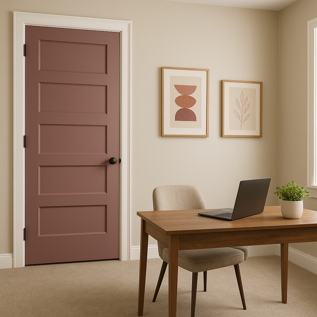
Purple tones like Concerto 6298 can stimulate creativity and focus, making them a great choice for home offices. Combine it with clean lines,
Note: These images were all generated with AI, there may be inaccurate color results. Please only use a general reference to get a rough idea of what a color may look like, we will continue to generate new images to improve accuracy.
View Colors Only by Brand (No Imagery):
Sherwin-Williams
|
Benjamin-Moore
|
Behr
|
Valspar
Live on the Eastern Slope of Colorado and looking for a local painting professional, check out all our painting services and reach out for a free estimate.
Copyright © 2026 : Wild Fox Painting Inc. : 12435 Mead Way, Littleton, CO 80125


