Sherwin-Williams Burgundy (SW 6300) is a rich, luxurious red that exudes elegance and warmth. This deep hue is reminiscent of fine wine and classic sophistication, making it an excellent choice for spaces where you want to create a dramatic yet inviting atmosphere. Burgundy is a versatile color that can anchor a design scheme or serve as an accent to elevate your decor to new levels of refinement.
Burgundy (SW 6300) boasts subtle undertones of brown and blue, which balance its bold red base. The brown undertones lend warmth and earthiness, while the muted hints of blue add depth and richness. These undertones give the color a grounded yet regal feel, making it a perfect choice for traditional, transitional, or even modern interiors.
The undertones also ensure that Burgundy doesn’t lean too bright or overly saturated, making it a sophisticated choice that feels timeless rather than trendy. This balance allows it to pair beautifully with a wide range of complementary colors and materials.
Sherwin-Williams Burgundy is remarkably versatile when it comes to color coordination. Whether you’re designing a cozy retreat or an elegant dining room, here are some suggested pairings:
For accents, metallics like gold, bronze, or brushed nickel can elevate the luxurious feel of Burgundy. Additionally, pops of teal or turquoise can add vibrancy and energy to the space.
Sherwin-Williams Burgundy is an ideal choice for spaces where you want to cultivate warmth, character, and sophistication. Below are some creative ways to incorporate this stunning hue into your home or commercial space:
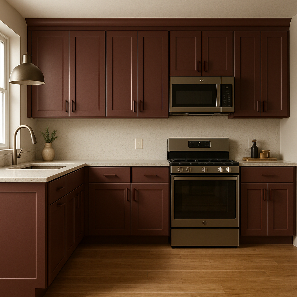
Burgundy can create a cozy and inviting ambiance in living rooms. Use it on an accent wall paired with neutral furniture and soft textures like velvet or chenille. Add metallic finishes for an upscale vibe.
This color is perfect for dining spaces where you want to encourage conversation and intimacy. Burgundy evokes feelings of warmth and richness, making it an excellent backdrop for family dinners or entertaining guests. Pair it with wooden dining furniture and soft lighting to complete the look.
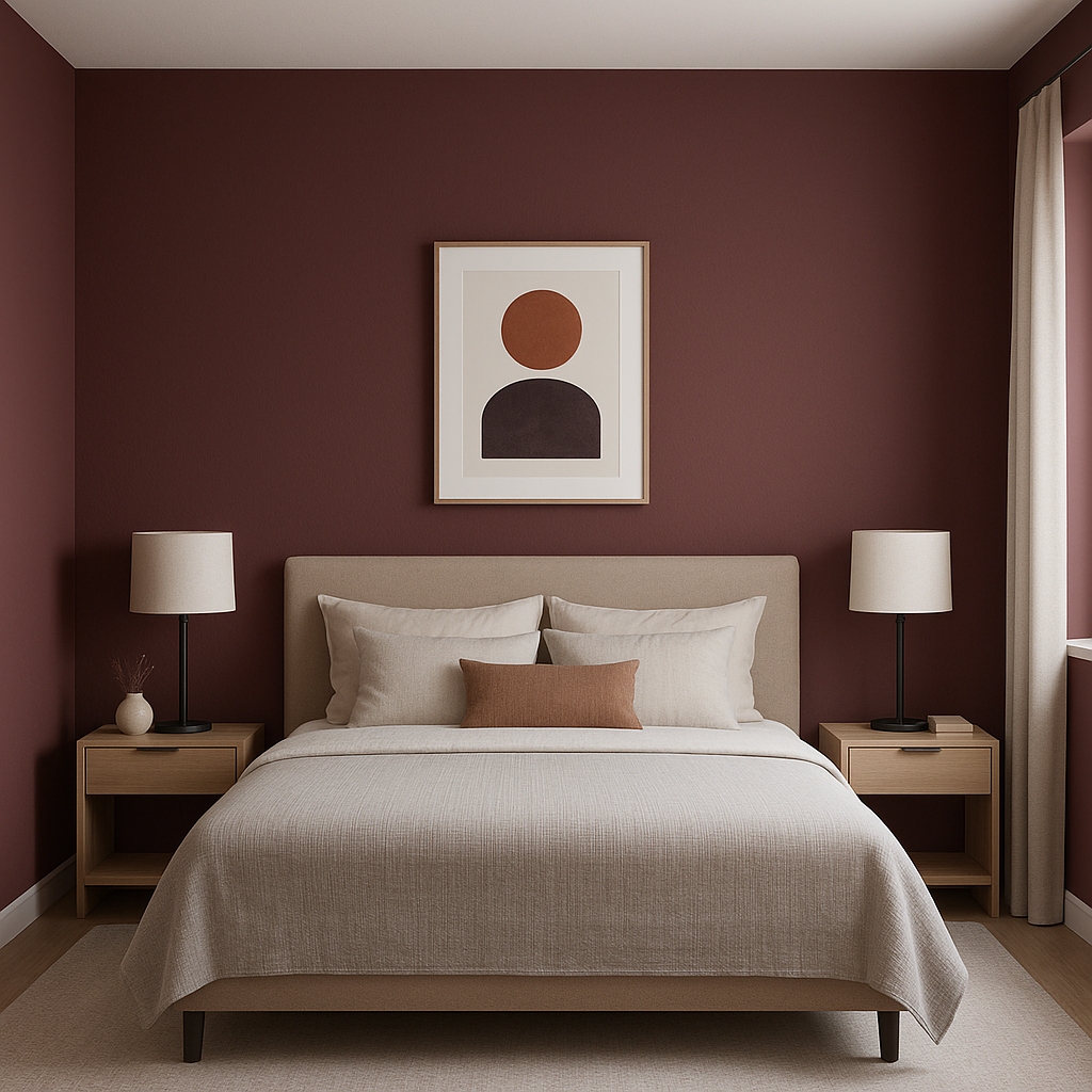
In bedrooms, Burgundy can add a sense of drama and romanticism. Use it sparingly, such as on an accent wall behind the bed, and pair it with soft whites, blush tones, or muted grays for a serene yet luxurious retreat.
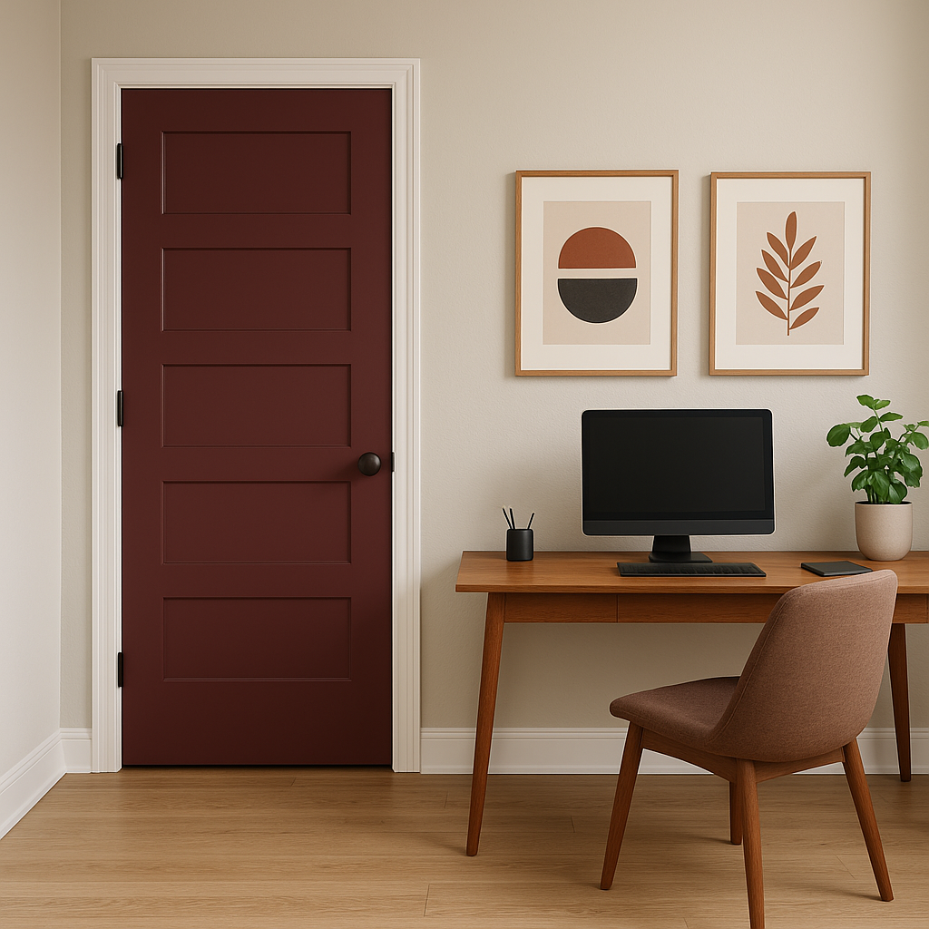
Burgundy can foster focus and creativity in home offices. Its rich tone adds depth and character to the space, especially when paired with warm wood finishes and coordinating neutrals like beige or taupe.
Make a bold first impression by using Burgundy in entryways or foyers. Pair it with crisp white trim and polished brass hardware for a polished, timeless look that welcomes guests in style.
In restaurants, wine bars, or boutique stores, Burgundy can serve as a signature color that communicates luxury and refinement. It works beautifully with wood accents, vintage decor, or industrial elements like exposed brick.
Sherwin-Williams Burgundy (SW 6300) is a color that transcends trends, offering timeless elegance and versatility. Whether you’re designing a cozy living space or a bold commercial interior, Burgundy’s rich depth and sophisticated undertones make it an exceptional choice for creating memorable environments.
Note: These images were all generated with AI, there may be inaccurate color results. Please only use a general reference to get a rough idea of what a color may look like, we will continue to generate new images to improve accuracy.
View Colors Only by Brand (No Imagery):
Sherwin-Williams
|
Benjamin-Moore
|
Behr
|
Valspar
Live on the Eastern Slope of Colorado and looking for a local painting professional, check out all our painting services and reach out for a free estimate.
Copyright © 2026 : Wild Fox Painting Inc. : 12435 Mead Way, Littleton, CO 80125


