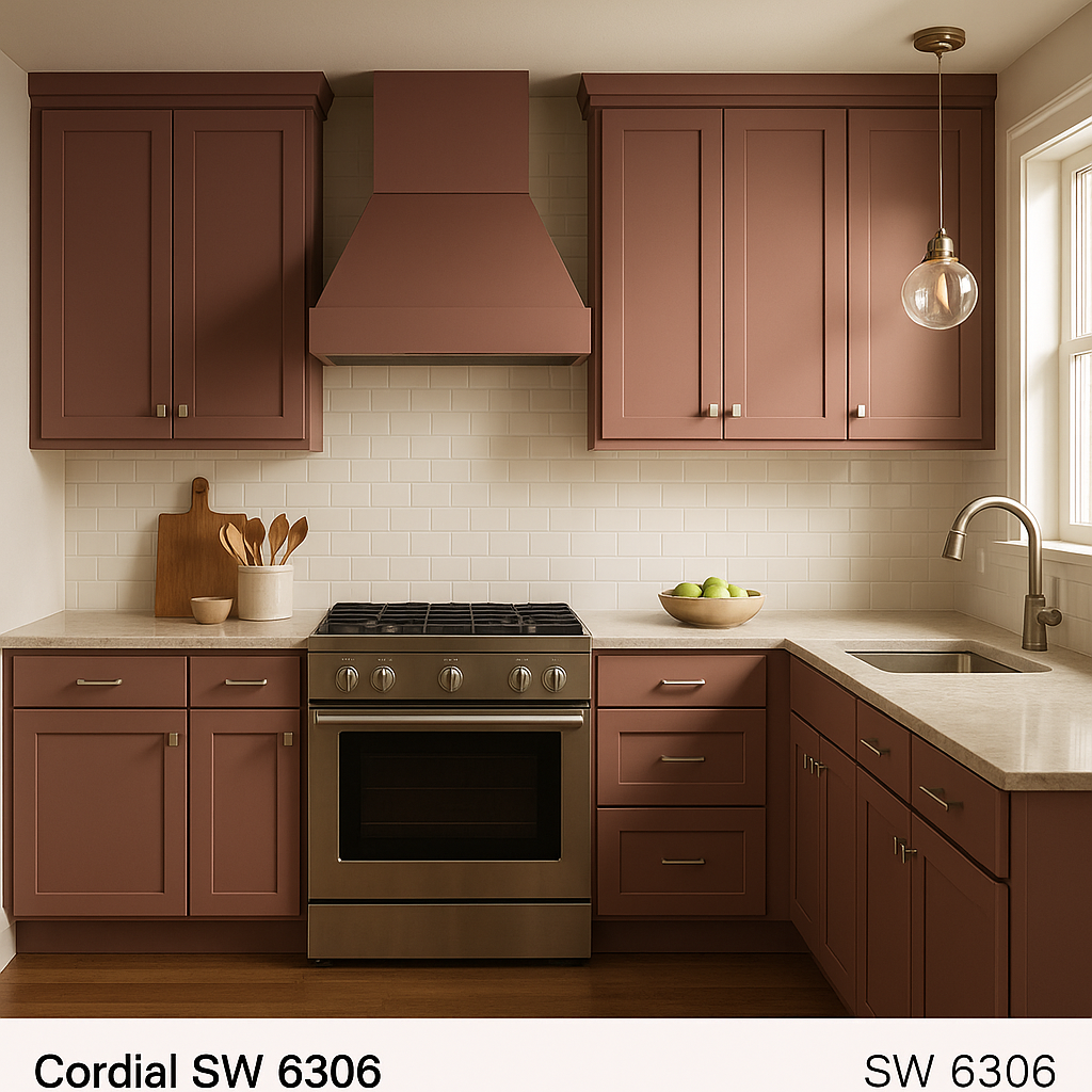
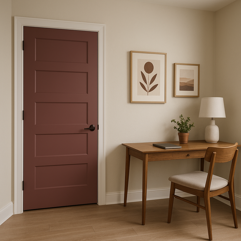
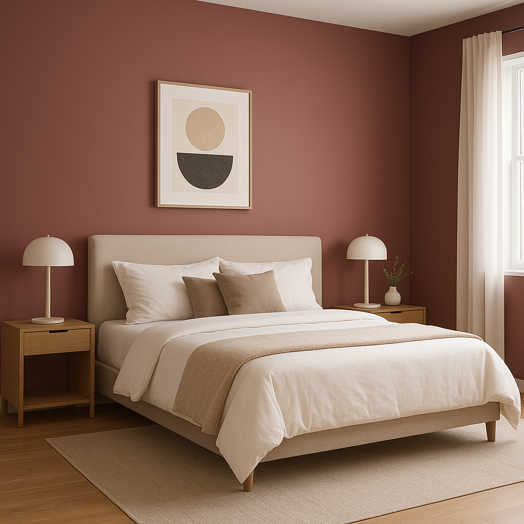
Sherwin-Williams Cordial (SW 6306) is a refined and welcoming paint color that effortlessly radiates elegance and charm. This soft, earthy hue falls within the rosy taupe family, blending warm pink undertones with a subtle brownish base to create a balanced, soothing aesthetic. Cordial is an excellent choice for spaces that need a touch of sophistication while maintaining a relaxed, inviting ambiance. Its versatility and warmth make it a standout option for both contemporary and traditional designs.
Cordial has a foundation of warm taupe with distinct rosy undertones, giving it a nuanced depth that feels both cozy and timeless. The pink undertones are gentle and understated, avoiding overly saturated or bright appearances. This subtle warmth ensures that Cordial works harmoniously in various lighting conditions, whether bathed in natural daylight or illuminated by artificial light. In cooler, dimmer spaces, its brownish base may become more pronounced, whereas in brighter areas, the pink undertones shine through, adding a touch of softness.
Sherwin-Williams Cordial pairs beautifully with a variety of complementary and contrasting shades. For a harmonious palette, consider coordinating it with these colors:
These coordinating colors work well to create diverse palettes, ranging from serene and understated to bold and dramatic.
Sherwin-Williams Cordial is a versatile paint color that can be applied in various spaces to achieve different design goals. Here are some ideas for integrating it into your home:
Cordial’s warm taupe tones make it an excellent choice for living rooms and family spaces. It fosters a cozy yet sophisticated atmosphere, perfect for gathering with family or entertaining guests. Pair it with light neutral furniture and accents in brass or gold for a polished look.
The rosy undertones in Cordial create a calming and romantic vibe, making it ideal for bedrooms. Layer it with soft textiles, such as blush or beige bedding, and accent with darker wood tones for a balanced, serene retreat.
Cordial can elevate dining spaces with its refined warmth. When paired with rich wood furniture and metallic accents, it creates a luxurious yet welcoming environment that encourages lingering meals and meaningful conversations.
In bathrooms, Cordial brings a spa-like quality when paired with white or cream tiles and brushed metal fixtures. This color provides a soothing backdrop while maintaining a sense of elegance.
For home offices, Cordial offers an understated sophistication that promotes focus and productivity without feeling sterile. Combine it with natural wood tones and green plants to create an inspiring workspace.
If you’re looking to add depth and character to a room, Cordial works beautifully as an accent wall. Pair it with lighter neutrals for contrast or complementary shades to create a cohesive, layered look.
To get the most out of Sherwin-Williams Cordial, consider the lighting in your space. In rooms with ample natural light, the rosy undertones will feel more prominent, lending a warm and cheerful vibe. In spaces with less light, the taupe base takes center stage, offering a more subdued and grounded feel. Incorporating layered lighting with warm bulbs can help enhance the color's richness.
Sherwin-Williams Cordial (SW 6306) is a timeless choice that adapts beautifully to a range of interior design styles. Its blend of rosy warmth and earthy taupe makes it a versatile and elegant addition to any home. Whether used as a main wall color, an accent, or in combination with coordinating shades, Cordial effortlessly transforms spaces with its inviting charm.
Note: These images were all generated with AI, there may be inaccurate color results. Please only use a general reference to get a rough idea of what a color may look like, we will continue to generate new images to improve accuracy.
View Colors Only by Brand (No Imagery):
Sherwin-Williams
|
Benjamin-Moore
|
Behr
|
Valspar
Live on the Eastern Slope of Colorado and looking for a local painting professional, check out all our painting services and reach out for a free estimate.
Copyright © 2026 : Wild Fox Painting Inc. : 12435 Mead Way, Littleton, CO 80125


