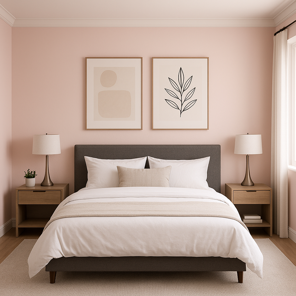
Sherwin-Williams Charming Pink (SW 6309) is a delicate and graceful shade of pink that exudes warmth, sophistication, and subtle femininity. Perfectly balanced, this pastel hue is neither too bold nor overly muted, making it an ideal choice for spaces that seek to convey a sense of comfort, elegance, and serenity. Whether you're designing a nursery, a chic living room, or a romantic bedroom, Charming Pink offers endless possibilities for creating inviting interiors.
Charming Pink carries gentle peach undertones that lend the color a soft, natural warmth. These undertones prevent it from feeling overly sweet or saccharine, giving the shade a refined and understated quality. The peachy base makes it versatile for pairing with a wide range of coordinating colors, whether you're aiming for a modern aesthetic or a more traditional look.
The beauty of Sherwin-Williams Charming Pink lies in its ability to harmonize with a variety of palettes. Here are some suggestions for coordinating colors that enhance its charm:
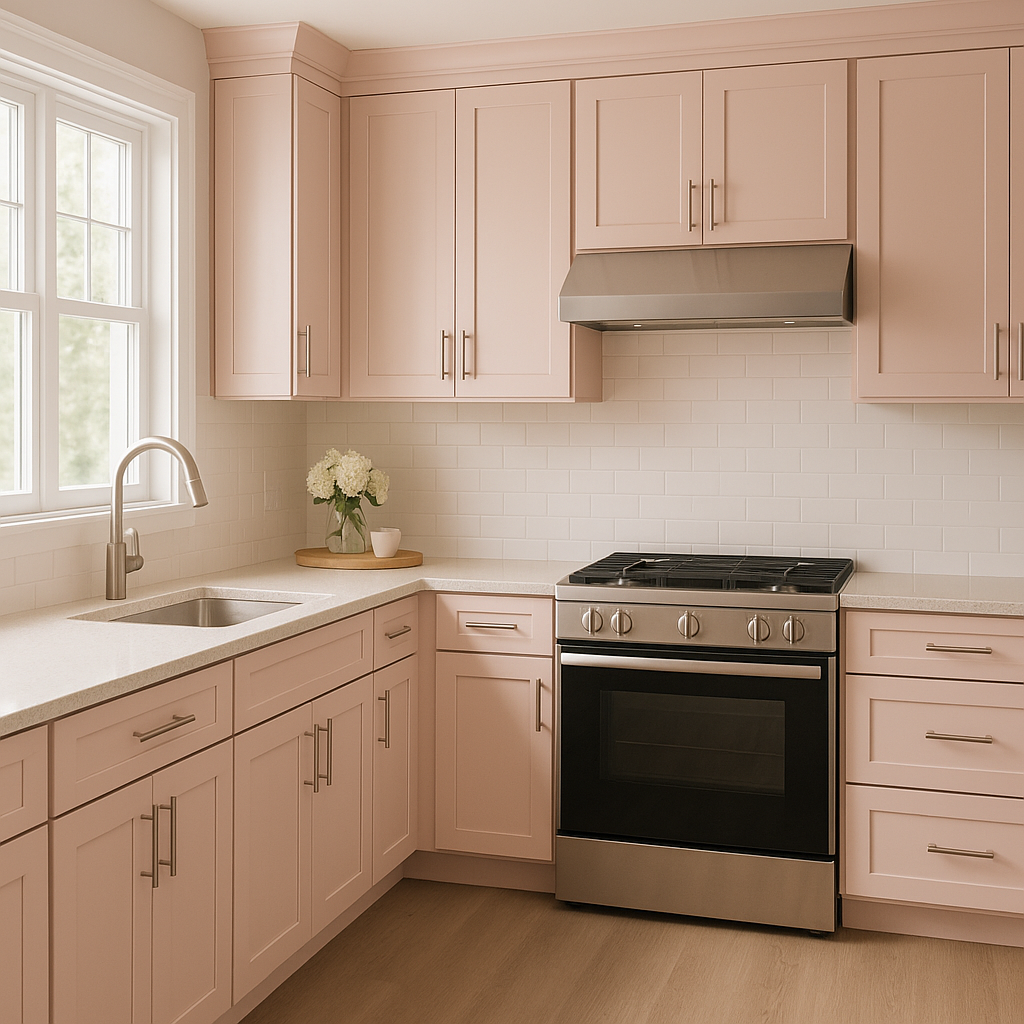
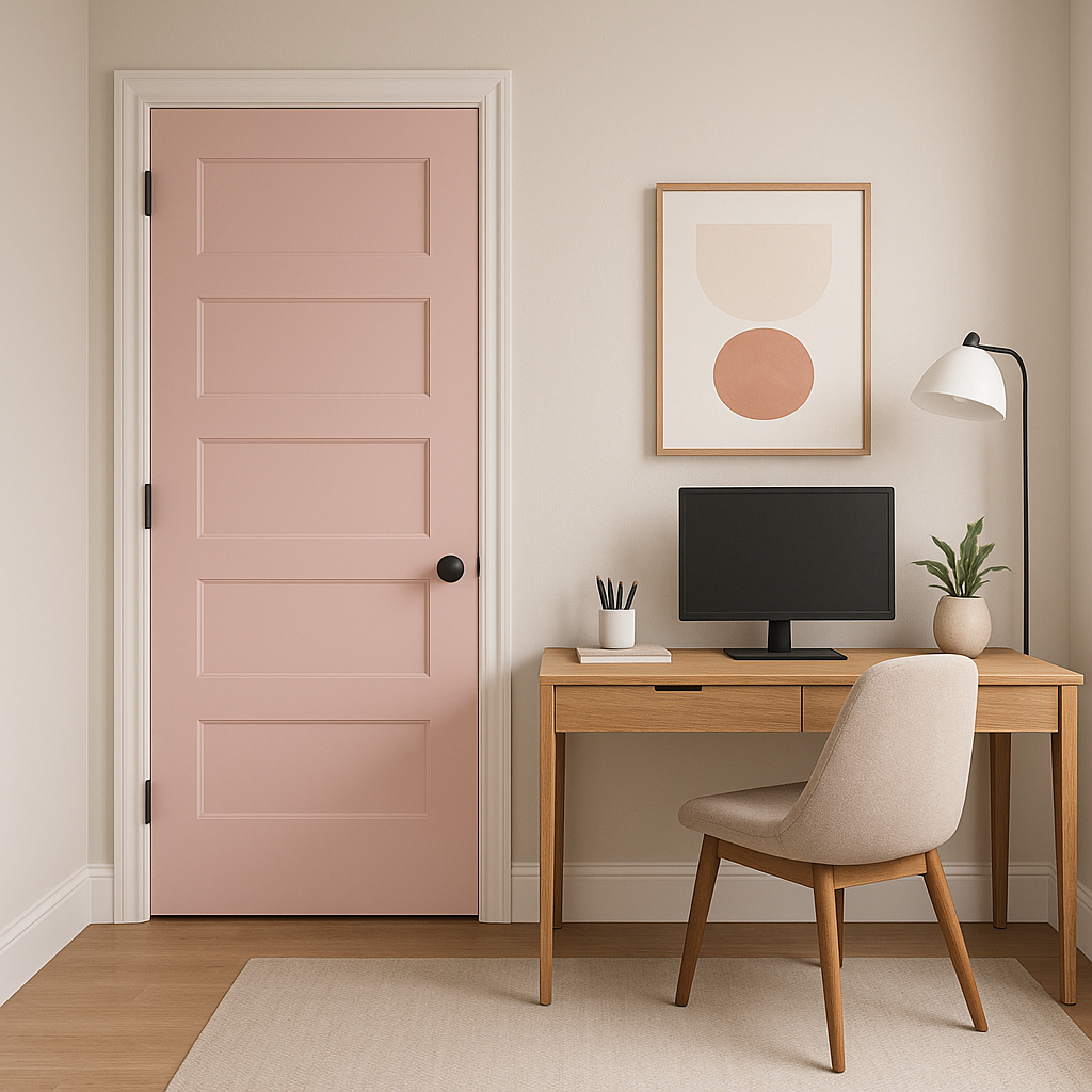
Charming Pink is an incredibly versatile color that can be used in a variety of spaces and design styles:
As with any paint color, lighting plays a crucial role in how Charming Pink appears in your space. In rooms with ample natural light, its peach undertones become more pronounced, giving it a sunny and cheerful quality. In dimly lit spaces, the color takes on a richer, more muted tone, lending a cozy and intimate atmosphere.
Sherwin-Williams Charming Pink (SW 6309) is more than just a color—it's a mood enhancer. Its soft, peach-infused undertones bring warmth and elegance to any space, while its versatility ensures it pairs beautifully with a wide range of coordinating shades and design styles. Whether you're designing a tranquil retreat or a chic modern space, Charming Pink is a timeless choice that will elevate your interiors with sophistication and charm.
Note: These images were all generated with AI, there may be inaccurate color results. Please only use a general reference to get a rough idea of what a color may look like, we will continue to generate new images to improve accuracy.
View Colors Only by Brand (No Imagery):
Sherwin-Williams
|
Benjamin-Moore
|
Behr
|
Valspar
Live on the Eastern Slope of Colorado and looking for a local painting professional, check out all our painting services and reach out for a free estimate.
Copyright © 2026 : Wild Fox Painting Inc. : 12435 Mead Way, Littleton, CO 80125


