Sherwin-Williams Kirsch Red (SW 6313) is a deeply evocative, rich red paint color that makes a dramatic design statement. Its bold intensity strikes a balance between elegance and vibrancy, making it an ideal choice for spaces that need a touch of passion, sophistication, or warmth. Whether you’re curating a luxurious dining room or adding personality to an accent wall, Kirsch Red offers a timeless allure that transforms any space into something extraordinary.
Kirsch Red carries subtle brown undertones, giving it depth and grounding its vibrancy. These undertones ensure the color feels warm and inviting rather than overpowering. Unlike cooler reds that can lean toward pink or purple, this hue leans toward earthy richness, making it versatile and suitable for a variety of design aesthetics. The undertones also contribute to its ability to pair beautifully with both neutral and bold coordinating colors.
Kirsch Red pairs effortlessly with a variety of complementary and coordinating hues. Whether you're aiming for a harmonious palette or a bold contrast, here are some expert recommendations:
Kirsch Red’s versatility shines across a variety of interior design applications. Its dramatic yet inviting nature makes it perfect for spaces that thrive on bold statements. Here are some suggestions for incorporating this stunning color:
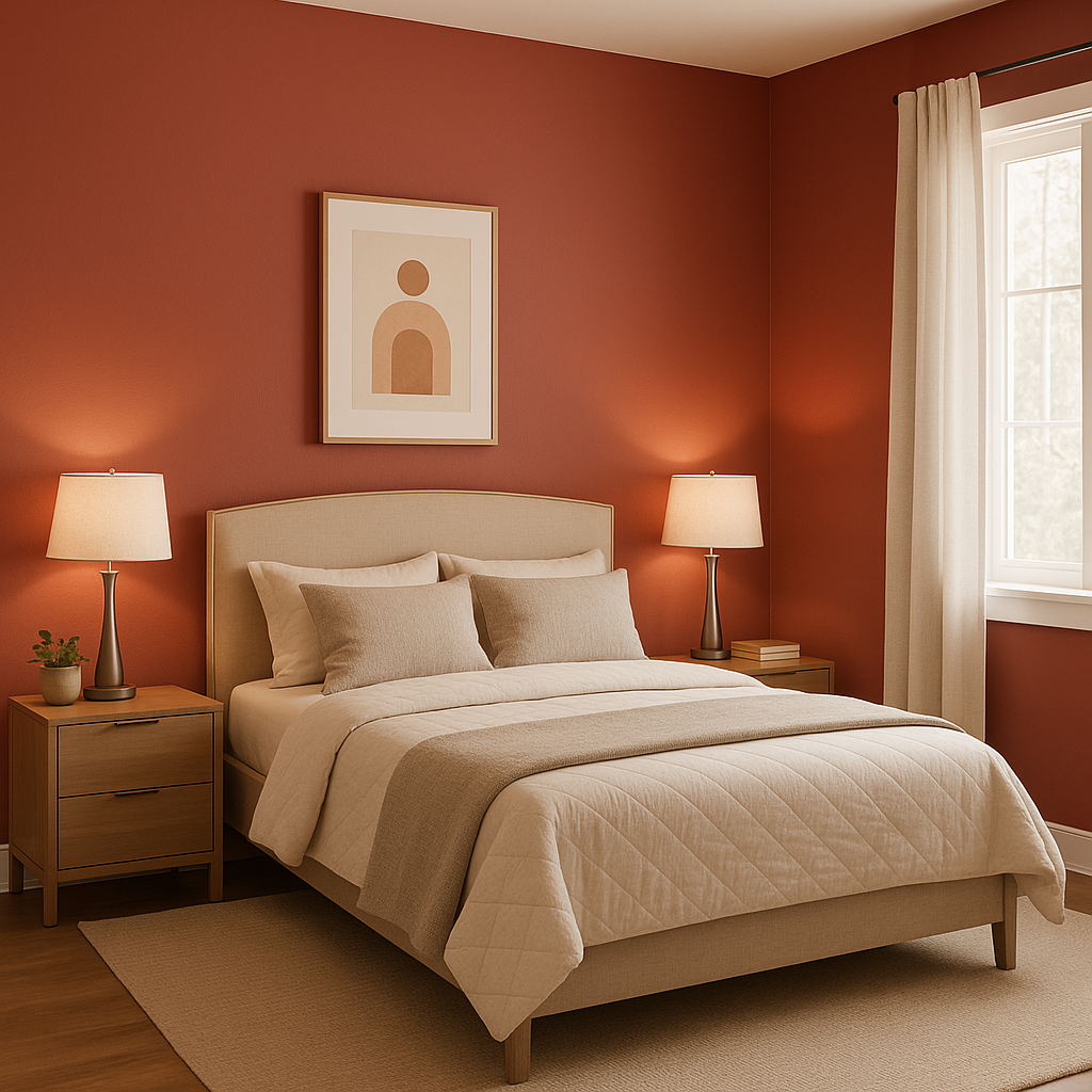
Use Kirsch Red as an accent wall in living rooms, bedrooms, or home offices to add depth and personality. Pair it with neutral walls for a balanced aesthetic.
The warmth and richness of Kirsch Red create an intimate and luxurious atmosphere in dining areas. This hue encourages conversation and fosters an inviting environment for entertaining.
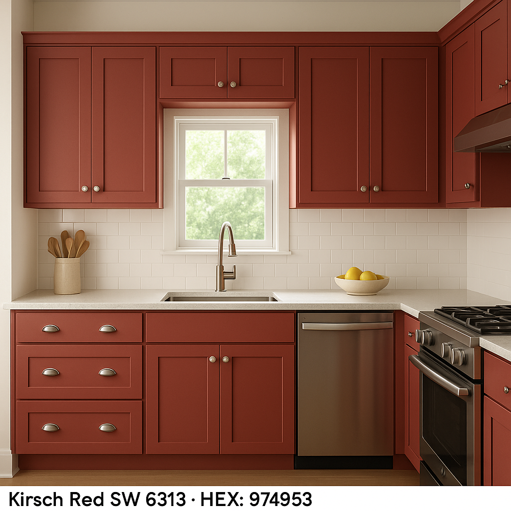
In smaller doses, Kirsch Red can be applied to cabinetry, furniture, or built-ins for a pop of color that feels both daring and sophisticated. Pair it with brushed brass hardware for a modern yet timeless look.
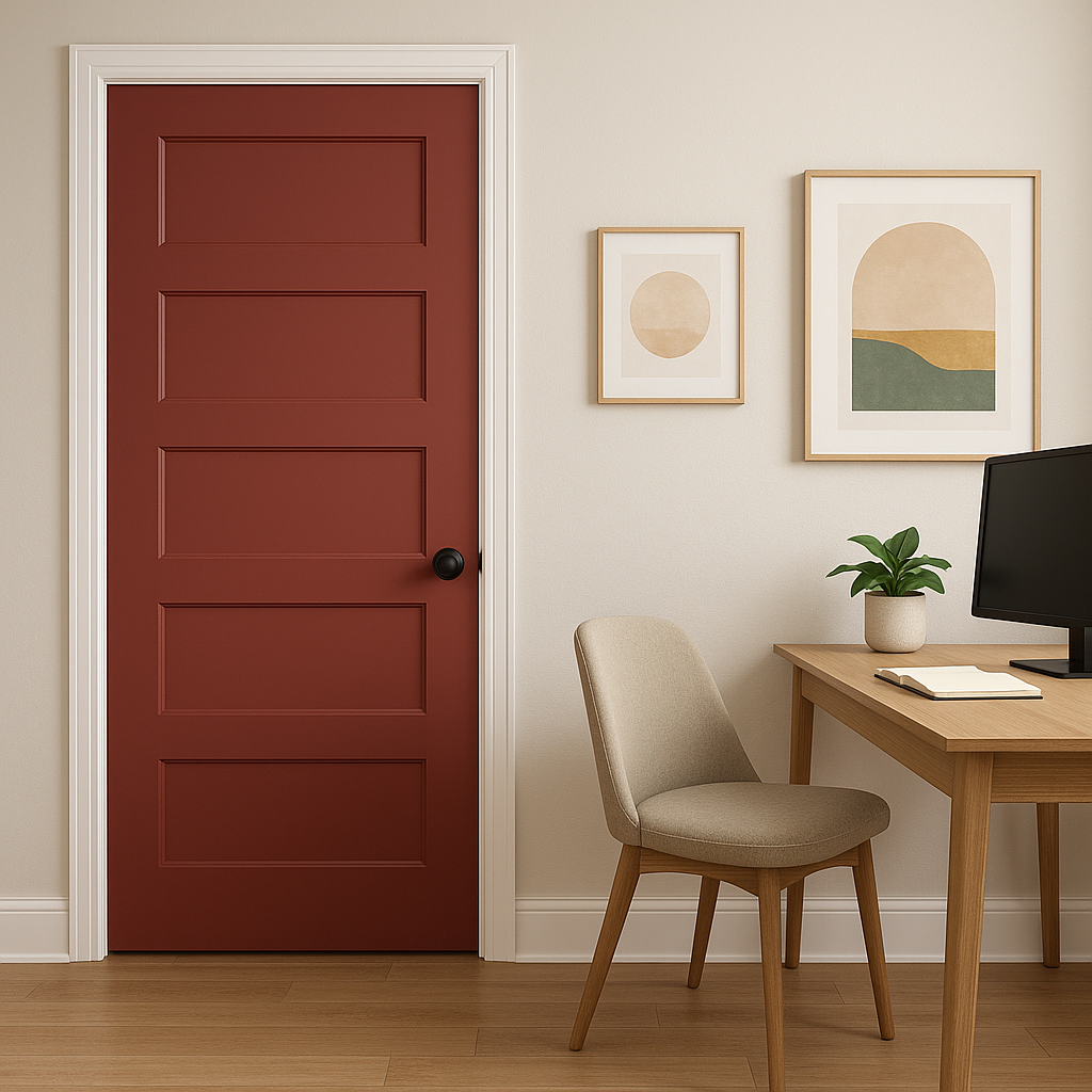
Make an unforgettable first impression by using Kirsch Red in entryways or foyers. Combine it with white trim or crown molding for a clean, polished finish.
Infuse energy into creative spaces like art studios or craft rooms with Kirsch Red. Its boldness can spark inspiration and fuel artistic expression.
Kirsch Red works beautifully in restaurants, boutique shops, or other commercial settings where you want to evoke a sense of luxury and sophistication. Pair it with ambient lighting to enhance its dramatic quality.
As with any bold color, lighting plays a key role in how Kirsch Red is perceived. In spaces with ample natural light, the color takes on a vibrant energy, while in dimly lit rooms, it appears richer and more dramatic. To optimize its impact, consider using warm light bulbs to enhance its earthy undertones and create a welcoming glow.
Sherwin-Williams Kirsch Red is more than just a paint color; it’s an experience. With its bold presence and versatile undertones, it offers endless possibilities for elevating your interiors, whether through subtle accents or bold statements. Make your space unforgettable with this timeless hue.
Note: These images were all generated with AI, there may be inaccurate color results. Please only use a general reference to get a rough idea of what a color may look like, we will continue to generate new images to improve accuracy.
View Colors Only by Brand (No Imagery):
Sherwin-Williams
|
Benjamin-Moore
|
Behr
|
Valspar
Live on the Eastern Slope of Colorado and looking for a local painting professional, check out all our painting services and reach out for a free estimate.
Copyright © 2026 : Wild Fox Painting Inc. : 12435 Mead Way, Littleton, CO 80125


