Sherwin-Williams Gracious Rose 6317 is a beautifully soft and romantic shade of pink that exudes warmth, charm, and sophistication. With its understated elegance, this hue is the perfect choice for creating spaces that feel inviting, serene, and effortlessly stylish. Whether you're designing a cozy bedroom retreat or a cheerful living space, Gracious Rose brings a sense of refinement and comfort to any interior.
Gracious Rose leans toward a warm pink with subtle peachy undertones. These warm undertones give it a delicate glow, preventing it from feeling overly sweet or saccharine. The peachy hints also provide versatility, allowing it to harmonize beautifully with a variety of other colors and decor styles. This soft and balanced pink is neither too bold nor too muted, making it a versatile choice for anyone seeking a refined yet approachable palette.
Gracious Rose 6317 pairs effortlessly with a range of complementary hues, allowing you to create a cohesive and intentional design. Here are a few suggestions to inspire your color combinations:
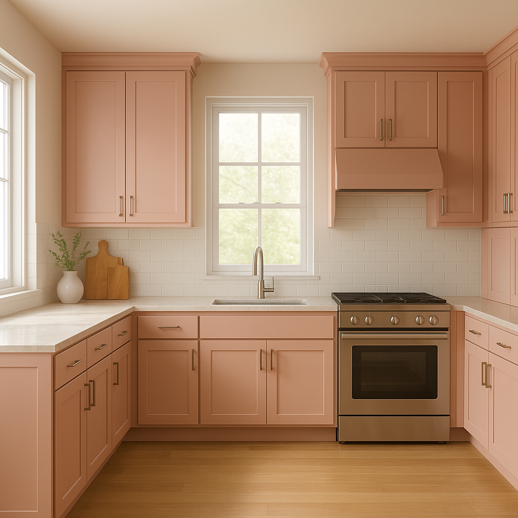
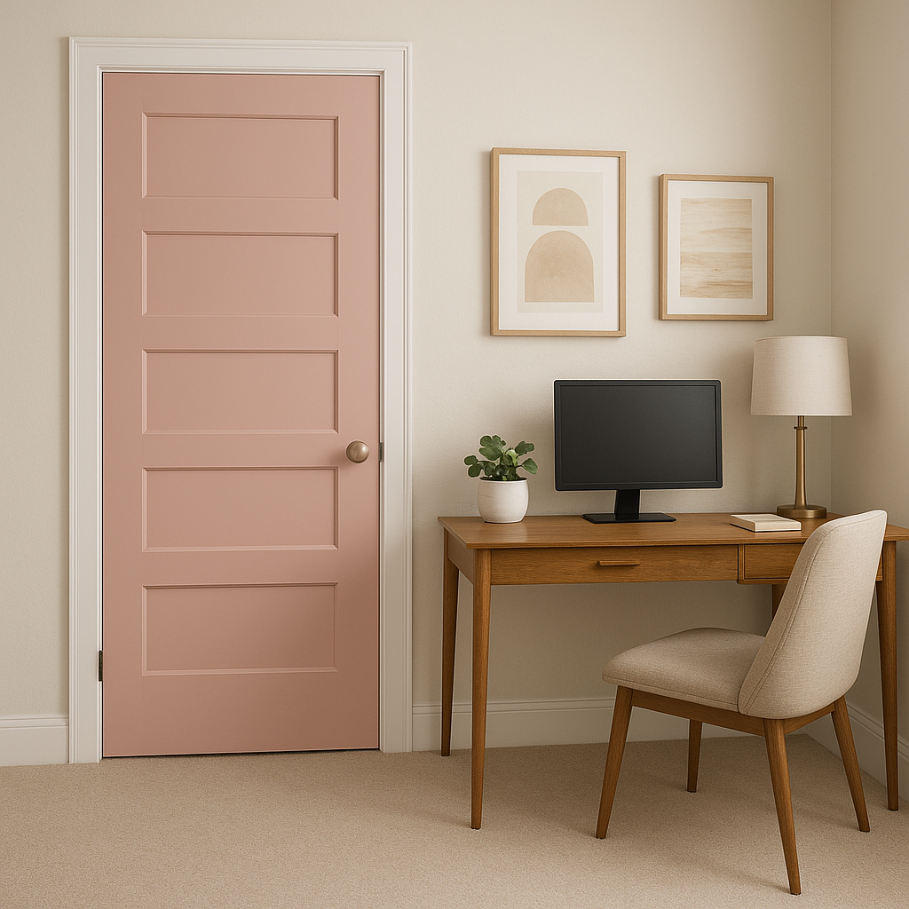
Gracious Rose 6317 is an incredibly versatile color that works well across a variety of spaces and design styles. Here are some ideas for incorporating this lovely hue into your home:
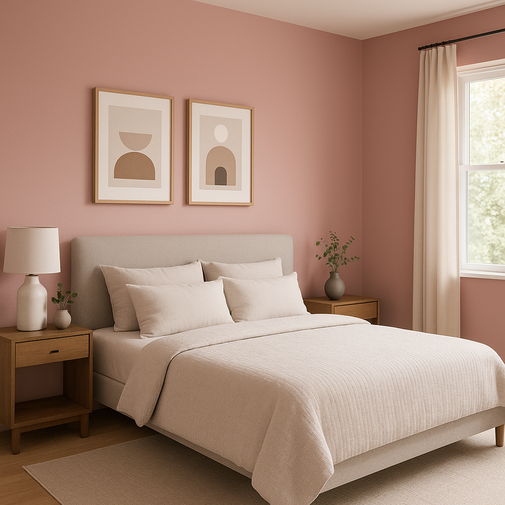
This soft pink is a perfect choice for bedrooms, where its soothing undertones create a tranquil and relaxing retreat. Pair it with plush bedding, soft textures, and subtle metallic accents for a luxurious and cozy feel.
In living spaces, Gracious Rose can be used to add warmth and personality. Use it on an accent wall to create a focal point or throughout the room for a cohesive, welcoming vibe. Pair with neutral furniture and natural materials like wood or rattan for an organic and balanced look.
Gracious Rose is an excellent option for nurseries or children's rooms, offering a playful yet sophisticated alternative to brighter pinks. Incorporate whimsical decor and soft lighting to create a dreamy, comforting space.
For a spa-like bathroom, consider using Gracious Rose alongside white subway tiles, marble countertops, and brushed gold fixtures. The pink hue adds a subtle femininity without overwhelming the space.
This warm pink can bring a sense of intimacy and charm to dining rooms or breakfast nooks. Pair it with dark wood furniture and soft lighting to create a cozy, inviting atmosphere for meals and gatherings.
Note: These images were all generated with AI, there may be inaccurate color results. Please only use a general reference to get a rough idea of what a color may look like, we will continue to generate new images to improve accuracy.
View Colors Only by Brand (No Imagery):
Sherwin-Williams
|
Benjamin-Moore
|
Behr
|
Valspar
Live on the Eastern Slope of Colorado and looking for a local painting professional, check out all our painting services and reach out for a free estimate.
Copyright © 2026 : Wild Fox Painting Inc. : 12435 Mead Way, Littleton, CO 80125


