Sherwin-Williams Faint Coral (SW 6329) is a delicate shade that effortlessly blends warmth and subtlety to create a serene atmosphere in any space. This captivating hue belongs to the color family of soft pinks and corals, making it an ideal choice for interiors that require a touch of elegance without overwhelming the senses. With its gentle presence, Faint Coral offers versatility and charm, making it suitable for a wide range of design styles, from coastal chic to modern minimalism.
Faint Coral is characterized by its understated warmth, achieved through peachy-pink undertones. These undertones give the color its distinct softness while ensuring it doesn’t veer into overly bright or saturated territory. The subtle infusion of warmth makes it feel cozy and inviting, yet refined enough to complement sophisticated design schemes.
The peachy undertones in Faint Coral are balanced by a hint of neutrality, allowing it to harmonize with both warm and cool color palettes. This versatility makes it a perfect choice for spaces where you want to introduce gentle color while maintaining a cohesive look with surrounding shades.
Sherwin-Williams Faint Coral works beautifully in combination with other colors, whether you’re aiming for a monochromatic palette or seeking complementary contrasts. Below are some suggestions for coordinating colors:
Faint Coral’s versatility makes it a go-to choice for a variety of interior applications. Whether you’re painting an entire room or using it as an accent color, this shade brings a sense of softness and sophistication to any space.
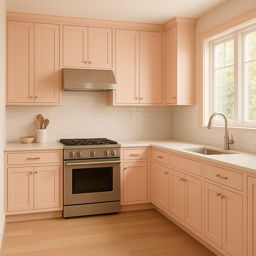
For living areas, Faint Coral creates a welcoming ambiance that is perfect for entertaining or relaxing. Pair it with neutral furniture and metallic accents, like brushed gold or copper, to elevate the space with a touch of luxury.
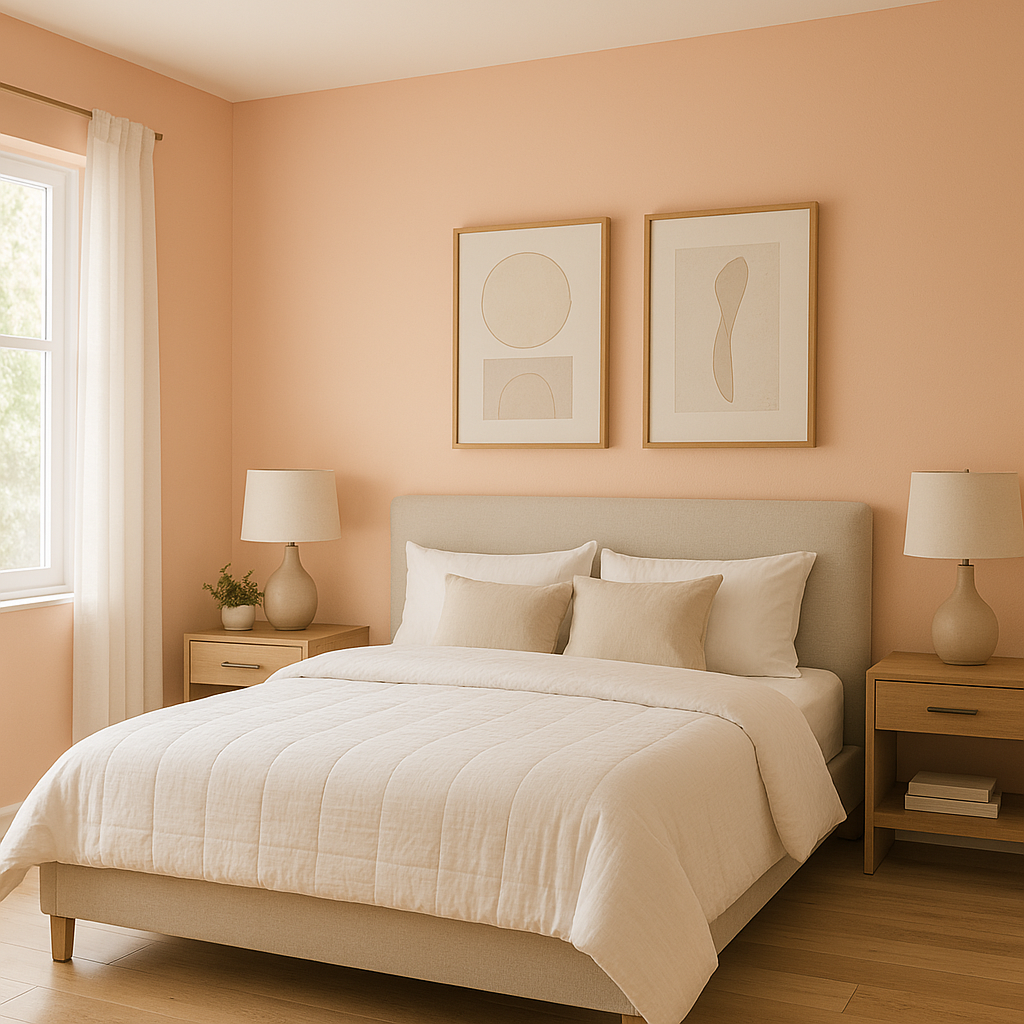
In bedrooms, Faint Coral shines as a wall color or accent. Its gentle tone makes it ideal for fostering relaxation and tranquility. Combine it with crisp white bedding and soft gray throw pillows for a modern yet cozy retreat.
Faint Coral can transform bathrooms into spa-like sanctuaries. Use it on walls or cabinetry, and pair it with marble countertops or tiles for a sophisticated look. Add accents in soft blues or greens to create a refreshing, coastal vibe.
Its delicate peachy-pink undertones make Faint Coral a charming choice for nurseries or children’s rooms. It feels playful without being overly bright, and it pairs well with whimsical patterns and pastel accents.
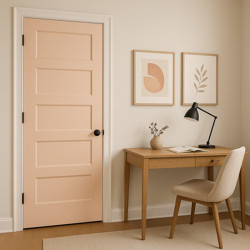
If you’re hesitant to commit to an entire room painted in Faint Coral, consider using it as an accent wall. Pair it with neutral tones like gray or beige for a balanced look that draws attention without overpowering the space.
Faint Coral responds beautifully to different lighting conditions, which can subtly shift its appearance. In spaces with ample natural light, the peachy-pink tones become more pronounced, lending a cheerful vibe to the room. Under artificial lighting, particularly warm-toned bulbs, Faint Coral takes on a cozier and more subdued appearance.
To ensure the color aligns with your vision, test Faint Coral in your space under various lighting conditions before committing to it.
Sherwin-Williams Faint Coral (SW 6329) is a sophisticated, versatile shade that can elevate any room with its graceful warmth and understated elegance. Whether used in living areas, bedrooms, or as an accent, this hue brings a sense of harmony and charm to your interior design, making it a timeless choice for homeowners and designers alike.
Note: These images were all generated with AI, there may be inaccurate color results. Please only use a general reference to get a rough idea of what a color may look like, we will continue to generate new images to improve accuracy.
View Colors Only by Brand (No Imagery):
Sherwin-Williams
|
Benjamin-Moore
|
Behr
|
Valspar
Live on the Eastern Slope of Colorado and looking for a local painting professional, check out all our painting services and reach out for a free estimate.
Copyright © 2026 : Wild Fox Painting Inc. : 12435 Mead Way, Littleton, CO 80125


