Sherwin-Williams Flower Pot (SW 6334) is a captivating, earthy red hue that exudes warmth, vibrancy, and charm. This rich, terracotta-inspired color brings a grounded yet lively personality to any interior or exterior space. Whether you're creating a cozy ambiance in a living room, an inviting entryway, or enhancing curb appeal, Flower Pot is a versatile choice that can transform your surroundings into a warm and welcoming retreat.
Flower Pot (SW 6334) carries distinct orange and brown undertones, giving it a natural warmth reminiscent of sunlit clay or baked earth. These undertones soften the boldness of the red base, ensuring the color feels grounded without being overpowering. The subtle hints of brown make it an excellent choice for spaces seeking balance between rustic charm and modern flair.
Its unique undertones allow Flower Pot to adapt beautifully to a variety of lighting conditions. In brighter, sunlit rooms, the orange undertones become more pronounced, lending the space a cheerful and energetic atmosphere. Meanwhile, in dimmer settings, the brown undertones deepen, creating a cozy and intimate environment.
To maximize the impact of Sherwin-Williams Flower Pot (SW 6334) in your design, pair it with complementary and coordinating colors. Consider these options for harmonious color palettes:
Neutrals:
Accent Colors:
Trim and Wood Tones:
Flower Pot (SW 6334) is a versatile color that works well in a variety of design styles, from Southwestern and Mediterranean aesthetics to modern rustic or bohemian interiors. Here are some ways to use this radiant hue effectively:
Living Rooms and Dining Areas:
Flower Pot creates a warm and inviting atmosphere, perfect for spaces meant for socializing and relaxation. Use it as an accent wall or pair it with neutral furniture and earthy textures like woven rugs or linen curtains to create a cozy retreat.
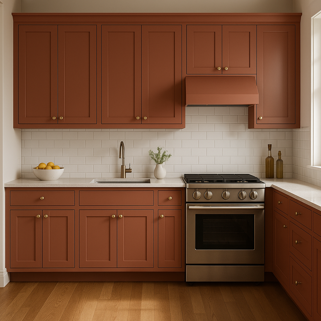
Kitchens:
This color shines in kitchens when used on cabinetry or as a backsplash accent. Coordinate with natural wood tones and metallic finishes—like copper or bronze—for a chic, timeless look.
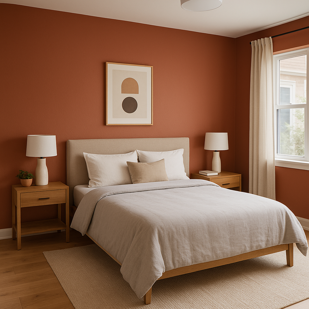
Bedrooms:
Bring a sense of intimacy and warmth to bedrooms by incorporating Flower Pot on walls or textiles. Balance the boldness with soft neutrals for a serene environment.
Exterior Spaces:
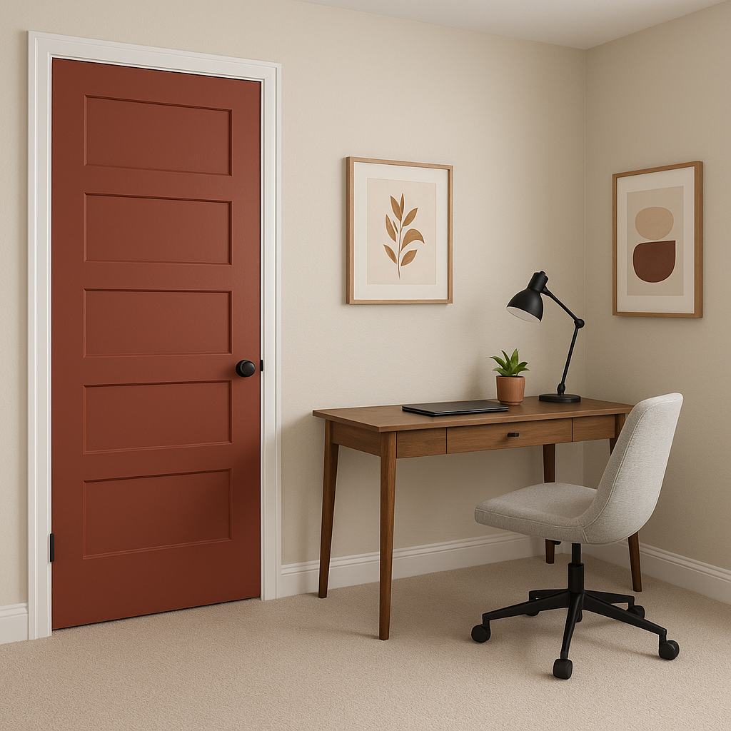
Flower Pot is a stunning choice for exterior walls, shutters, or front doors. Its earthy vibrancy adds curb appeal and pairs beautifully with natural landscaping elements like stone pathways and lush greenery.
Creative Spaces:
Incorporate Flower Pot as a feature wall in an art studio, home office, or reading nook to inspire creativity and energy.
The warmth of Flower Pot can vary depending on the lighting in your space. In natural light, its terracotta tones shine brightly, creating a cheerful and invigorating atmosphere. In artificial or softer lighting, the earthy brown undertones emerge, resulting in a calming and grounded feel. Experiment with different lighting to determine the ideal application for your space.
Sherwin-Williams Flower Pot (SW 6334) is a bold yet approachable color that invites warmth, creativity, and personality into your home. Its versatility in blending with neutrals, deep accents, and natural materials makes it an excellent choice for designers and homeowners seeking to infuse character into their spaces.
Note: These images were all generated with AI, there may be inaccurate color results. Please only use a general reference to get a rough idea of what a color may look like, we will continue to generate new images to improve accuracy.
View Colors Only by Brand (No Imagery):
Sherwin-Williams
|
Benjamin-Moore
|
Behr
|
Valspar
Live on the Eastern Slope of Colorado and looking for a local painting professional, check out all our painting services and reach out for a free estimate.
Copyright © 2026 : Wild Fox Painting Inc. : 12435 Mead Way, Littleton, CO 80125


