Sherwin-Williams Persimmon (SW 6339) is a captivating, rich orange-red that brings a sense of warmth, vitality, and bold character to any room. This color exudes an energizing and adventurous vibe, making it an excellent choice for homeowners or designers looking to create a dramatic focal point or infuse a space with personality and charm.
Persimmon is a warm, saturated hue with subtle undertones that lean toward fiery orange and deep terracotta. These undertones give it a grounded, earthy quality while still maintaining its vibrant and dynamic essence. The balance between the red and orange tones ensures that Persimmon feels both inviting and energizing, making it suitable for a variety of interior styles, from contemporary to eclectic.
Its undertones allow it to pair beautifully with a range of coordinating colors, whether you're aiming for a bold contrast or a harmonious palette.
Finding complementary colors for Sherwin-Williams Persimmon is key to achieving a cohesive and visually striking design. Here are a few expert recommendations to enhance the beauty of this rich hue:
Persimmon is a statement-making color that can transform a space when used strategically. Here are some ways to incorporate this bold hue into your home or project:
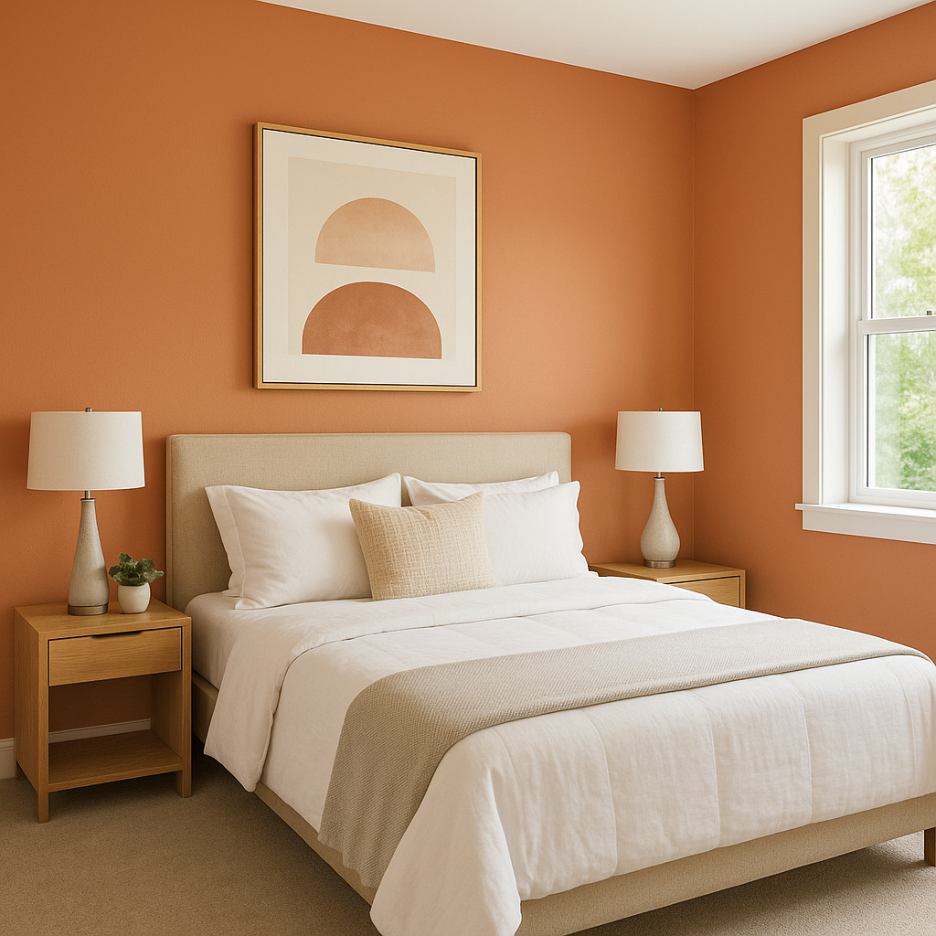
Use Persimmon on a single wall to create a vibrant focal point in living rooms, dining areas, or bedrooms. Its warmth naturally draws attention, making it an excellent choice for showcasing artwork or architectural details.
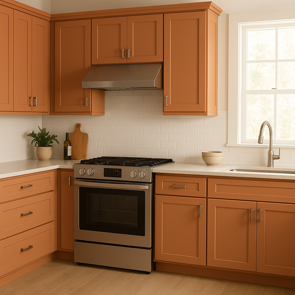
Persimmon is particularly well-suited for kitchens and dining rooms, as its warm tones can stimulate conversation and appetite. Pair it with white cabinetry or natural wood for a balanced, inviting look.
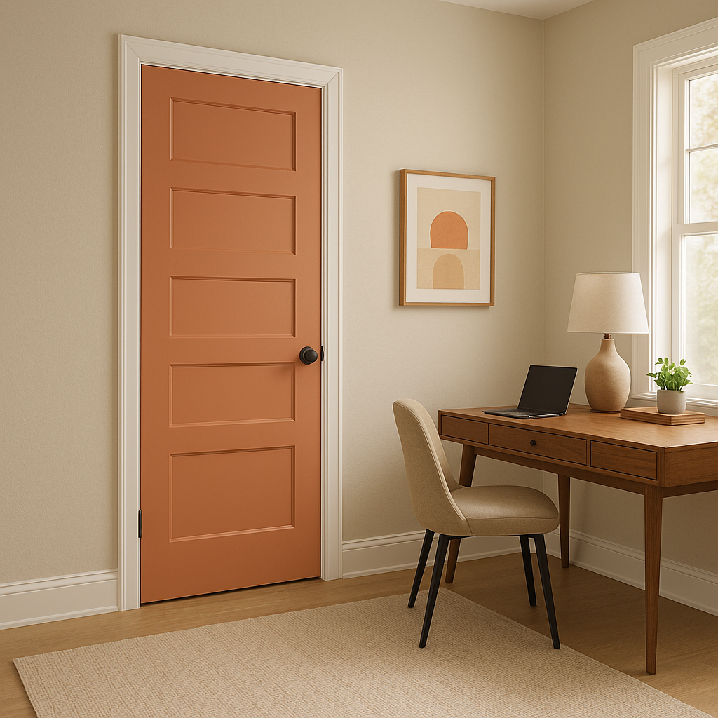
Make a lasting first impression by painting your entryway or hallway walls in Persimmon. Its bold character sets the tone for the rest of your home and creates a welcoming atmosphere.
If you’re not ready to commit to painting your walls, use Persimmon as an accent color for furniture, throw pillows, rugs, or artwork. A pop of this rich hue can elevate a neutral room and add personality without overwhelming the space.
Persimmon’s energizing qualities make it a fantastic choice for home offices, studios, or craft rooms. It inspires creativity and keeps the atmosphere lively and productive.
Keep in mind that the appearance of Persimmon can vary depending on the lighting in your space. In natural light, its orange undertones may feel brighter and more vivid, while under artificial lighting, the red notes may become more pronounced. Always test a sample in your space to see how the color interacts with your lighting conditions.
Sherwin-Williams Persimmon (SW 6339) is a bold yet versatile color that can bring life and warmth to any room. Whether used sparingly as an accent or boldly across larger surfaces, it’s a hue that commands attention while offering endless opportunities for creativity and design expression.
Note: These images were all generated with AI, there may be inaccurate color results. Please only use a general reference to get a rough idea of what a color may look like, we will continue to generate new images to improve accuracy.
View Colors Only by Brand (No Imagery):
Sherwin-Williams
|
Benjamin-Moore
|
Behr
|
Valspar
Live on the Eastern Slope of Colorado and looking for a local painting professional, check out all our painting services and reach out for a free estimate.
Copyright © 2026 : Wild Fox Painting Inc. : 12435 Mead Way, Littleton, CO 80125


