Sherwin-Williams Chrysanthemum (SW 6347) is a striking and sophisticated color that brings a bold yet refined energy to any space. With its warm, rich reddish-orange base, Chrysanthemum evokes feelings of warmth, vitality, and timeless elegance. This color is perfect for those looking to make a statement while maintaining a sense of balance and harmony in their interiors.
Chrysanthemum is a warm shade with subtle brown undertones that give it depth and complexity. These earthy undertones soften the otherwise vibrant reddish-orange hue, making it versatile and suitable for a variety of design styles. The brown undertones ensure that Chrysanthemum doesn’t feel too bright or overwhelming, allowing it to exude sophistication without losing its energy.
Sherwin-Williams Chrysanthemum pairs beautifully with neutral tones and complementary shades, offering endless possibilities for creating a cohesive and harmonious palette. Here are some coordinating colors to consider:
Using these coordinating colors allows you to experiment with layering neutrals or introducing complementary shades for a more dynamic look.
Chrysanthemum is a versatile color that works well in a variety of spaces, from residential interiors to commercial settings. Here are some ideas for incorporating this bold hue into your design:
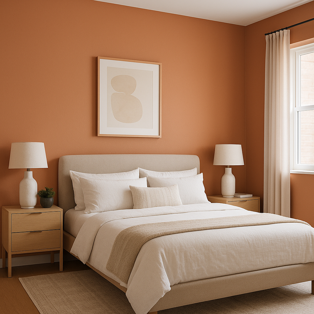
Chrysanthemum makes a stunning choice for an accent wall, adding depth and character to living rooms, dining areas, or bedrooms. Pair it with lighter neutral walls to create a balanced and impactful statement.
The warm and inviting nature of Chrysanthemum makes it ideal for dining spaces. It fosters a cozy yet elegant atmosphere, perfect for entertaining guests or enjoying family meals.
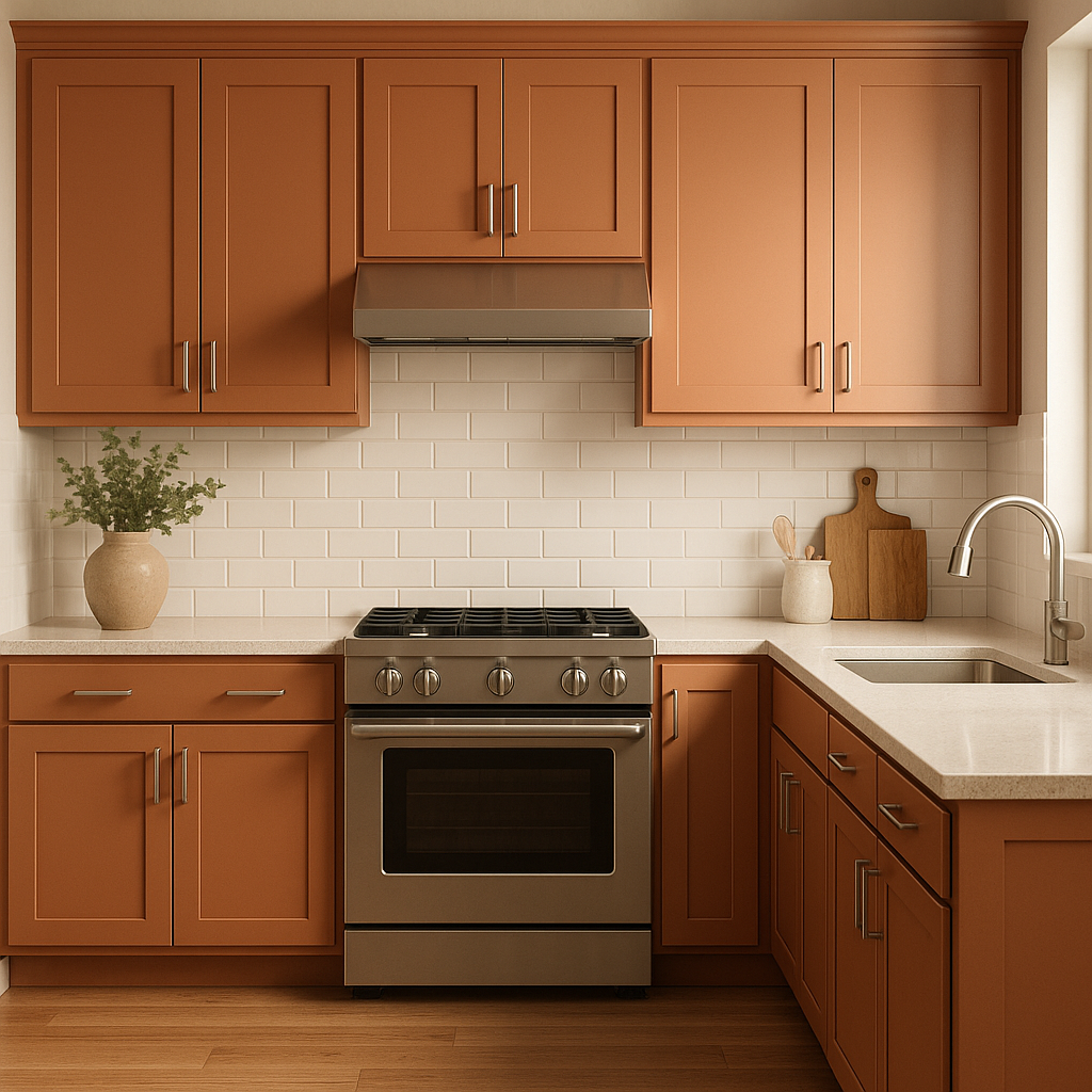
Infuse energy into your kitchen by incorporating Chrysanthemum on cabinetry or as a backsplash color. This bold hue pairs beautifully with white countertops and metallic finishes, such as brushed gold or stainless steel.
Chrysanthemum adds a refined vibrancy to living rooms, especially when paired with plush furniture and textured fabrics. Complement it with rich wood tones and neutral area rugs to create a sophisticated yet approachable ambiance.
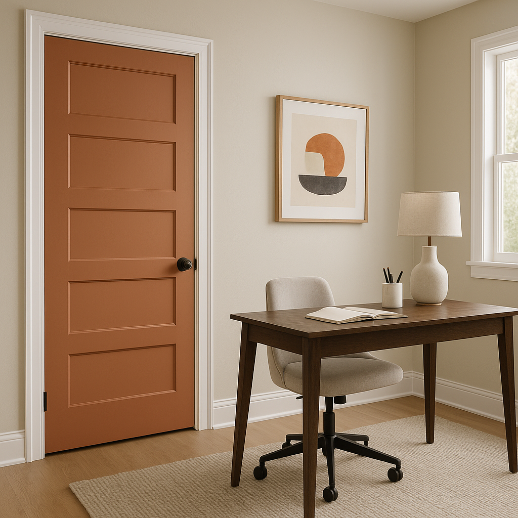
Make a memorable first impression by using Chrysanthemum in your entryway or foyer. Its boldness creates a welcoming and impactful introduction to your home’s design.
Chrysanthemum’s warm and inviting qualities make it an excellent choice for retail stores, restaurants, or offices seeking to create a welcoming yet professional atmosphere.
Sherwin-Williams Chrysanthemum (SW 6347) is more than just a paint color; it’s a design statement that brings warmth, energy, and sophistication to any space. Whether used as a bold focal point or a subtle complement, this versatile hue is sure to elevate your interior design.
Note: These images were all generated with AI, there may be inaccurate color results. Please only use a general reference to get a rough idea of what a color may look like, we will continue to generate new images to improve accuracy.
View Colors Only by Brand (No Imagery):
Sherwin-Williams
|
Benjamin-Moore
|
Behr
|
Valspar
Live on the Eastern Slope of Colorado and looking for a local painting professional, check out all our painting services and reach out for a free estimate.
Copyright © 2026 : Wild Fox Painting Inc. : 12435 Mead Way, Littleton, CO 80125


