Sherwin-Williams Pennywise (SW 6349) is a rich, earthy terracotta hue that brings warmth, charm, and sophistication to any space. With its natural, sun-kissed undertones, this color evokes feelings of comfort and timeless elegance, making it a popular choice for homeowners and designers alike. Whether you’re curating a cozy living room or aiming to create an inviting outdoor space, Pennywise’s warm personality ensures it can seamlessly transform your environment.
Pennywise boasts a harmonious blend of reddish-brown and orange undertones that give it its distinctive terracotta appearance. These undertones make it a versatile shade that can adapt beautifully to various lighting conditions. In spaces with natural light, Pennywise tends to appear brighter, showcasing its orange notes. In dimmer lighting, it leans toward a deeper, more muted reddish-brown, exuding a rustic and grounded vibe.
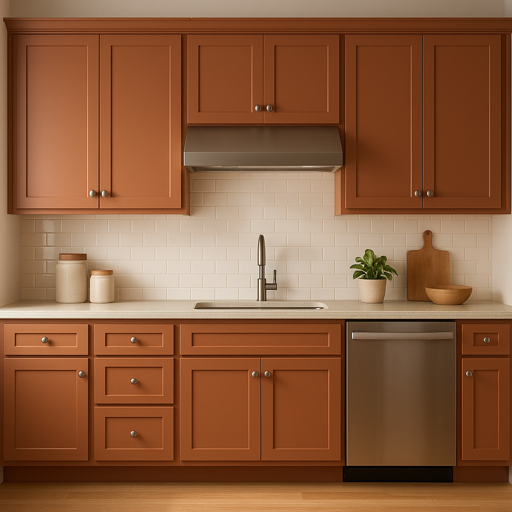
The warm undertones of Pennywise make it ideal for creating cozy and welcoming atmospheres. Its earthy nature pairs well with natural materials like wood, stone, and leather, emphasizing its organic appeal.
To maximize the beauty of Sherwin-Williams Pennywise, pairing it with complementary colors is key. This shade works beautifully with both neutral tones and bold accents:
These coordinating colors allow Pennywise to shine in a variety of palettes, from rustic farmhouse to boho chic or even modern eclectic designs.
Sherwin-Williams Pennywise is a versatile color that can be used in a range of spaces. Its warm, terracotta tones make it particularly suited for creating intimate, grounded environments. Below are some ways to incorporate this stunning shade into your home:
Pennywise excels in living rooms where warmth and comfort are paramount. Pair it with neutral furniture and rustic wood accents for a charming farmhouse aesthetic. Alternatively, combine it with bold navy or deep green accents for a more contemporary, sophisticated look.
This inviting shade creates a cozy atmosphere perfect for shared meals and celebrations. Pennywise works well with natural wood dining tables and chairs, paired with soft white or beige walls for balance.
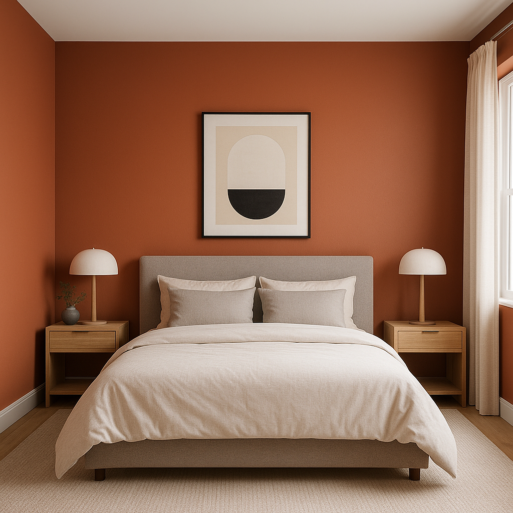
Transform your bedroom into a serene retreat with Pennywise as a feature wall color. Complement it with soft linens in muted cream or beige tones for a relaxing ambiance. Add pops of greenery for a refreshing natural touch.
Pennywise can bring an unexpected warmth to bathrooms, especially when paired with crisp whites or creamy off-whites for a clean yet inviting look. Incorporate textured tiles or matte black fixtures for a modern twist.
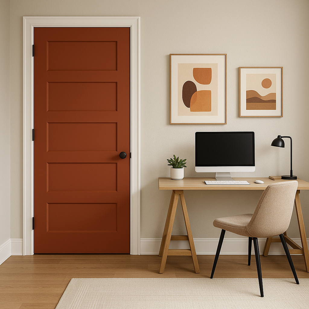
Pennywise isn’t just for interiors—it’s also a fantastic choice for exterior spaces. Use it for siding or accents like shutters and doors to create a welcoming curb appeal. Pair it with deep green landscaping and soft white trim for a timeless, earthy aesthetic.
Sherwin-Williams Pennywise (SW 6349) is an exceptional choice for anyone seeking a warm, earthy color that exudes character and charm. Its rich terracotta tones and versatile undertones make it a standout shade for transforming interiors and exteriors alike. Whether you’re aiming to create a rustic haven, a boho retreat, or a modern masterpiece, Pennywise offers endless possibilities for design.
Note: These images were all generated with AI, there may be inaccurate color results. Please only use a general reference to get a rough idea of what a color may look like, we will continue to generate new images to improve accuracy.
View Colors Only by Brand (No Imagery):
Sherwin-Williams
|
Benjamin-Moore
|
Behr
|
Valspar
Live on the Eastern Slope of Colorado and looking for a local painting professional, check out all our painting services and reach out for a free estimate.
Copyright © 2026 : Wild Fox Painting Inc. : 12435 Mead Way, Littleton, CO 80125


