Sherwin-Williams Soft Apricot (6352) is a soft, peachy hue that brings warmth, subtle energy, and an inviting ambiance to any room. This delicate shade sits comfortably between beige and blush, offering a nuanced tone that feels both sophisticated and cheerful. Its versatility makes it suitable for a wide range of interior styles, from modern minimalism to cozy traditional spaces.
Soft Apricot carries subtle orange undertones balanced with a whisper of pink, giving it a creamy and warm character. The orange base provides a sense of vitality and energy, while the pink undertones soften the hue, lending a touch of femininity and charm. This unique combination ensures that Soft Apricot feels warm and welcoming without being overpowering.
Its undertones allow the color to shift depending on lighting conditions. In natural light, it appears bright and airy, while under warm artificial lights, it takes on a richer, more intimate glow. This dynamic quality makes Soft Apricot particularly suitable for spaces where light changes throughout the day, such as living rooms, bedrooms, or kitchens.
Sherwin-Williams Soft Apricot pairs beautifully with a variety of complementary and contrasting hues. To create a cohesive and harmonious palette, consider pairing it with the following:
Neutral Coordinating Colors:
Earthy and Warm Tones:
Accent Colors:
Soft Apricot is an incredibly versatile color that can transform a variety of spaces. Its warm and welcoming nature makes it ideal for rooms where comfort and relaxation are key. Here are some ways to incorporate this hue into your home:
Soft Apricot creates a cozy backdrop for family gatherings or quiet evenings at home. Pair it with neutral furniture and natural textures, such as wood or woven accents, to create a warm and inviting space. Add pops of color through throw pillows or artwork to liven up the room.
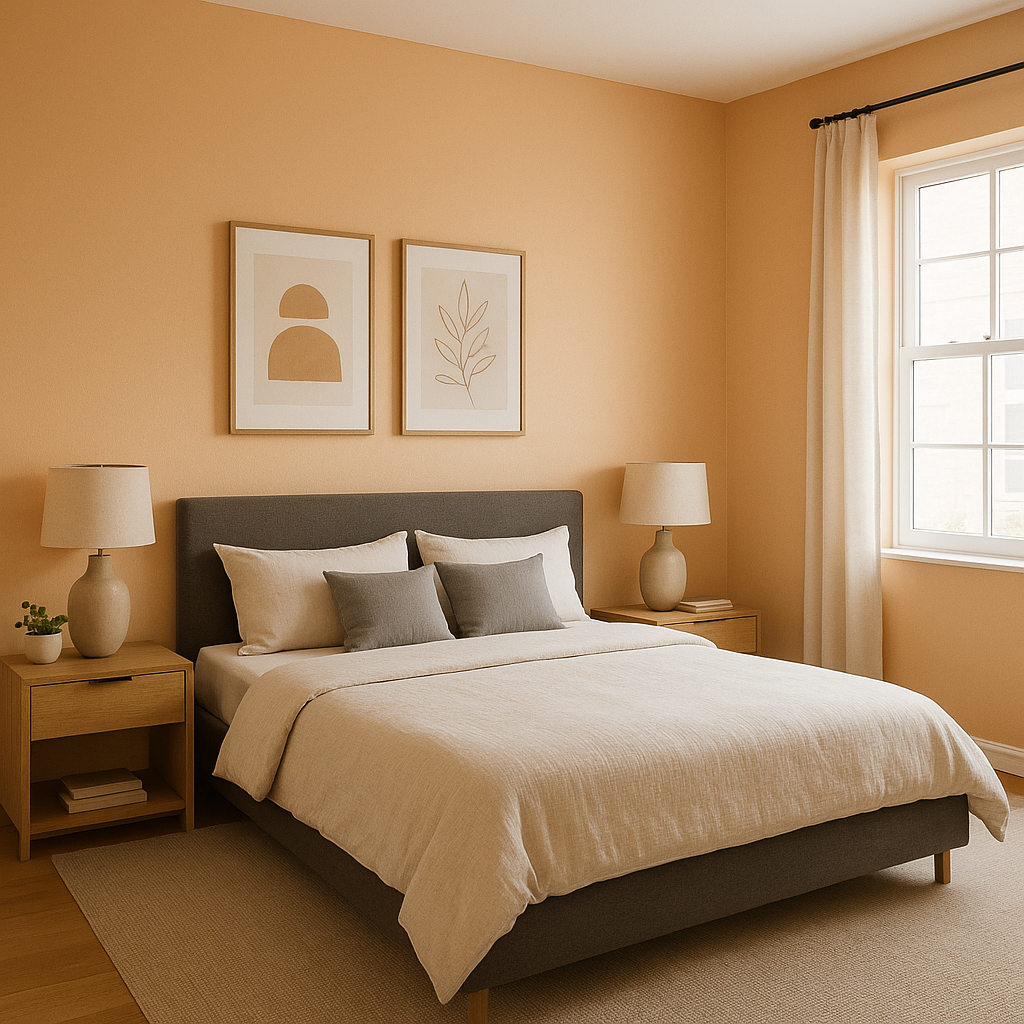
For a serene and restful bedroom, use Soft Apricot on the walls and complement it with white linens and light wood furniture. The pink undertones of this hue bring a subtle romantic touch, making it a perfect choice for master bedrooms or guest rooms.
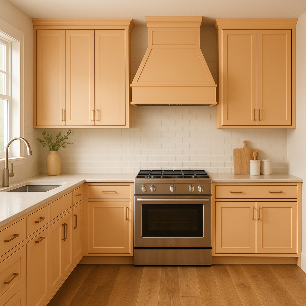
Infuse your kitchen or dining area with a sense of warmth and charm by using Soft Apricot as a wall color. Pair it with white cabinetry and brass or copper hardware for a timeless look. It also works well in breakfast nooks, where its cheerful tone can brighten up mornings.
The playful yet refined nature of Soft Apricot makes it a great choice for children’s rooms or nurseries. It feels youthful and fresh without being too bold, and its warm undertones create a comforting environment for little ones.
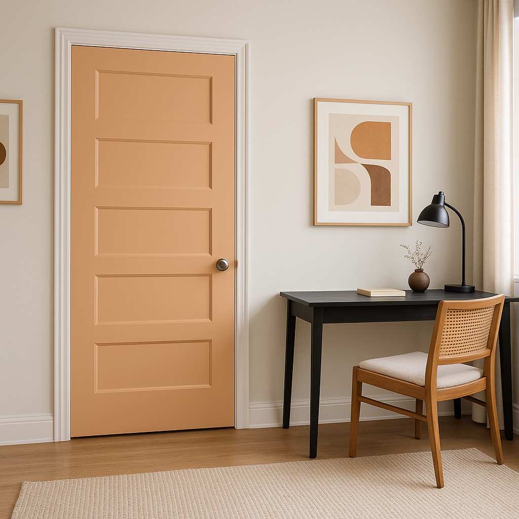
If you’re hesitant to use Soft Apricot on all four walls, consider it for an accent wall to add a splash of color and personality to your space. It also works beautifully in decorative elements, such as painted furniture, picture frames, or even kitchen backsplashes.
Sherwin-Williams Soft Apricot (6352) is a color that exudes warmth, charm, and understated elegance. Its soft peachy tones and versatile nature make it an excellent choice for any room in your home. Whether you’re creating a cozy retreat or adding a touch of vibrancy to your space, Soft Apricot’s inviting personality ensures it will elevate your interior design effortlessly.
Note: These images were all generated with AI, there may be inaccurate color results. Please only use a general reference to get a rough idea of what a color may look like, we will continue to generate new images to improve accuracy.
View Colors Only by Brand (No Imagery):
Sherwin-Williams
|
Benjamin-Moore
|
Behr
|
Valspar
Live on the Eastern Slope of Colorado and looking for a local painting professional, check out all our painting services and reach out for a free estimate.
Copyright © 2026 : Wild Fox Painting Inc. : 12435 Mead Way, Littleton, CO 80125


