Sherwin-Williams Truepenny SW 6355 is a dynamic and versatile paint color that exudes warmth, character, and timeless sophistication. This medium terracotta shade strikes a beautiful balance between earthy and refined, making it an ideal choice for a variety of interior and exterior applications. Whether you’re aiming to create a cozy living room, a stylish accent wall, or a welcoming exterior façade, Truepenny has the depth and richness to elevate your design vision.
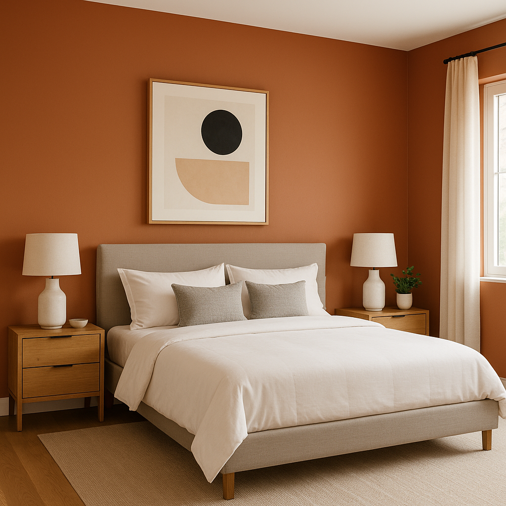
Truepenny is a warm terracotta with subtle red and orange undertones, giving it a distinct earthy quality. These undertones evoke feelings of comfort and grounding, while still maintaining an air of elegance. The reddish notes lend a touch of drama, while the orange undertones soften the hue, creating a beautifully balanced color that neither overwhelms nor fades into the background. Its muted, sun-baked feel makes it especially appealing in spaces where you want to evoke warmth and authenticity.
The undertones also ensure that Truepenny adapts well to a variety of lighting conditions. In natural light, the color takes on a soft, sunlit glow, while in artificial lighting, it deepens slightly, adding a cozy richness to the space.
Truepenny’s versatility shines when paired with the right coordinating colors. Its warm, earthy base makes it an excellent partner to a wide range of shades, allowing you to create cohesive and harmonious designs. Here are some standout pairings:
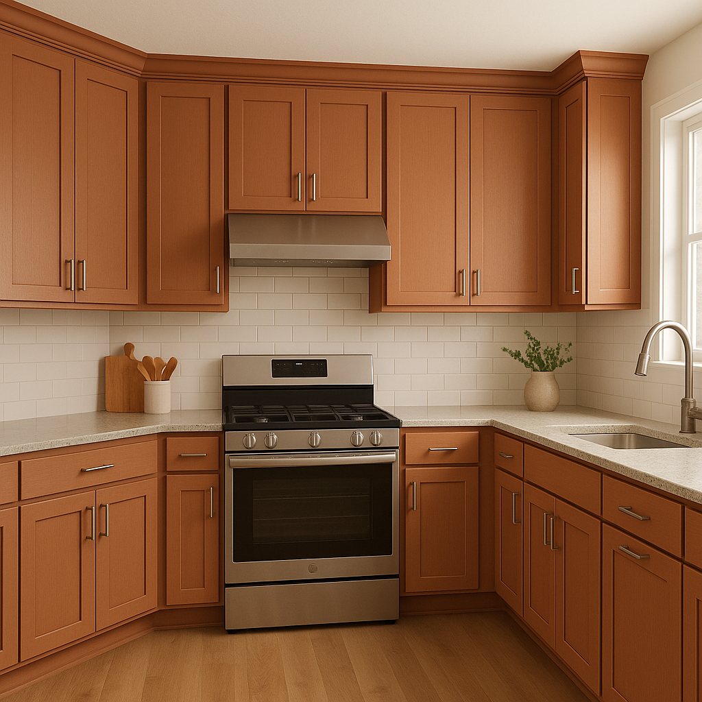
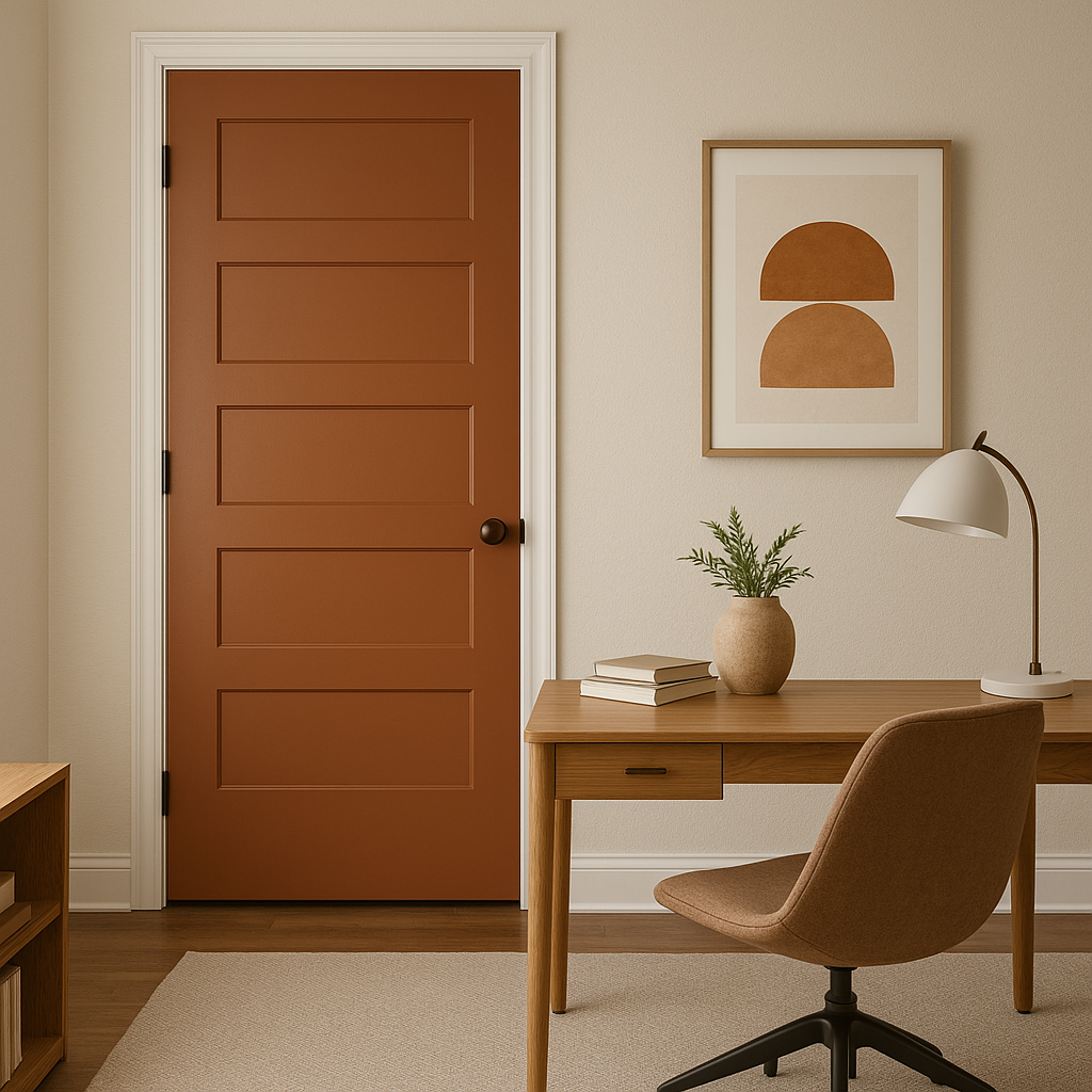
Truepenny’s rich, earthy character makes it a perfect choice for a variety of design applications. Its versatility allows it to shine in both traditional and modern settings, lending warmth, depth, and personality to any space.
Note: These images were all generated with AI, there may be inaccurate color results. Please only use a general reference to get a rough idea of what a color may look like, we will continue to generate new images to improve accuracy.
View Colors Only by Brand (No Imagery):
Sherwin-Williams
|
Benjamin-Moore
|
Behr
|
Valspar
Live on the Eastern Slope of Colorado and looking for a local painting professional, check out all our painting services and reach out for a free estimate.
Copyright © 2026 : Wild Fox Painting Inc. : 12435 Mead Way, Littleton, CO 80125


