Sherwin-Williams Creamery 6358 is a timeless, versatile shade that radiates warmth and comfort. This soft, creamy neutral is the perfect choice for creating cozy spaces that feel welcoming and serene. Its understated elegance makes it a great option for both traditional and modern interiors, effortlessly bridging the gap between classic and contemporary design trends.
Creamery 6358 features subtle yellow undertones, which lend it a warm, sunny disposition without veering into overly saturated or bright territory. These golden undertones are balanced with a hint of beige, giving the color depth and sophistication. The result is a hue that feels light and airy but with enough warmth to create an inviting atmosphere. Its undertones make it especially appealing for spaces where you want to evoke a sense of relaxation and comfort.
One of the most appealing aspects of Creamery 6358 is its versatility when paired with other colors. Whether you're designing a monochromatic palette or introducing bold accents, this creamy neutral can adapt to a variety of schemes. Here are some coordinating colors to consider:
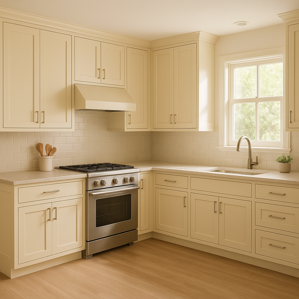
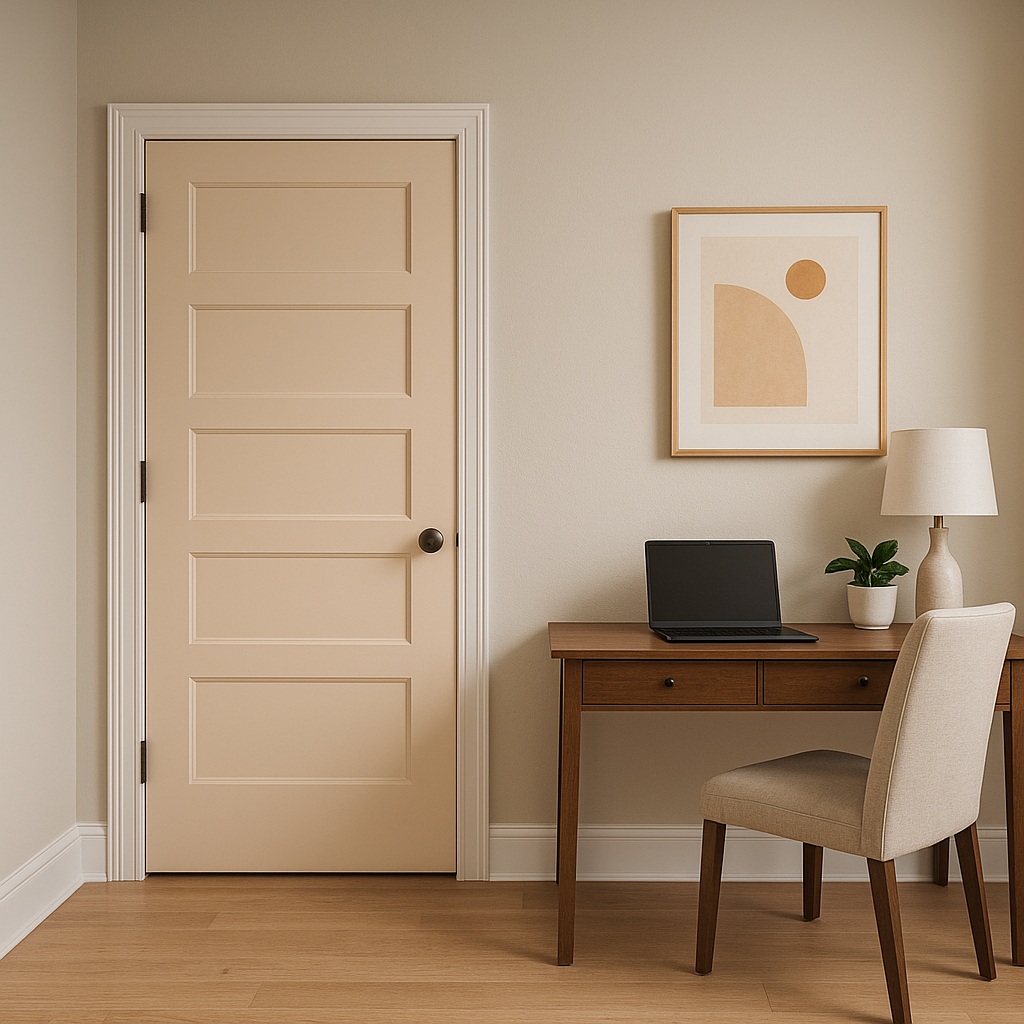
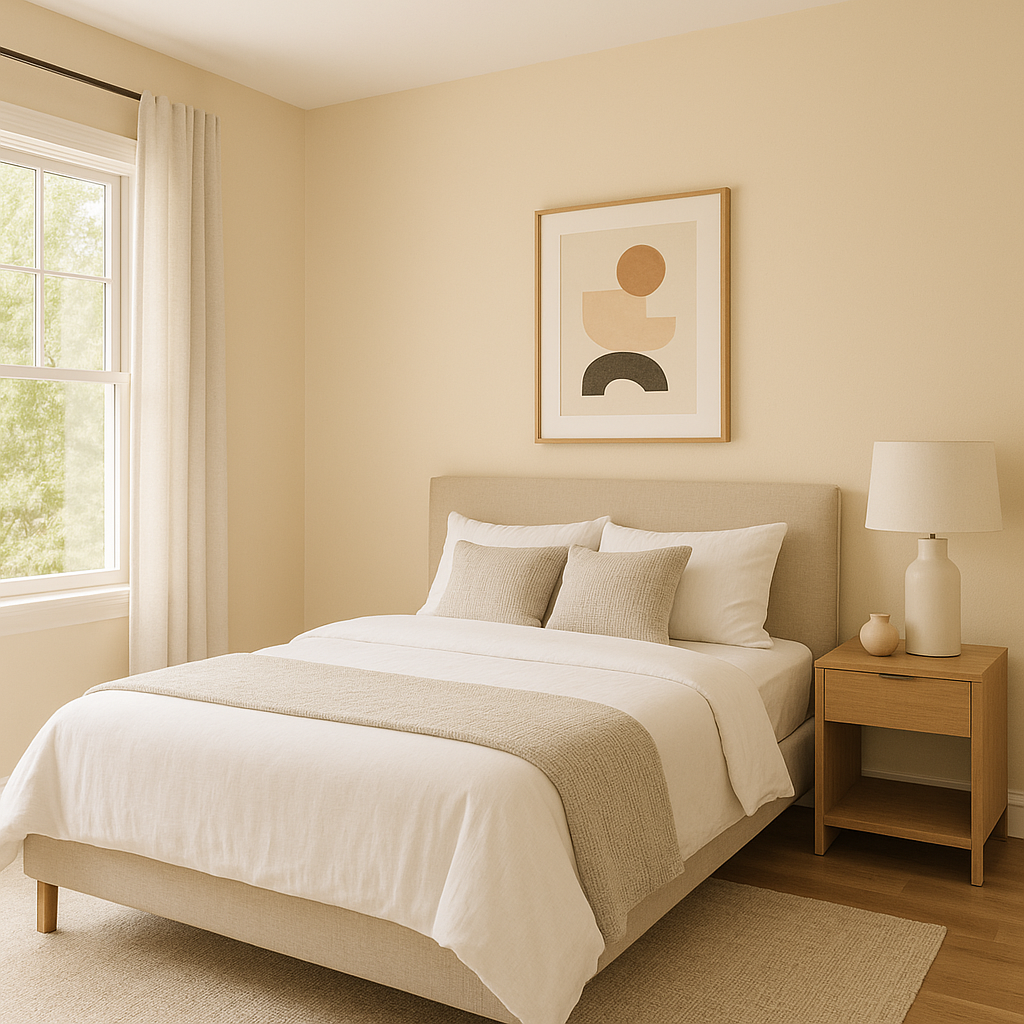
Creamery 6358 is a highly versatile neutral that can be used in virtually any room of the home. Its warm, inviting tone makes it particularly well-suited for spaces where you want to encourage relaxation and conversation. Here are some ideas:
As with any paint color, lighting plays a significant role in how Sherwin-Williams Creamery 6358 will appear in your space. In rooms with ample natural light, the warm undertones will feel more pronounced, enhancing the color's creamy richness.
Note: These images were all generated with AI, there may be inaccurate color results. Please only use a general reference to get a rough idea of what a color may look like, we will continue to generate new images to improve accuracy.
View Colors Only by Brand (No Imagery):
Sherwin-Williams
|
Benjamin-Moore
|
Behr
|
Valspar
Live on the Eastern Slope of Colorado and looking for a local painting professional, check out all our painting services and reach out for a free estimate.
Copyright © 2026 : Wild Fox Painting Inc. : 12435 Mead Way, Littleton, CO 80125


