Sherwin-Williams Vanillin (6371) is a beautifully soft and creamy neutral paint color that exudes warmth and sophistication. Its delicate blend of undertones and adaptability makes it an excellent choice for a wide range of interior design styles, from traditional to modern and everything in between. Whether you're refreshing a single space or coordinating an entire home palette, Vanillin offers a timeless backdrop that complements a variety of aesthetics.
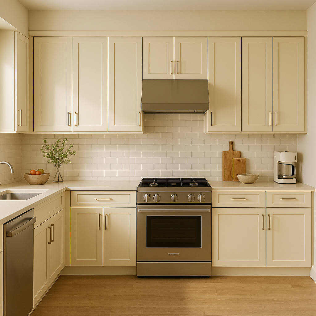
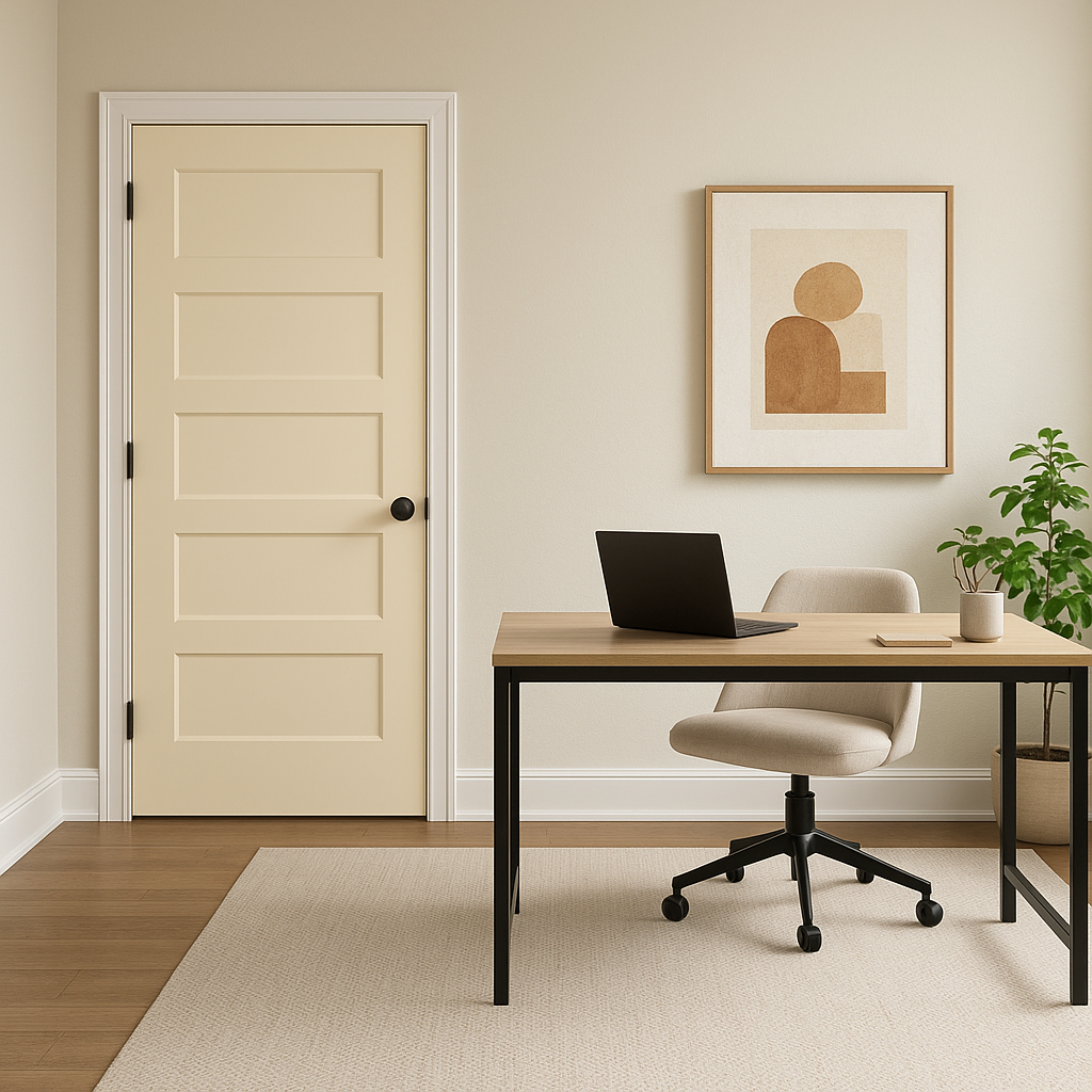
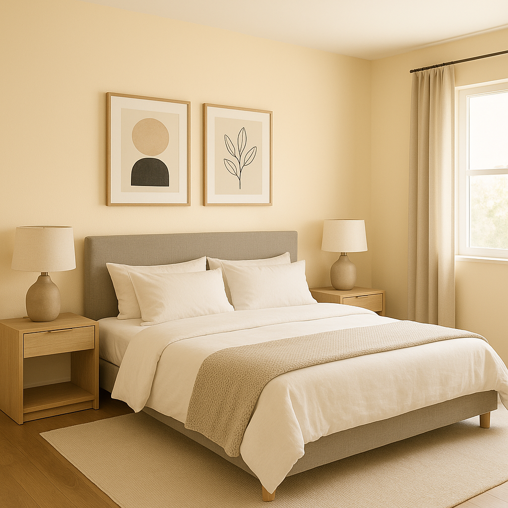
Vanillin is a light beige with subtle yellow undertones, creating a cozy and inviting atmosphere. The touch of warmth prevents it from feeling stark or sterile, yet it maintains enough neutrality to work effortlessly in many spaces. Its creamy, buttery hue evokes feelings of comfort, making it ideal for rooms where relaxation and softness are key.
While the yellow undertones are noticeable, they are not overpowering, allowing Vanillin to remain versatile and adaptable. It pairs beautifully with other warm tones, but it also works well alongside cooler shades, creating a balanced and harmonious look in any space.
Sherwin-Williams Vanillin shines brightest when paired with complementary colors that enhance its warmth and softness. Here are a few coordinating color suggestions to inspire your design:
With its versatility, Vanillin also coordinates well with natural wood tones and metal finishes like brushed brass, polished chrome, and matte black, offering endless design possibilities.
Sherwin-Williams Vanillin is a go-to choice for spaces that need a gentle, welcoming vibe. Its understated elegance makes it suitable for a variety of applications:
Sherwin-Williams Vanillin responds beautifully to different lighting conditions. In spaces with abundant natural light, the yellow undertones become more pronounced, giving the room a sunny and cheerful feel. In areas with limited light or artificial lighting, Vanillin leans slightly more beige, maintaining its soft warmth without feeling overly bright.
Sherwin-Williams Vanillin is more than just a paint color; it’s a versatile design element that brings balance, warmth, and timeless beauty to your home. Its ability to coordinate well with other shades, along with its welcoming undertones, makes it a perfect choice for homeowners seeking a neutral paint color that’s both elegant and approachable. Whether used as the main wall color or as part of a layered palette, Vanillin is sure to elevate your interiors with its charm and adaptability.
Note: These images were all generated with AI, there may be inaccurate color results. Please only use a general reference to get a rough idea of what a color may look like, we will continue to generate new images to improve accuracy.
View Colors Only by Brand (No Imagery):
Sherwin-Williams
|
Benjamin-Moore
|
Behr
|
Valspar
Live on the Eastern Slope of Colorado and looking for a local painting professional, check out all our painting services and reach out for a free estimate.
Copyright © 2026 : Wild Fox Painting Inc. : 12435 Mead Way, Littleton, CO 80125


