Sherwin-Williams Butterscotch (SW 6377) is a rich, golden hue that exudes warmth and a sense of comfort. With its deep caramel undertones, this color can transform any space into a cozy retreat. Perfect for interiors that aim to radiate sophistication with a touch of nostalgia, Butterscotch strikes a balance between boldness and subtlety, making it an exceptional choice for a variety of design styles.
The secret to Butterscotch’s charm lies in its earthy undertones. This golden shade carries hints of caramel and amber, giving it a slightly muted yet warm appearance. These undertones ensure that the color feels grounded and inviting rather than overly vibrant or saturated. The subtle brown notes within Butterscotch add depth, making it versatile for pairing with other colors while avoiding an overpowering effect.
Sherwin-Williams Butterscotch pairs beautifully with complementary tones that enhance its richness and warmth. Here are a few suggestions for coordinating colors:
Neutral Pairings:
For a balanced and understated look, pair Butterscotch with soft beiges, warm whites, or creamy tones like Sherwin-Williams Alabaster (SW 7008) or Sherwin-Williams Natural Linen (SW 9109). These hues create an elegant, cohesive palette that feels tranquil and timeless.
Cool Contrasts:
To create contrast and balance, opt for cooler shades like Sherwin-Williams Rainwashed (SW 6211) or Sherwin-Williams Sea Salt (SW 6204). These muted greens and blues bring out the warmth of Butterscotch while adding freshness to the overall design.
Bold Accents:
If you're looking to add drama, deep jewel tones like Sherwin-Williams Naval (SW 6244) or Sherwin-Williams Tricorn Black (SW 6258) work wonderfully as accent colors. These darker hues amplify Butterscotch’s golden vibrancy, making it pop without overwhelming the space.
Earthy Complements:
For a harmonious, nature-inspired palette, pair Butterscotch with terracotta shades like Sherwin-Williams Cavern Clay (SW 7701) or olive greens such as Sherwin-Williams Ripe Olive (SW 6209). These combinations create a grounded and organic aesthetic.
Butterscotch is a versatile color that can be used in various settings to evoke warmth and sophistication. Here are some ideas for incorporating this hue into your interior design:
Living Rooms:
Infuse your living space with coziness by using Butterscotch on walls or as an accent color. Pair it with neutral furniture and metallic accessories like brass or gold to bring out its luxurious undertones.
Dining Areas:
This golden hue is perfect for dining spaces, as it creates a welcoming and appetizing atmosphere. Combine Butterscotch with rustic wooden furniture and earthy textures for a farmhouse-inspired look, or pair it with modern minimalist pieces for a more contemporary vibe.
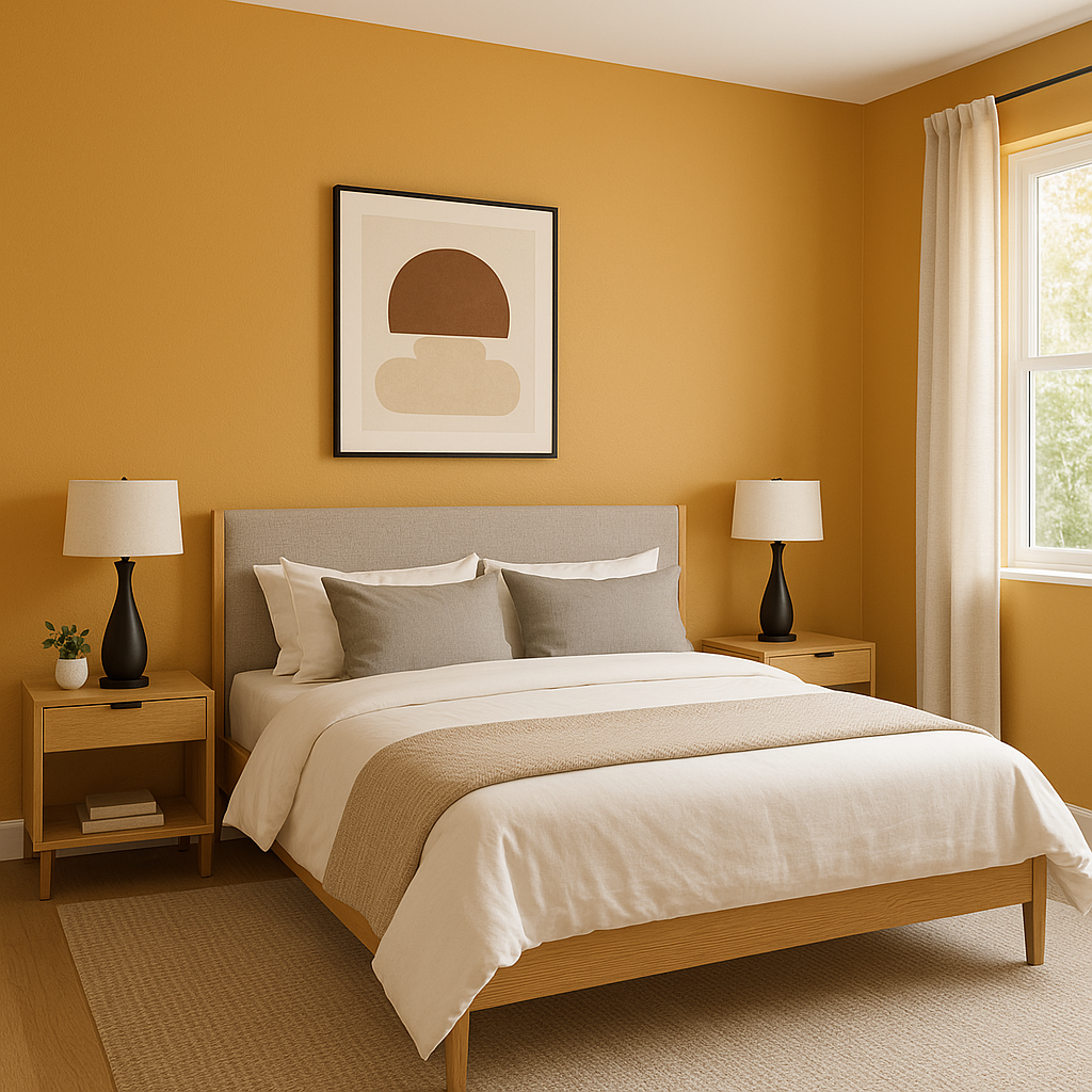
Bedrooms:
In bedrooms, Butterscotch can be used to create a serene and comforting retreat. Use it as an accent wall behind the bed or incorporate it through textiles, such as throw pillows and curtains, to add warmth without overwhelming the space.
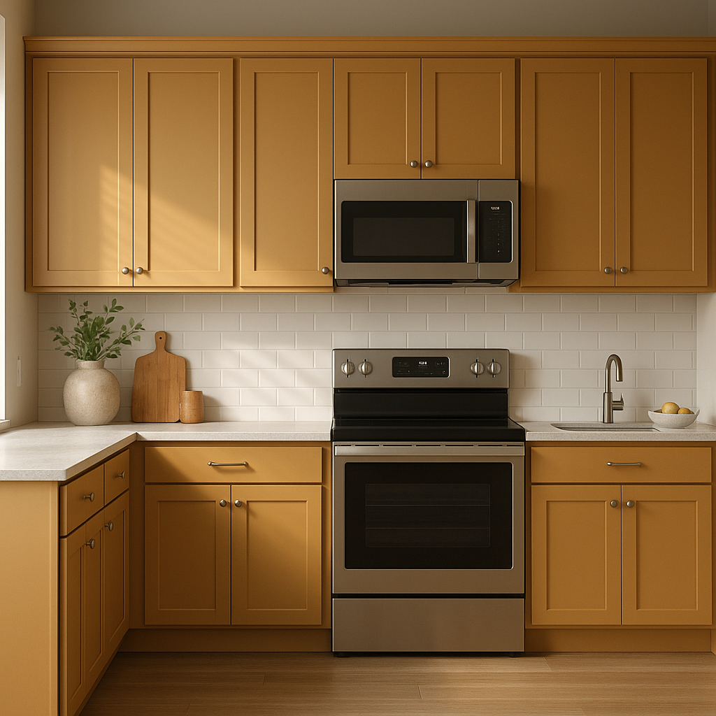
Kitchens:
Butterscotch works beautifully in kitchens, especially when paired with white cabinetry or natural wood finishes. It can add an inviting glow to the space, making it feel both stylish and functional.
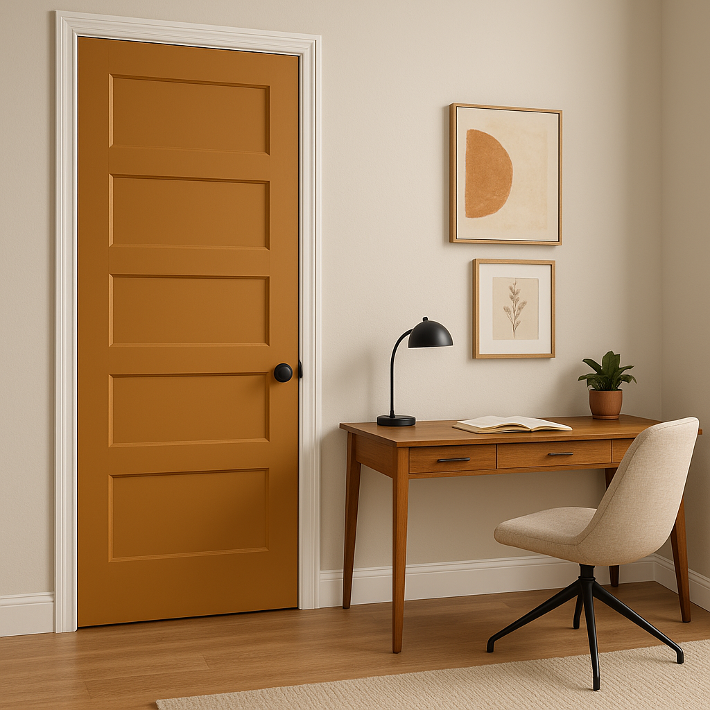
Entryways:
Welcome guests into your home with the warmth of Butterscotch. As an entryway color, it sets a friendly and inviting tone. Pair it with darker trims for a dramatic contrast or lighter tones for a softer look.
The appearance of Sherwin-Williams Butterscotch can vary depending on the lighting in the space. In natural light, its golden tones are more pronounced, creating a vibrant and cheerful ambiance. In dimmer, artificial lighting, the caramel undertones become more dominant, lending a cozier and more intimate vibe. To get the best effect, test the color in different lighting conditions before committing.
Sherwin-Williams Butterscotch (SW 6377) is more than just a paint color—it’s a statement of warmth, elegance, and timeless appeal. Whether you’re creating a rustic haven, a modern retreat, or a transitional masterpiece, this rich hue has the versatility to bring your vision to life.
Note: These images were all generated with AI, there may be inaccurate color results. Please only use a general reference to get a rough idea of what a color may look like, we will continue to generate new images to improve accuracy.
View Colors Only by Brand (No Imagery):
Sherwin-Williams
|
Benjamin-Moore
|
Behr
|
Valspar
Live on the Eastern Slope of Colorado and looking for a local painting professional, check out all our painting services and reach out for a free estimate.
Copyright © 2026 : Wild Fox Painting Inc. : 12435 Mead Way, Littleton, CO 80125


