Sherwin-Williams Butternut (6389) is a rich, golden-brown paint color that exudes warmth and sophistication. Its earthy undertones create a welcoming ambiance, making it a versatile choice for both residential and commercial spaces. This color strikes the perfect balance between boldness and subtlety, offering a natural aesthetic that works well in various design styles, from rustic farmhouse to upscale traditional.
Butternut is characterized by warm, golden undertones that bring a sense of coziness and comfort to any room. Its brown base has hints of amber and muted yellow, which give it a natural glow without overpowering the space. These undertones make it an excellent choice for rooms that need a touch of warmth or a grounding element in the overall design. Its earthy qualities make it especially suitable for autumn-inspired palettes or spaces that aim to connect with nature.
When designing with Sherwin-Williams Butternut, it’s essential to pair it with complementary hues to create a harmonious color scheme. Here are some recommended coordinating colors:
Sherwin-Williams Butternut is a versatile color that can be used in different ways throughout your home or business. Its warm and grounding presence makes it ideal for spaces that require a sense of comfort and connection. Here are some ideas for incorporating Butternut into your interiors:
Create a cozy and inviting atmosphere in your living room by using Butternut on the walls. Pair it with cream-colored furniture, natural wood accents, and textured fabrics like linen or wool to emphasize its earthy tones. Add pops of green or black for visual interest and balance.
Butternut works beautifully in dining rooms, where it can evoke a sense of warmth and intimacy. Use it as an accent wall behind the dining table or as the main wall color, complemented by rustic wooden furniture and metallic finishes in gold or bronze.
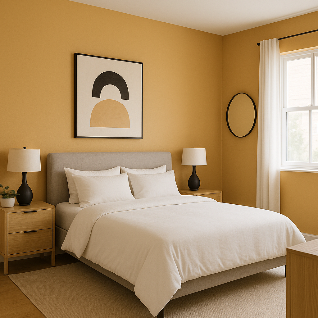
In bedrooms, Butternut creates a calming and serene environment while maintaining a sense of luxury. Pair it with soft white bedding, a plush area rug, and natural wood tones to create a restful retreat.
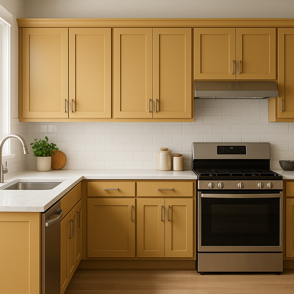
For kitchens, Butternut lends itself well to cabinet finishes or as a feature wall. It pairs wonderfully with white quartz countertops, brass hardware, and ceramic tile backsplashes for a sophisticated yet approachable look.
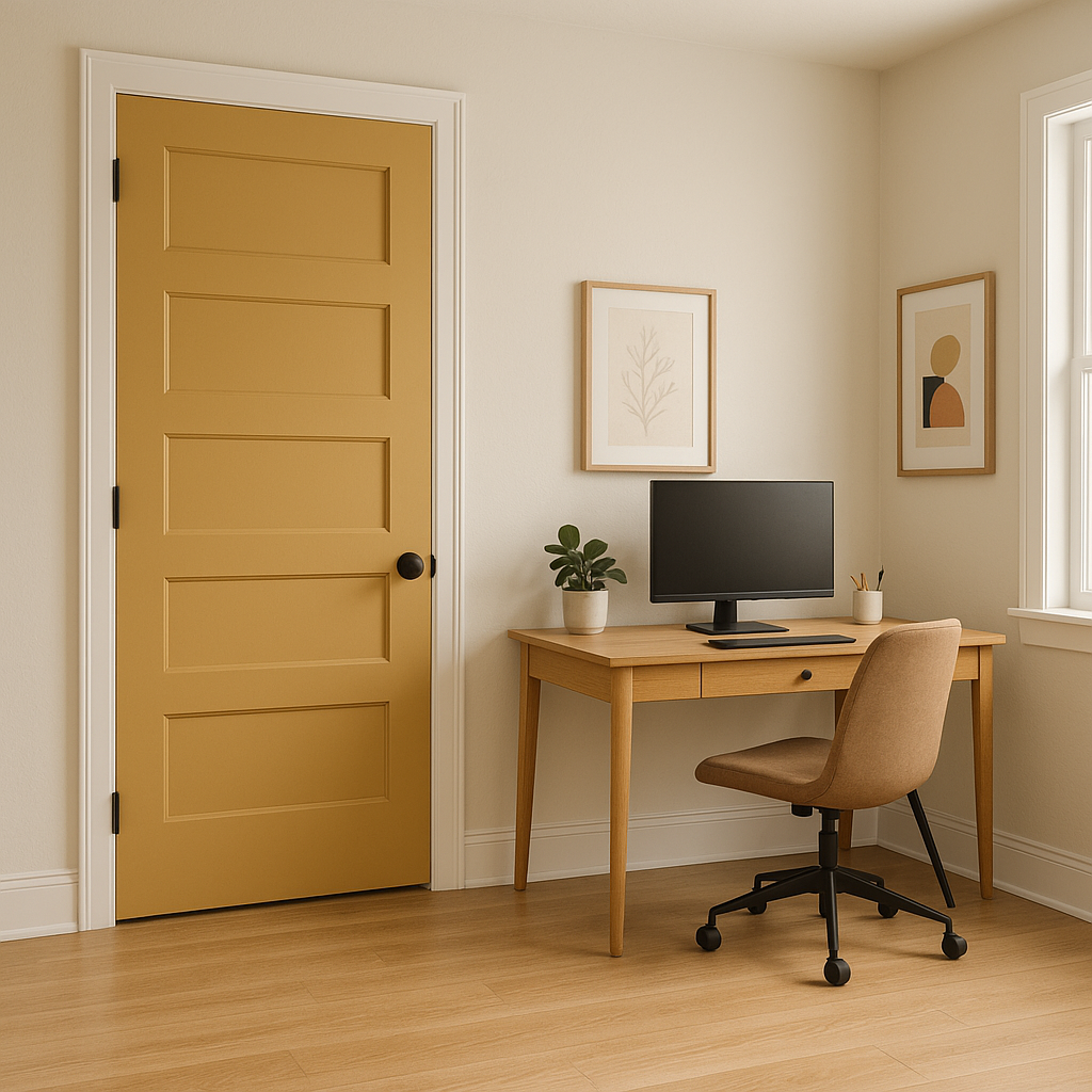
Use Butternut as an accent color in spaces like entryways, staircases, or home offices. Its bold yet inviting nature makes it a standout choice for creating visual interest without overwhelming the space.
Sherwin-Williams Butternut (6389) is more than just a paint color; it’s a design tool that can transform interiors into warm, elegant, and timeless spaces. Its versatility makes it suitable for a wide range of applications, whether used as the main color or as part of a carefully curated palette. By pairing it with complementary hues and textures, you can achieve a look that feels both grounded and sophisticated.
Whether you’re redesigning a cozy family room or elevating a dining space, Sherwin-Williams Butternut offers a golden-brown hue that’s sure to leave a lasting impression.
Note: These images were all generated with AI, there may be inaccurate color results. Please only use a general reference to get a rough idea of what a color may look like, we will continue to generate new images to improve accuracy.
View Colors Only by Brand (No Imagery):
Sherwin-Williams
|
Benjamin-Moore
|
Behr
|
Valspar
Live on the Eastern Slope of Colorado and looking for a local painting professional, check out all our painting services and reach out for a free estimate.
Copyright © 2026 : Wild Fox Painting Inc. : 12435 Mead Way, Littleton, CO 80125


