Sherwin-Williams Different Gold (SW 6396) is a bold and radiant color that infuses spaces with warmth, energy, and an undeniable touch of luxury. Its vibrant golden hue is versatile enough to make a statement while maintaining a timeless appeal, making it a favorite choice for designers seeking to create interiors that feel inviting and refined. Whether used as a primary wall color or as an accent, Different Gold adds a sense of richness and personality to any room.
Different Gold is characterized by its warm undertones, which lean toward a deep yellow with hints of soft amber and ochre. These earthy undertones give the color depth and prevent it from feeling overly bright or harsh. The result is a golden hue that feels grounded and sophisticated, with a subtle glow that changes depending on lighting conditions. In natural light, the color appears livelier, while in softer artificial lighting, it exudes a cozy, golden warmth that transforms the mood of the space.
When working with Sherwin-Williams Different Gold, choosing coordinating colors is key to creating a harmonious and balanced space. Here are some suggestions to complement and enhance this stunning hue:
Neutrals: Pair Different Gold with soft neutrals like Sherwin-Williams Alabaster (SW 7008) or Creamy (SW 7012). These light, creamy tones offer contrast while keeping the overall aesthetic warm and airy.
Earthy Greens: Consider muted greens like Sherwin-Williams Courtyard (SW 6440) or Filmy Green (SW 6190). These natural hues bring out the richness of Different Gold and create a serene, organic vibe.
Deep Browns and Charcoals: For a sophisticated look, pair Different Gold with darker shades such as Sherwin-Williams Black Fox (SW 7020) or Turkish Coffee (SW 6076). These dramatic tones create depth and make the gold pop beautifully.
Accents: For energetic accents, try Sherwin-Williams Heartthrob (SW 6866), a bold red, or Naval (SW 6244), a deep navy blue. These colors provide striking contrast and can be used sparingly to create focal points.
Different Gold is a versatile color that works in a variety of design styles and spaces. Here are some creative ways to use it effectively:
Living Rooms: Create a warm and inviting atmosphere by using Different Gold on the walls. Pair it with neutral furniture and accessories for a cozy yet elegant look.
Dining Rooms: This rich golden hue is ideal for dining spaces, as it adds a sense of refinement and enhances the mood for gatherings. Pair it with dark wood finishes and metallic accents for a luxurious feel.
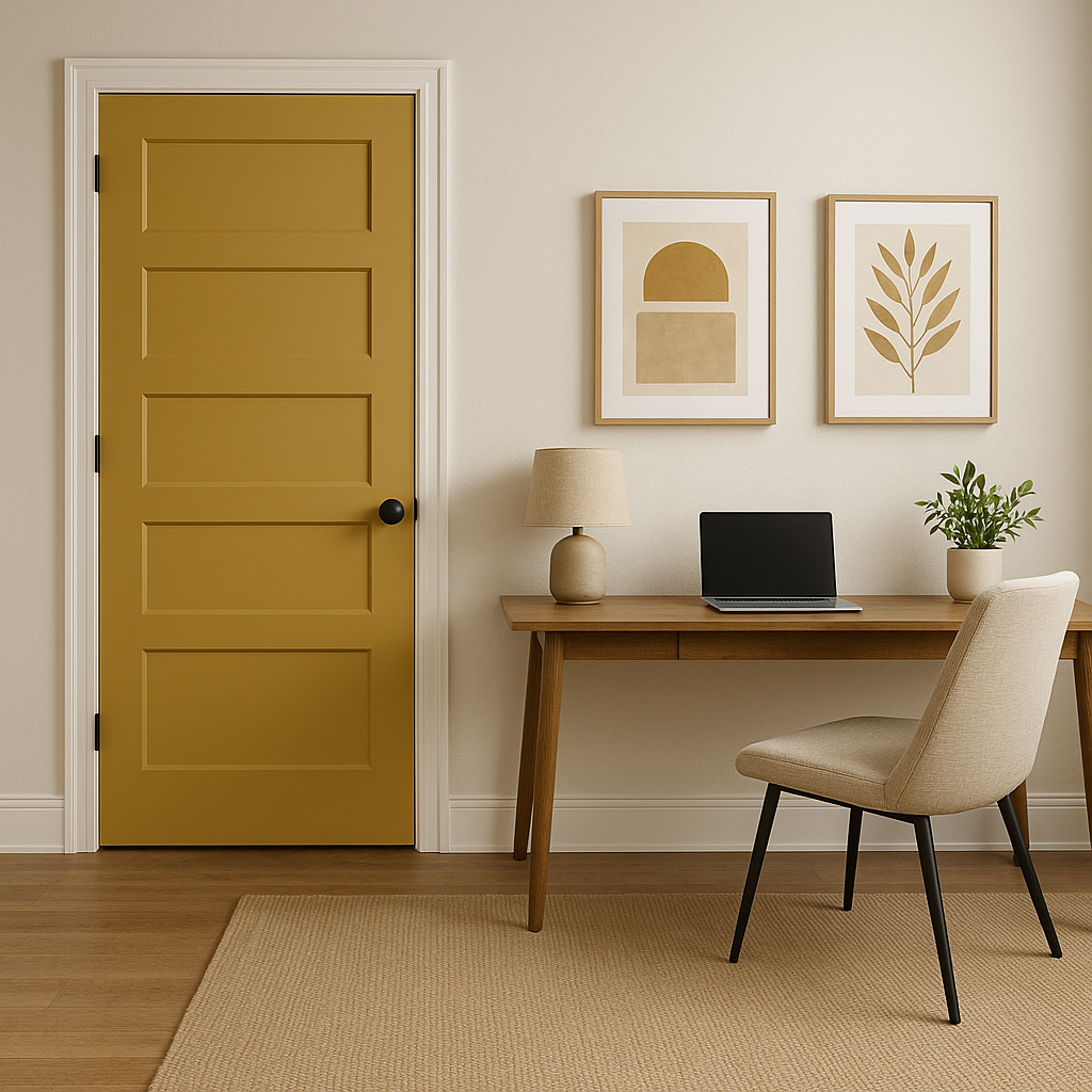
Accent Walls: If you’re not ready to commit to an entire room, use Different Gold as an accent wall color. It can serve as a stunning backdrop for artwork, mirrors, or shelving.
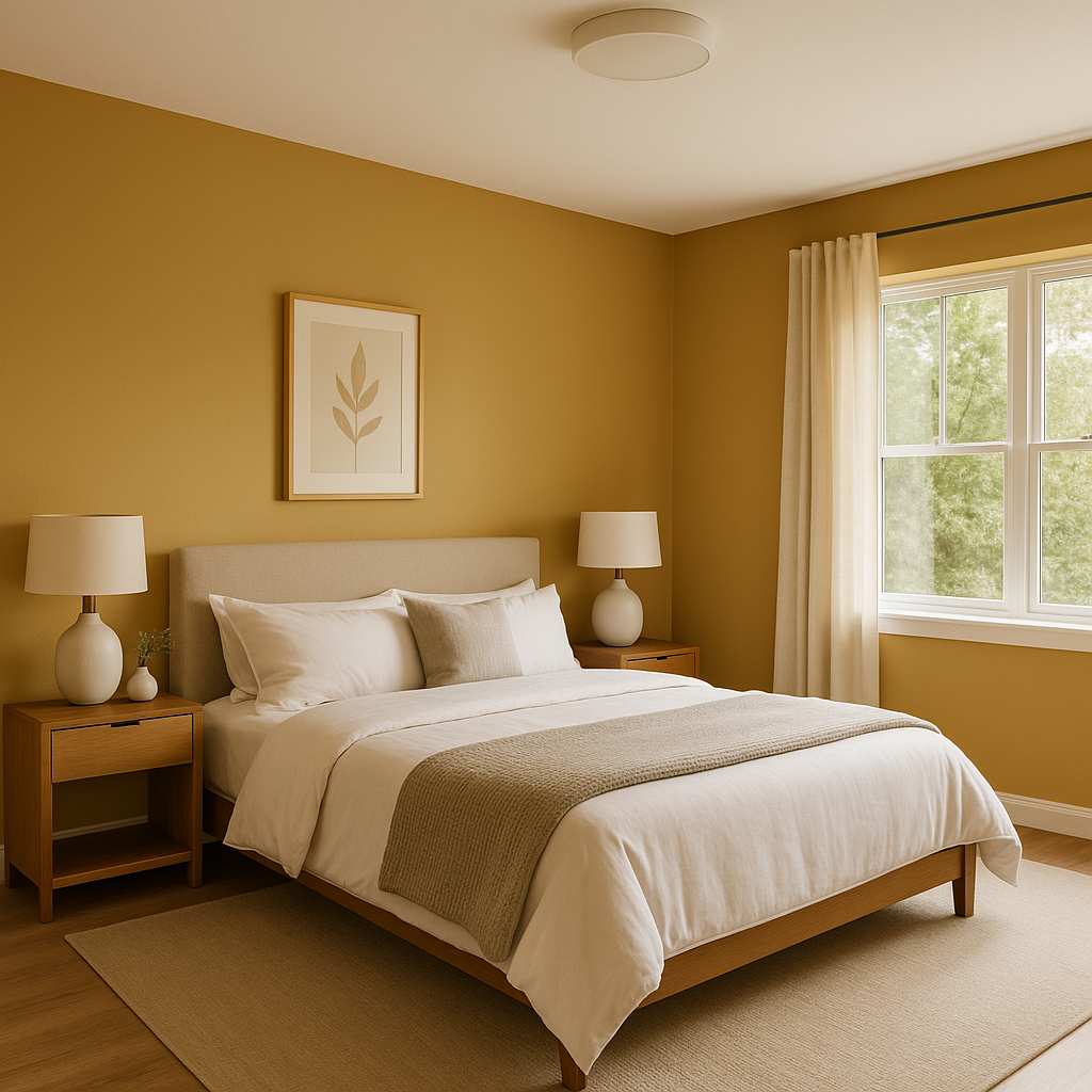
Bedrooms: For a bedroom that feels both relaxing and regal, use Different Gold on the walls, complemented by soft white bedding and natural wood furniture.
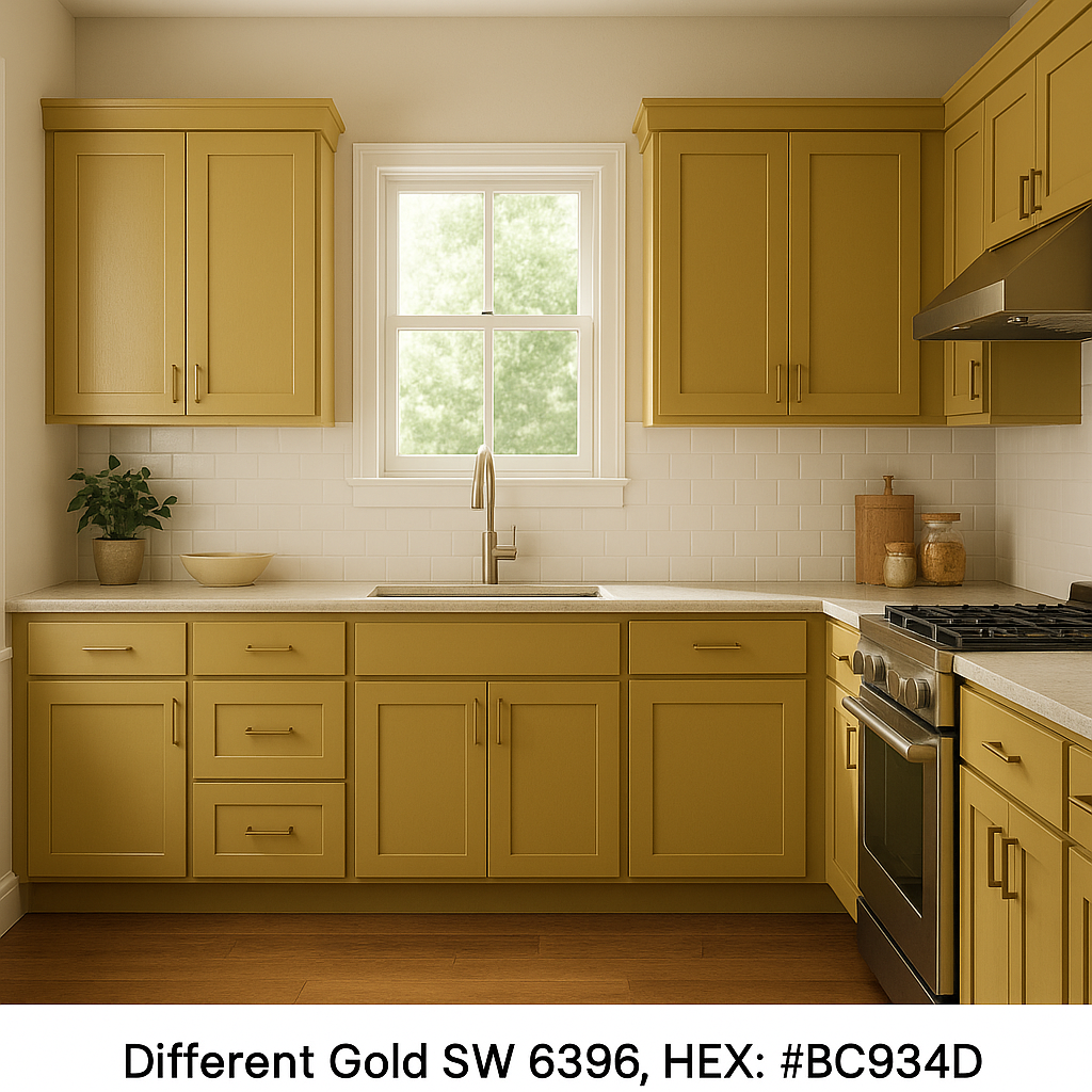
Kitchens and Bathrooms: Add a touch of warmth to kitchens and bathrooms by incorporating Different Gold into cabinetry, backsplash tiles, or accent areas. It pairs beautifully with white marble or quartz countertops.
Commercial Spaces: Different Gold is also a popular choice for restaurants, cafes, and boutique shops. Its welcoming tone creates an inviting atmosphere that encourages guests to linger.
This color adapts seamlessly to a variety of interior design styles:
Lighting plays a crucial role in how Sherwin-Williams Different Gold appears in your space. In rooms with ample natural light, the color will feel bright and cheerful, while in darker spaces or under warm artificial lighting, its amber undertones will take center stage, creating a more subdued and intimate feeling.
Sherwin-Williams Different Gold (SW 6396) is a versatile and striking color that can transform any space into a warm, welcoming haven. With its rich undertones, coordinating color options, and adaptability to various design styles, it’s a perfect choice for adding personality and sophistication to your interiors.
Note: These images were all generated with AI, there may be inaccurate color results. Please only use a general reference to get a rough idea of what a color may look like, we will continue to generate new images to improve accuracy.
View Colors Only by Brand (No Imagery):
Sherwin-Williams
|
Benjamin-Moore
|
Behr
|
Valspar
Live on the Eastern Slope of Colorado and looking for a local painting professional, check out all our painting services and reach out for a free estimate.
Copyright © 2026 : Wild Fox Painting Inc. : 12435 Mead Way, Littleton, CO 80125


