Sherwin-Williams Chamomile (SW 6399) is a soothing, golden-yellow paint color that exudes warmth, comfort, and subtle elegance. Reminiscent of the gentle glow of a sunlit field, Chamomile offers a soft, muted tone that feels both cheerful and calming. Its balanced nature makes it incredibly versatile, perfect for creating welcoming spaces that feel grounded yet sophisticated.
Chamomile features warm, golden undertones with hints of beige, giving it an earthy softness while maintaining its sunny disposition. Unlike brighter yellows that can feel overwhelming, Chamomile offers a muted warmth that avoids harshness. Its slight beige undertones stabilize the color, ensuring it doesn’t lean too bold or too pastel. This makes Chamomile an excellent choice for homeowners seeking a color that bridges the gap between brightness and subtlety.
Sherwin-Williams Chamomile pairs beautifully with both complementary and contrasting colors, allowing you to tailor its use to a variety of design styles.
Neutral Partners:
For a serene, grounded palette, pair Chamomile with soft neutrals like Sherwin-Williams Alabaster (SW 7008) or Accessible Beige (SW 7036). These colors create an understated combination that enhances Chamomile’s natural warmth while maintaining a balanced, airy vibe.
Earthy Greens:
Chamomile also harmonizes effortlessly with nature-inspired greens like Clary Sage (SW 6178) or Privilege Green (SW 6193). These pairings evoke a rustic tranquility, perfect for accenting transitional or farmhouse-style interiors.
Rich Browns and Tans:
To add depth and richness, consider Cavern Clay (SW 7701) or Tony Taupe (SW 7038). These darker hues complement Chamomile’s golden undertones, creating a cozy, inviting atmosphere ideal for living rooms or dining spaces.
Playful Pops of Blue:
For a more modern, eclectic feel, contrast Chamomile with a bold blue such as Naval (SW 6244) or Honorable Blue (SW 6811). The coolness of blue offsets Chamomile’s warm glow, adding visual interest and energy to the room.
Chamomile’s versatility makes it suitable for a wide range of spaces, from cozy family rooms to airy kitchens. Its warm undertones create a welcoming ambiance that’s perfect for spaces where comfort and connection are priority.
Living Rooms and Family Spaces:
Chamomile is an excellent choice for gathering areas like living rooms or family rooms. Its uplifting yet understated tone fosters relaxation and conversation, especially when paired with plush fabrics and natural textures.
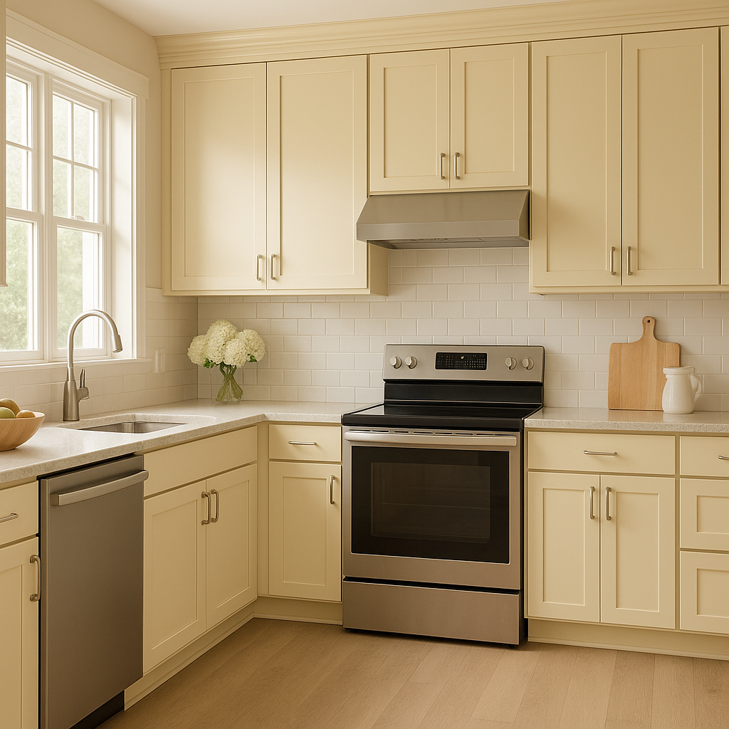
Kitchens and Dining Rooms:
Bring a touch of sunshine into your kitchen or dining area with Chamomile. This color works especially well with wood tones, creating an inviting environment that feels fresh and timeless.
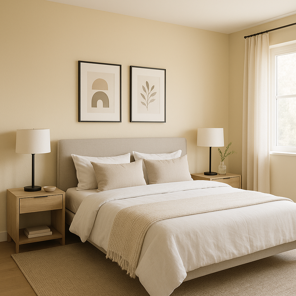
Bedrooms:
For a restful retreat, use Chamomile in bedrooms alongside soft whites and muted greens. Its calming qualities help create a space that feels serene and nurturing.
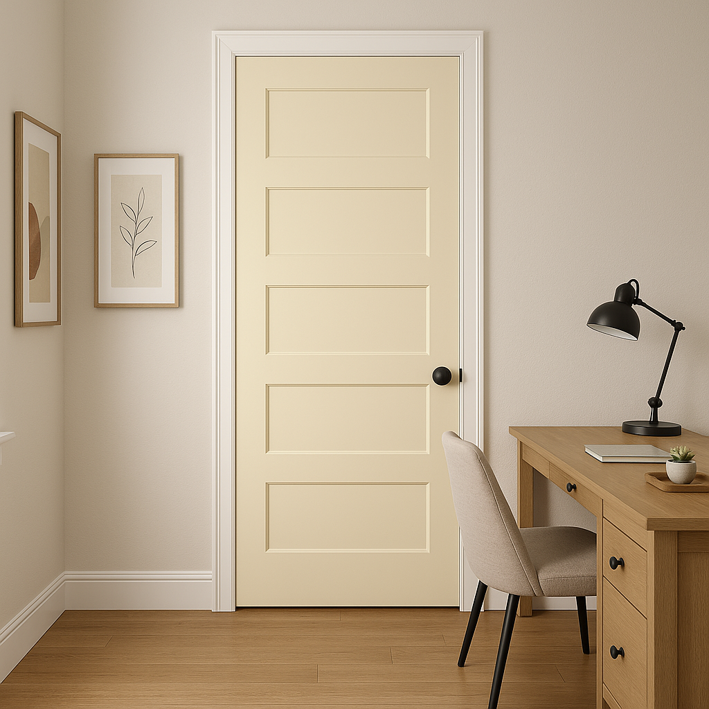
Hallways and Entryways:
Chamomile can also brighten up transitional spaces like hallways or entryways. Its subtle warmth makes these areas feel more welcoming, setting the tone for the rest of your home.
Chamomile’s appearance can slightly shift depending on lighting conditions:
Chamomile is ideal for classic, farmhouse, and transitional design styles where warmth and understated elegance are key. Its muted yellow tone also adapts beautifully to eclectic spaces when combined with bold accent colors or vintage furnishings.
Sherwin-Williams Chamomile (SW 6399) is more than just a paint color—it’s a mood enhancer, a backdrop for cherished memories, and a timeless choice for interiors that prioritize warmth and comfort. Whether you’re brightening up a space or grounding an area with earthy sophistication, Chamomile delivers a balanced, inviting aesthetic that’s sure to stand the test of time.
Note: These images were all generated with AI, there may be inaccurate color results. Please only use a general reference to get a rough idea of what a color may look like, we will continue to generate new images to improve accuracy.
View Colors Only by Brand (No Imagery):
Sherwin-Williams
|
Benjamin-Moore
|
Behr
|
Valspar
Live on the Eastern Slope of Colorado and looking for a local painting professional, check out all our painting services and reach out for a free estimate.
Copyright © 2026 : Wild Fox Painting Inc. : 12435 Mead Way, Littleton, CO 80125


