Sherwin-Williams Brassy (SW 6410) is a striking, earthy green that brings depth, warmth, and sophistication to any space. With its muted yet rich tone, Brassy feels grounded and harmonious while exuding a subtle air of refinement. This color is perfect for homeowners and designers who want to create a welcoming atmosphere with a touch of understated elegance. Whether you're designing a cozy living room, a serene bedroom, or a chic kitchen, Brassy offers the versatility to complement a wide range of styles.
Brassy is a medium green with prominent yellow and gray undertones. These undertones give the color a slightly olive-like quality, making it feel warm and approachable yet refined. The gray component softens its vibrancy, allowing it to blend effortlessly with neutral palettes and creating a calming effect in interior spaces. The yellow undertones, on the other hand, add a subtle warmth that keeps the color from feeling too cold or stark.
Depending on the lighting, Brassy can shift in appearance—looking more golden-green in spaces with ample natural light and leaning towards a muted olive in dimmer environments. This chameleon-like quality makes it an adaptable choice for both bright and moody rooms.
Sherwin-Williams Brassy pairs beautifully with a variety of coordinating colors, allowing you to craft a cohesive and visually appealing design. Here are some excellent options to consider:
Brassy is a versatile paint color that works well in a variety of interior design applications. Its earthy tones make it ideal for creating spaces that feel grounded and connected to nature, while its sophisticated undertones add refinement to modern and traditional designs alike.
Use Brassy to create a welcoming and cozy living room. Pair it with neutral furniture and textured textiles, like woven rugs and linen curtains, to enhance its natural appeal. Incorporate wood tones or brass accents for warmth and elegance.
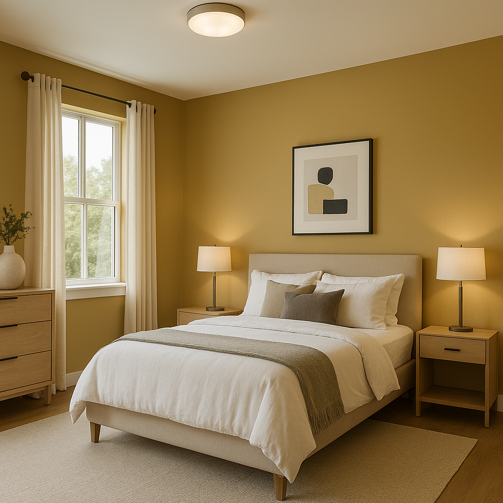
In bedrooms, Brassy sets a serene and calming mood. Combine it with soft whites and muted grays for a tranquil retreat, or layer it with darker hues for a cocoon-like ambiance. Add greenery with indoor plants to emphasize its organic feel.
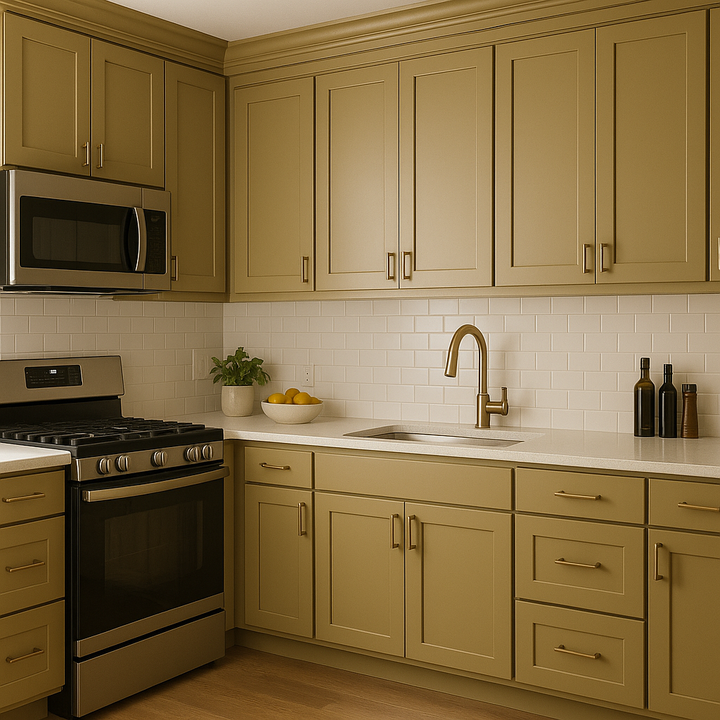
Brassy is an excellent choice for kitchen cabinets or accent walls. Pair it with marble countertops, brushed gold hardware, and white subway tiles for a sophisticated yet approachable look.
Transform your bathroom into a spa-like escape with Brassy. Use it on walls or vanity cabinets, and complement it with crisp whites and natural textures like bamboo or stone.
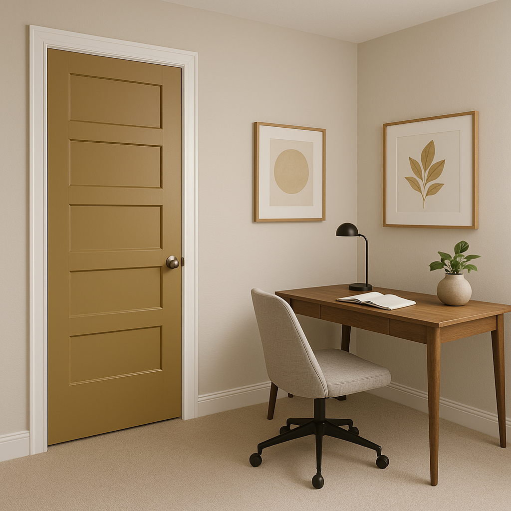
Brassy fosters focus and creativity, making it a great color for home offices. Pair it with sleek furniture and metallic accents to create a polished, professional aesthetic.
If you’re not ready to commit to painting an entire room, Brassy works beautifully as an accent wall. Use it to highlight architectural features, like built-in shelving or a fireplace, for a bold yet balanced statement.
The appearance of Brassy can vary depending on your lighting choices. In natural light, the yellow undertones shine through, giving the color a warm and inviting glow. In artificial lighting, especially under cooler bulbs, Brassy’s gray undertones become more pronounced, creating a muted and modern vibe. Be sure to test the color in your space under different lighting conditions to ensure it achieves the desired effect.
Sherwin-Williams Brassy is more than just a paint color—it’s a design tool that can transform a space into something truly special. Its earthy, sophisticated qualities allow it to feel both inviting and elevated, making it a favorite among interior designers. Whether your style leans classic, contemporary, or eclectic, Brassy’s versatility ensures it will seamlessly blend into your vision while adding a timeless charm.
Note: These images were all generated with AI, there may be inaccurate color results. Please only use a general reference to get a rough idea of what a color may look like, we will continue to generate new images to improve accuracy.
View Colors Only by Brand (No Imagery):
Sherwin-Williams
|
Benjamin-Moore
|
Behr
|
Valspar
Live on the Eastern Slope of Colorado and looking for a local painting professional, check out all our painting services and reach out for a free estimate.
Copyright © 2026 : Wild Fox Painting Inc. : 12435 Mead Way, Littleton, CO 80125


