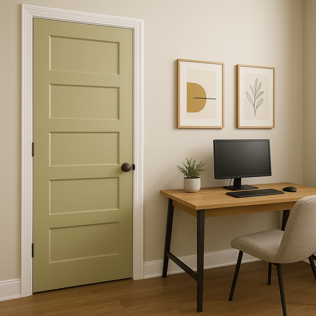
Sherwin-Williams Hearts of Palm (SW 6415) is a lively and refreshing green that can breathe new life into any interior or exterior space. This distinctive hue strikes the perfect balance between vibrant energy and natural serenity, making it an excellent choice for a wide range of design styles. Whether you’re looking to create a tropical-inspired retreat, a cozy cottage aesthetic, or a modern and eclectic vibe, Hearts of Palm is a color that delivers warmth, personality, and versatility.
Hearts of Palm is a yellow-green with warm undertones, which gives it a cheerful and inviting quality without being overwhelming. The subtle yellow base lends the shade a soft, sunny glow, making it feel approachable and easy to pair with other colors. Unlike cooler greens that can feel distant or stark, this hue has a natural warmth that creates a soothing yet uplifting atmosphere.
Its undertones also mean it works beautifully in rooms with natural light, where the sunlight enhances its vibrancy. In dimmer spaces, it takes on a slightly richer, deeper tone, maintaining its charm without feeling too heavy.
One of the reasons Hearts of Palm is so beloved is its ability to coordinate effortlessly with a variety of colors. Here are some complementary shades to consider:
Thanks to its versatility, Hearts of Palm works beautifully in a variety of settings. Here are some ideas to inspire your design:
Hearts of Palm is ideal for creating a warm and welcoming living area. Its cheerful undertones make it a great choice for walls, especially if you’re aiming to foster a cozy yet invigorating environment. Pair it with neutral furniture and natural wood finishes for a grounded look.
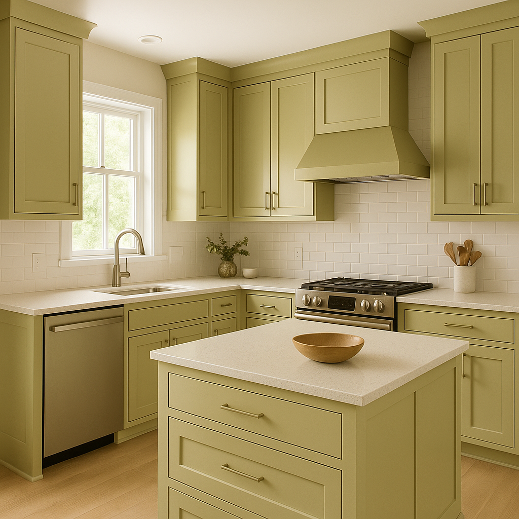
For a kitchen that feels fresh and full of life, use Hearts of Palm on cabinetry or accent walls. Combine it with white subway tiles, butcher block countertops, and brushed brass hardware to achieve a modern farmhouse aesthetic. Alternatively, pair it with sleek stainless steel for a contemporary twist.
Bring the tranquility of nature indoors by using Hearts of Palm in a bathroom. Its soft green tones evoke the calmness of a lush garden, perfect for creating a spa-like retreat. Pair it with crisp white trim, stone textures, and lush greenery for a cohesive and serene vibe.
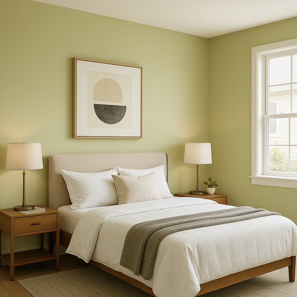
In bedrooms, Hearts of Palm strikes the perfect balance between restful and rejuvenating. Use it as a wall color and complement it with soft linens in neutral tones or muted pastels. Add touches of natural textures like wicker or rattan to enhance the organic feel.
Note: These images were all generated with AI, there may be inaccurate color results. Please only use a general reference to get a rough idea of what a color may look like, we will continue to generate new images to improve accuracy.
View Colors Only by Brand (No Imagery):
Sherwin-Williams
|
Benjamin-Moore
|
Behr
|
Valspar
Live on the Eastern Slope of Colorado and looking for a local painting professional, check out all our painting services and reach out for a free estimate.
Copyright © 2026 : Wild Fox Painting Inc. : 12435 Mead Way, Littleton, CO 80125


