
Sherwin-Williams Inverness (SW 6433) is a deep, sophisticated green that evokes a sense of nature’s tranquility and timeless elegance. This versatile shade is perfect for creating an atmosphere of warmth and refinement, making it a popular choice for homeowners and designers alike. Whether you're looking to add depth to a living room, create a cozy study, or bring character to cabinetry, Inverness delivers a striking yet approachable aesthetic.
Inverness is a rich green with subtle blue-gray undertones that give it a grounded and balanced feel. These undertones prevent the color from feeling overly bright or saturated, making it a perfect choice for spaces that need a touch of sophistication without being overwhelming. The muted nature of Inverness creates a harmonious connection to the outdoors, making it ideal for interiors and exteriors alike.
Pairing Sherwin-Williams Inverness with complementary colors can enhance its beauty while ensuring a cohesive design. Here are some coordinating colors to consider:
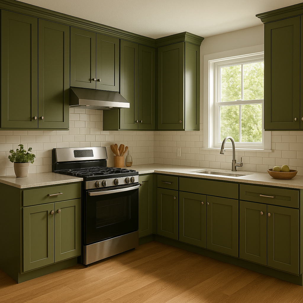
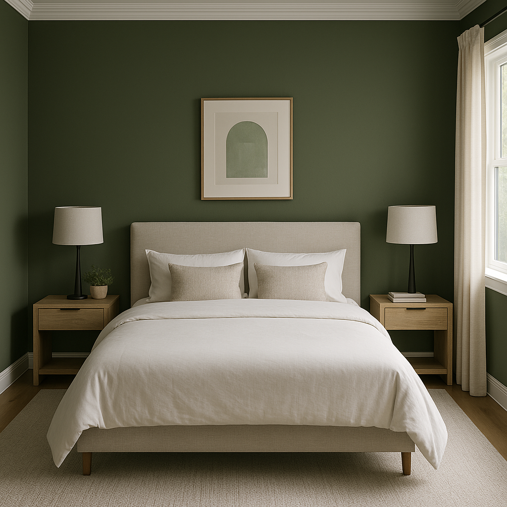
Sherwin-Williams Inverness is a robust, adaptable color that can be used in a variety of applications to create different moods and effects. Here are some ideas to inspire you:
Sherwin-Williams Inverness (SW 6433) is more than just a paint color—it's an opportunity to infuse your space with personality, depth, and timeless charm. Whether you're redecorating a single room or embarking on a full-scale design project, this elegant green is sure to leave a lasting impression.
Note: These images were all generated with AI, there may be inaccurate color results. Please only use a general reference to get a rough idea of what a color may look like, we will continue to generate new images to improve accuracy.
View Colors Only by Brand (No Imagery):
Sherwin-Williams
|
Benjamin-Moore
|
Behr
|
Valspar
Live on the Eastern Slope of Colorado and looking for a local painting professional, check out all our painting services and reach out for a free estimate.
Copyright © 2026 : Wild Fox Painting Inc. : 12435 Mead Way, Littleton, CO 80125


