Sherwin-Williams Restful (SW 6458) is a soothing and soft green paint color that evokes tranquility and balance, making it a perfect choice for spaces where serenity is key. This nature-inspired hue has a gentle, muted quality that brings a sense of freshness and relaxation to any room. Whether you're designing a spa-like bathroom, a peaceful bedroom, or a calming living space, Restful is a versatile shade that delivers understated elegance.
The beauty of Sherwin-Williams Restful lies in its subtle undertones. Restful is a light green with soft gray undertones that keep it grounded and versatile, rather than overly vibrant or saturated. These gray undertones give it a balanced feel and prevent it from leaning too warm or too cool. It has a slightly earthy quality, which allows it to pair beautifully with natural materials such as wood, stone, and woven textures.
Because of its muted nature, Restful works well in spaces that need a touch of color without being overwhelming. It feels fresh and airy while remaining sophisticated—perfect for creating a quiet retreat or enhancing a space with a natural vibe.
Sherwin-Williams Restful pairs seamlessly with an array of complementary colors, thanks to its neutral undertones. Here are some coordinating color suggestions to help you craft a harmonious color palette:
Neutral Pairings: Combine Restful with soft greige tones like Sherwin-Williams Accessible Beige (SW 7036) or creamy whites like Alabaster (SW 7008). These neutrals keep the palette light and airy, making Restful stand out as a gentle pop of color.
Deeper Accent Colors: For added depth, consider pairing Restful with rich, earthy shades like Sherwin-Williams Urbane Bronze (SW 7048) or Grays Harbor (SW 6236). These deeper tones create contrast and drama while maintaining a natural feel.
Complementary Greens and Blues: Restful works beautifully alongside other greens and blues for a monochromatic or analogous color scheme. Try Sherwin-Williams Rainwashed (SW 6211) for a soft blue-green pairing or Sherwin-Williams Sea Salt (SW 6204) for a muted coastal vibe.
Warm Accents: Balance the coolness of Restful with warm, golden hues like Sherwin-Williams Honey Bees (SW 9018) or muted terracotta shades like Cavern Clay (SW 7701). These accents create a well-rounded color palette with warmth and contrast.
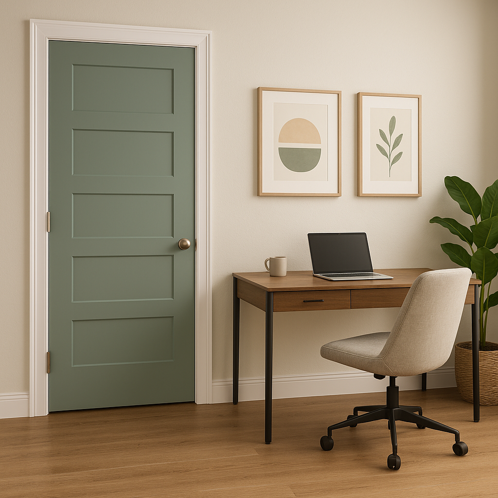
Sherwin-Williams Restful is a versatile paint color that adapts beautifully to different spaces and styles. Its gentle green tone makes it ideal for creating environments that feel calm, rejuvenating, and connected to nature. Below are some suggestions for using Restful effectively in your home:
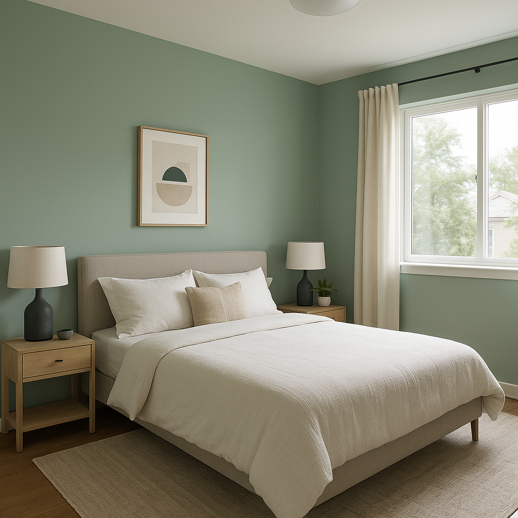
Restful is an excellent choice for bedrooms where relaxation is the priority. Its soft green hue promotes calmness and serenity, making it ideal for enhancing sleep and creating a soothing retreat. Pair it with white bedding and natural wood furniture for a minimalist, spa-like feel.
Transform your bathroom into a tranquil oasis with Restful. This color works perfectly in spaces with natural light and complements white tiles, marble countertops, and brushed nickel fixtures. Add greenery or bamboo accents for a fresh, organic vibe.
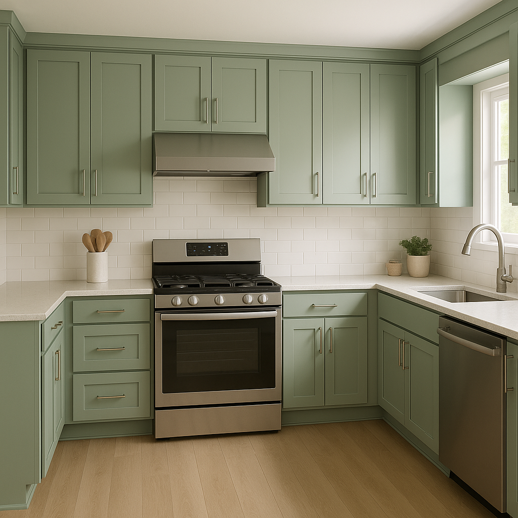
In living rooms, Restful creates a welcoming yet peaceful ambiance. It pairs beautifully with soft neutrals and textured fabrics, such as linen or wool. Add accents in darker greens or grays to create depth, or use metallic finishes like bronze or gold for a touch of elegance.
Make a calming first impression with Restful in your entryway or foyer. Its muted green tone sets the mood for the rest of the home, creating an inviting atmosphere. Pair it with crisp white trim for a clean, timeless look.
Restful is an excellent alternative to traditional pastel pinks and blues in nurseries. Its soothing green tone promotes relaxation while feeling modern and fresh. Combine it with soft whites and light wood furniture for a gender-neutral design.
Sherwin-Williams Restful behaves differently depending on the lighting conditions in a space. In rooms with abundant natural light, the green tones will appear lighter and more vibrant. In dimly lit spaces or rooms with artificial lighting, the gray undertones may become more prominent, giving the color a softer and more subdued feel. Be sure to test Restful in your space before committing to ensure it complements the light quality in your home.
Sherwin-Williams Restful (SW 6458) embodies the perfect balance of muted elegance and natural charm. Its versatility, calming undertones, and ability to coordinate effortlessly with a wide range of colors make it a go-to choice for creating serene environments. Whether you're refreshing your interiors or designing a space from scratch, Restful is a timeless and sophisticated option that brings harmony and peace to every corner of your home.
Note: These images were all generated with AI, there may be inaccurate color results. Please only use a general reference to get a rough idea of what a color may look like, we will continue to generate new images to improve accuracy.
View Colors Only by Brand (No Imagery):
Sherwin-Williams
|
Benjamin-Moore
|
Behr
|
Valspar
Live on the Eastern Slope of Colorado and looking for a local painting professional, check out all our painting services and reach out for a free estimate.
Copyright © 2026 : Wild Fox Painting Inc. : 12435 Mead Way, Littleton, CO 80125


