Sherwin-Williams Isle of Pines (SW 6461) is a captivating shade of green that evokes the serene beauty of a dense, pine-filled forest. This rich, mid-to-dark green with a slightly muted quality offers a grounding and timeless aesthetic that works beautifully in a variety of design styles. Whether you’re aiming to create a cozy retreat, add drama to a formal space, or bring a touch of nature indoors, Isle of Pines is a versatile choice that combines elegance with a sense of calm.
Isle of Pines carries subtle blue undertones that lend it a cool and sophisticated demeanor. These undertones ensure that the color feels balanced and not overly warm, making it an excellent option for spaces where you want to foster tranquility and depth. The touch of blue also allows the color to shift slightly depending on lighting, appearing deeper and moodier in low light or more invigorating in brighter settings.
When pairing Isle of Pines with other shades, consider both complementary and neutral tones to create a harmonious design. Here are some excellent coordinating options:
Neutrals:
Complementary Colors:
Accents:
Isle of Pines’ versatility makes it suitable for a wide range of applications, from intimate private spaces to bold accent walls. Here are some ideas for incorporating this color into your home or office:
Create a cozy, inviting environment in common areas by using Isle of Pines on walls or as an accent color. Pair it with warm neutrals like Accessible Beige on furniture or trim to balance the room. Add natural textures like wood and leather to enhance the organic feel.
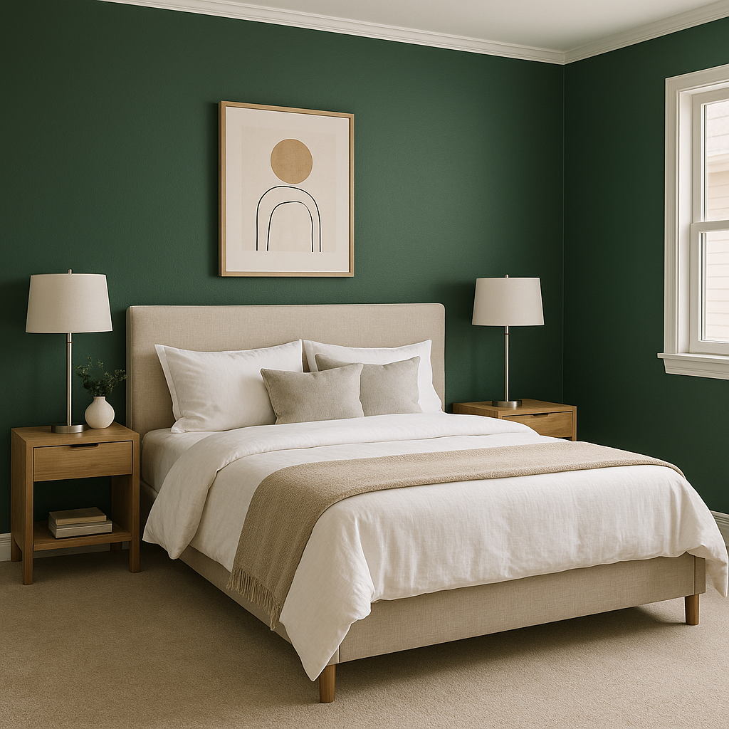
This calming shade is perfect for bedrooms, where it can promote relaxation and restful sleep. Use Isle of Pines as the primary wall color, then layer in crisp white bedding and soft gray accents to maintain a serene atmosphere.
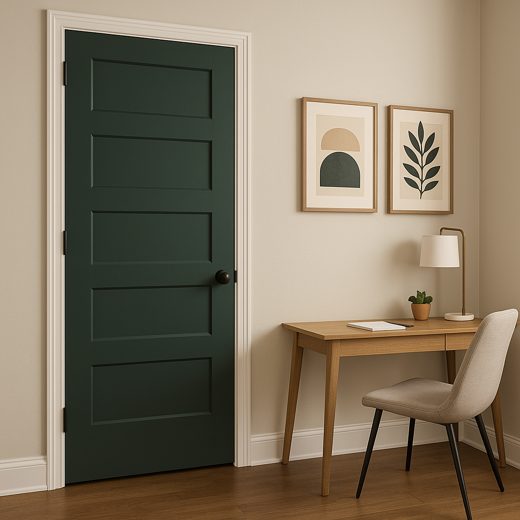
The depth and sophistication of Isle of Pines make it a stellar choice for a home office. It fosters focus and creativity while adding a touch of elegance. Pair it with brass or gold accents for a polished, professional look.
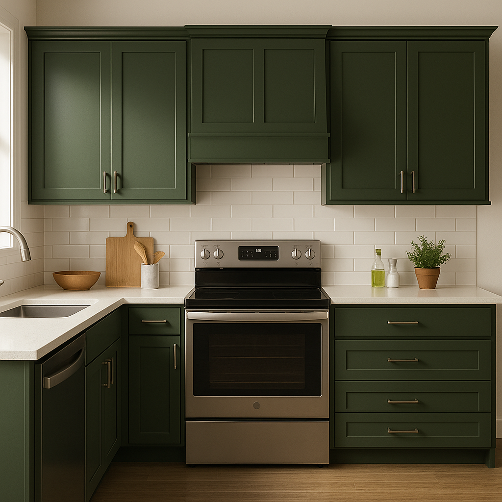
For a unique and bold kitchen or dining space, consider using Isle of Pines on cabinetry or as a feature wall. Pair it with marble countertops and brushed gold hardware for a modern, high-contrast style.
Transform your bathroom into a spa-like retreat with Isle of Pines. Its cool undertones work beautifully with crisp whites, light grays, and natural stone finishes. Add lush greenery to complete the look.
Isle of Pines isn’t just for interiors. Its deep, natural hue makes it a stunning choice for exteriors, whether you use it on siding, shutters, or a front door. Pair it with clean white trim and soft gray roofing for a classic, timeless curb appeal.
As with any deep hue, lighting plays a critical role in how Isle of Pines will appear in your space. In rooms with ample natural light, the color’s green tones will feel more vibrant, while in dimly lit spaces, the richer, moodier qualities will stand out. Test the color with swatches in different lighting conditions to see how it interacts with your environment.
Sherwin-Williams Isle of Pines (SW 6461) strikes a perfect balance between boldness and versatility. Its earthy, forest-inspired hue adds depth and character while remaining adaptable to various design styles and color palettes. Whether you’re creating a cozy retreat or making a bold statement, Isle of Pines is a sophisticated and timeless choice that will elevate any space.
Note: These images were all generated with AI, there may be inaccurate color results. Please only use a general reference to get a rough idea of what a color may look like, we will continue to generate new images to improve accuracy.
View Colors Only by Brand (No Imagery):
Sherwin-Williams
|
Benjamin-Moore
|
Behr
|
Valspar
Live on the Eastern Slope of Colorado and looking for a local painting professional, check out all our painting services and reach out for a free estimate.
Copyright © 2026 : Wild Fox Painting Inc. : 12435 Mead Way, Littleton, CO 80125


