Sherwin-Williams Spearmint (SW 6465) is a crisp, invigorating shade of green that effortlessly bridges the gap between serene sophistication and lively energy. This hue is reminiscent of fresh mint leaves, evoking feelings of renewal and tranquility while adding a modern touch to any space. Its versatility makes it a favorite among interior designers for creating spaces that feel both vibrant and harmonious.
Spearmint features subtle blue undertones that lend it a cool and refreshing character. These undertones ensure the color remains soothing rather than overwhelming, making it an excellent choice for spaces where balance and calmness are desired. The blue undertones also give Spearmint a slightly coastal vibe, making it ideal for homes aiming to achieve a breezy and tranquil aesthetic.
Pairing Spearmint with complementary colors enhances its beauty and creates a cohesive look. Here are some coordinating colors to consider:
Whites and Off-Whites:
Neutrals:
Deep Accent Colors:
Earthy and Natural Tones:
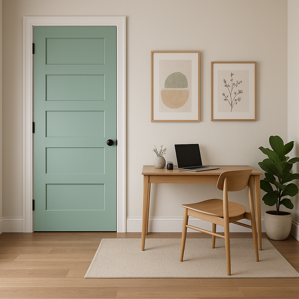
Sherwin-Williams Spearmint is a versatile color that can be used in almost any room, from modern kitchens to tranquil bedrooms. Here are some creative ways to incorporate this refreshing shade into your home:
Spearmint is an excellent choice for living rooms where you want to create a welcoming yet energized atmosphere. Pair it with creamy whites and weathered wood furniture for a rustic-meets-modern vibe, or use it with sleek metallic accents for a contemporary aesthetic.
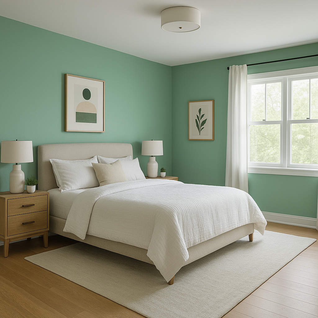
In bedrooms, Spearmint’s calming undertones promote relaxation and rejuvenation. Combine it with soft linens and muted grays for a serene retreat, or add pops of coral or blush pink for a playful touch.
Spearmint’s cool and refreshing vibe makes it a perfect fit for bathrooms. Pair it with crisp white tiles and silver fixtures for a clean, spa-like feel. Add natural accents such as woven baskets or greenery to bring out its organic charm.
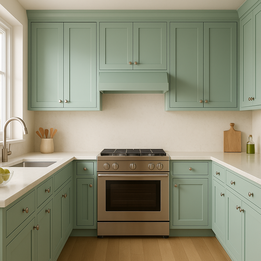
Spearmint can breathe new life into a kitchen, whether as a wall color or on cabinetry. Pair it with brushed nickel fixtures and marble countertops for a modern look, or use it alongside natural wood finishes for a farmhouse aesthetic.
For those who love bold statements, Spearmint can be used as an accent wall to enliven a space without overpowering it. Combine it with neutral colors like Agreeable Gray or Pure White for a balanced and stylish look.
Spearmint is a wonderful option for exterior spaces such as patios or garden walls. Its fresh, natural tone blends seamlessly with outdoor greenery, creating an inviting and harmonious environment.
Sherwin-Williams Spearmint is perfect for homeowners seeking a color that feels natural yet contemporary. Its cool undertones and refreshing vibe make it ideal for creating spaces that feel uplifting, peaceful, and connected to nature. Whether you’re designing a coastal retreat or a modern sanctuary, Spearmint offers the versatility to fit seamlessly into various design styles.
Sherwin-Williams Spearmint (SW 6465) is more than just a color; it’s a statement of tranquility and renewal that can transform any space into a haven of calm and beauty.
Note: These images were all generated with AI, there may be inaccurate color results. Please only use a general reference to get a rough idea of what a color may look like, we will continue to generate new images to improve accuracy.
View Colors Only by Brand (No Imagery):
Sherwin-Williams
|
Benjamin-Moore
|
Behr
|
Valspar
Live on the Eastern Slope of Colorado and looking for a local painting professional, check out all our painting services and reach out for a free estimate.
Copyright © 2026 : Wild Fox Painting Inc. : 12435 Mead Way, Littleton, CO 80125


