Sherwin-Williams Waterscape (SW 6470) is a serene, soft blue-green paint color that evokes the calming essence of nature's most tranquil moments. Perfectly blending sophistication and versatility, Waterscape is a great choice for homeowners and designers seeking to create spaces that feel rejuvenating, airy, and inviting. Its understated charm makes it a favorite for achieving a light, breezy aesthetic while adding depth and character to any room.
Waterscape is a delicate balance of blue and green with subtle gray undertones. The gray influence tempers the vibrancy of the blue-green combination, ensuring the color doesn't feel overly bright or saturated. This muted quality gives Waterscape a soft, spa-like presence, making it ideal for spaces where relaxation and tranquility are paramount. Depending on lighting conditions, the color may lean more toward its green or blue side, offering just the right amount of versatility to complement various design styles.
Sherwin-Williams Waterscape pairs beautifully with a wide range of shades, from warm neutrals to deeper accent colors. Here are a few suggestions to create harmonious palettes:
Neutral Coordinating Colors
Accent Colors
Complementary Colors
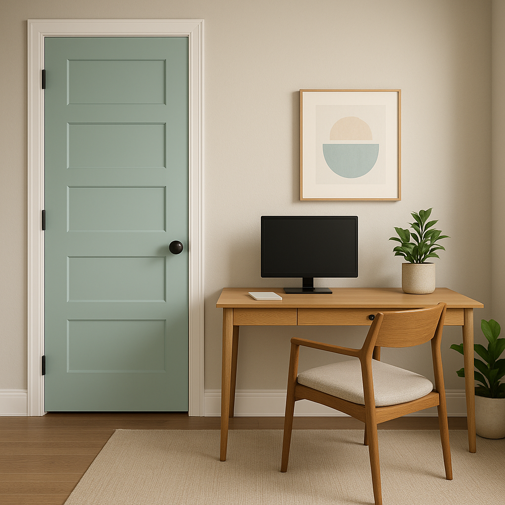
Waterscape’s versatility makes it a fantastic choice for a variety of interior applications. Its soothing qualities are especially well-suited for spaces where relaxation and rejuvenation take center stage. Here are some ideas for incorporating Waterscape into your home:
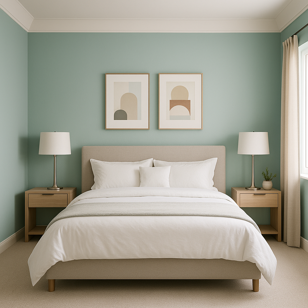
Transform your bedroom into a calming retreat by using Waterscape on the walls. Pair it with crisp white bedding and natural wood furniture for a serene, minimalist aesthetic. Add soft textures like linen curtains or woven rugs to enhance the overall sense of tranquility.
Waterscape is a natural fit for bathrooms, evoking a spa-inspired atmosphere. Use it as the primary wall color and pair it with white subway tiles, chrome fixtures, and plush towels in coordinating blue or green tones. For an elevated look, incorporate marble accents to highlight the subtle sophistication of the color.
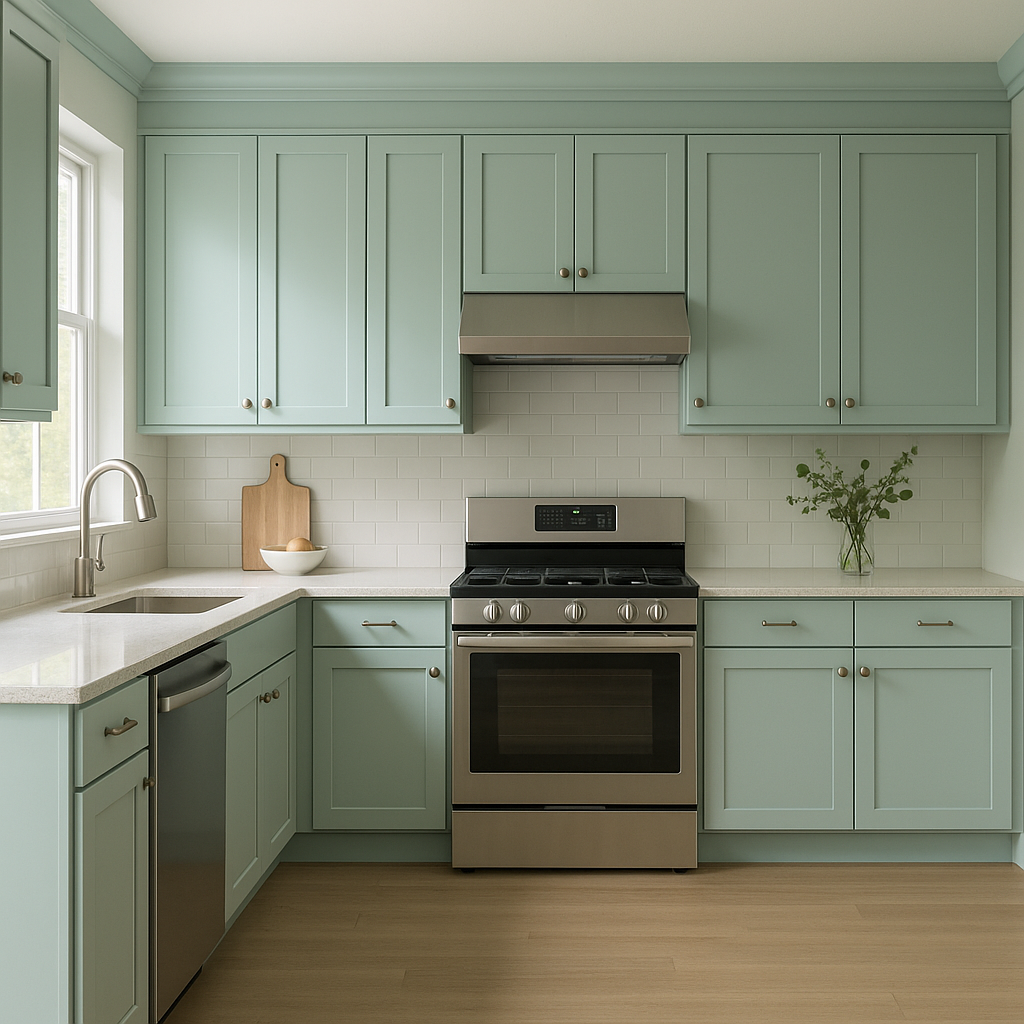
In kitchens, Waterscape creates a fresh, clean vibe. Use it on cabinetry for a pop of color that feels elegant and timeless. Pair it with white countertops, brushed nickel hardware, and natural wood flooring for a balanced, modern look.
Bring a sense of calm to your living room by using Waterscape as an accent wall color or throughout the entire space. Layer in warm neutral furniture and metallic accessories like gold or brass to provide contrast and a touch of glamour.
Waterscape is perfect for nurseries and kids’ rooms thanks to its gentle, soothing nature. Pair it with pastel-colored decor for a whimsical, youthful feel or keep it simple with white furniture and natural textures for a more timeless approach.
As with any paint color, the way Waterscape appears in your space will depend on lighting conditions. In rooms with ample natural light, its blue-green tones will feel brighter and more pronounced, creating a fresh and airy ambiance. In spaces with limited light, the gray undertones will emerge more prominently, lending a cozy and calming feel. For best results, test Waterscape in different lighting scenarios within your home before committing to the color.
Sherwin-Williams Waterscape (SW 6470) is a versatile and timeless choice that can breathe life into any design style, from coastal-inspired retreats to modern minimalist spaces. Its soft, balanced hue and tranquil undertones make it a go-to for creating interiors that feel both elegant and rejuvenating. Pair it with carefully selected coordinating colors and textures to fully unlock its potential in your home.
Note: These images were all generated with AI, there may be inaccurate color results. Please only use a general reference to get a rough idea of what a color may look like, we will continue to generate new images to improve accuracy.
View Colors Only by Brand (No Imagery):
Sherwin-Williams
|
Benjamin-Moore
|
Behr
|
Valspar
Live on the Eastern Slope of Colorado and looking for a local painting professional, check out all our painting services and reach out for a free estimate.
Copyright © 2026 : Wild Fox Painting Inc. : 12435 Mead Way, Littleton, CO 80125


