Sherwin-Williams Composed (SW 6472) is a richly elegant shade of green that embodies tranquility and sophistication. This color strikes the perfect balance between being grounded and refreshing, making it a versatile choice for various interior styles. Whether you're looking to create a serene bedroom retreat, a polished living space, or a nature-inspired office, Composed offers a timeless appeal that enhances the ambiance of any room.
Composed (SW 6472) is a deep green with cool undertones, including hints of blue and gray that contribute to its calming aesthetic. These subtle undertones make Composed feel modern and refined, as opposed to overly vibrant or earthy. The presence of blue in the mix provides a soothing quality, while the gray undertones lend a sophisticated edge. Together, these elements allow Composed to adapt seamlessly to both light and shadow, ensuring it feels harmonious in a variety of lighting conditions.
Sherwin-Williams Composed pairs beautifully with both neutrals and complementary hues, allowing for flexibility in design. Here are some coordinating colors to help you craft a cohesive palette:
These coordinating colors work together to enhance the versatility of Composed, whether you're aiming for a minimalist aesthetic, a cozy vibe, or a bold design statement.
Composed is a highly adaptable color that can be used in a variety of spaces and applications. Here are some ideas on where and how to use it effectively:
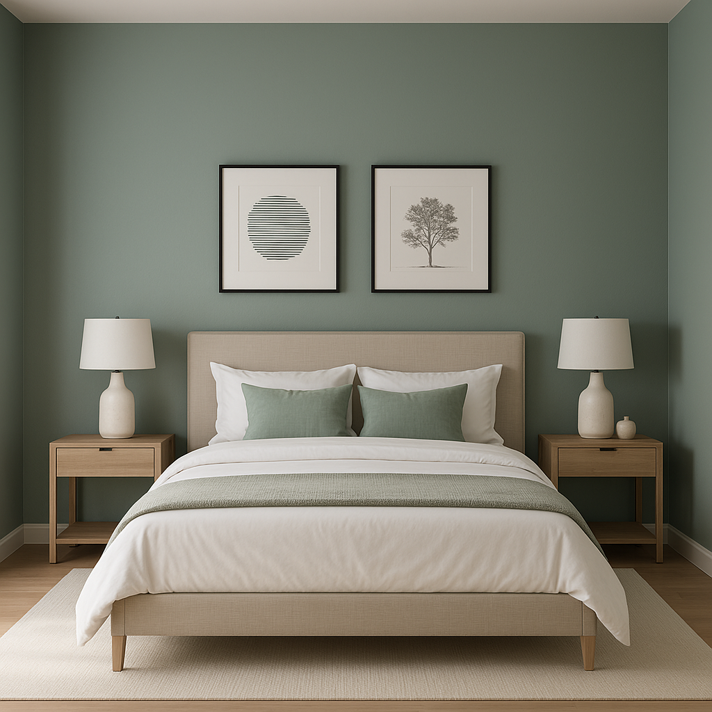
Transform your bedroom into a serene haven by using Composed on the walls. Pair it with soft white bedding, natural wood furniture, and accents in muted blues or grays for a calming atmosphere that promotes relaxation and rest.
In living spaces, Composed provides an air of sophistication. Consider pairing it with light-colored furniture and metallic accents like brushed brass or matte black. Use artwork or textiles with subtle green hues to tie the room together seamlessly.
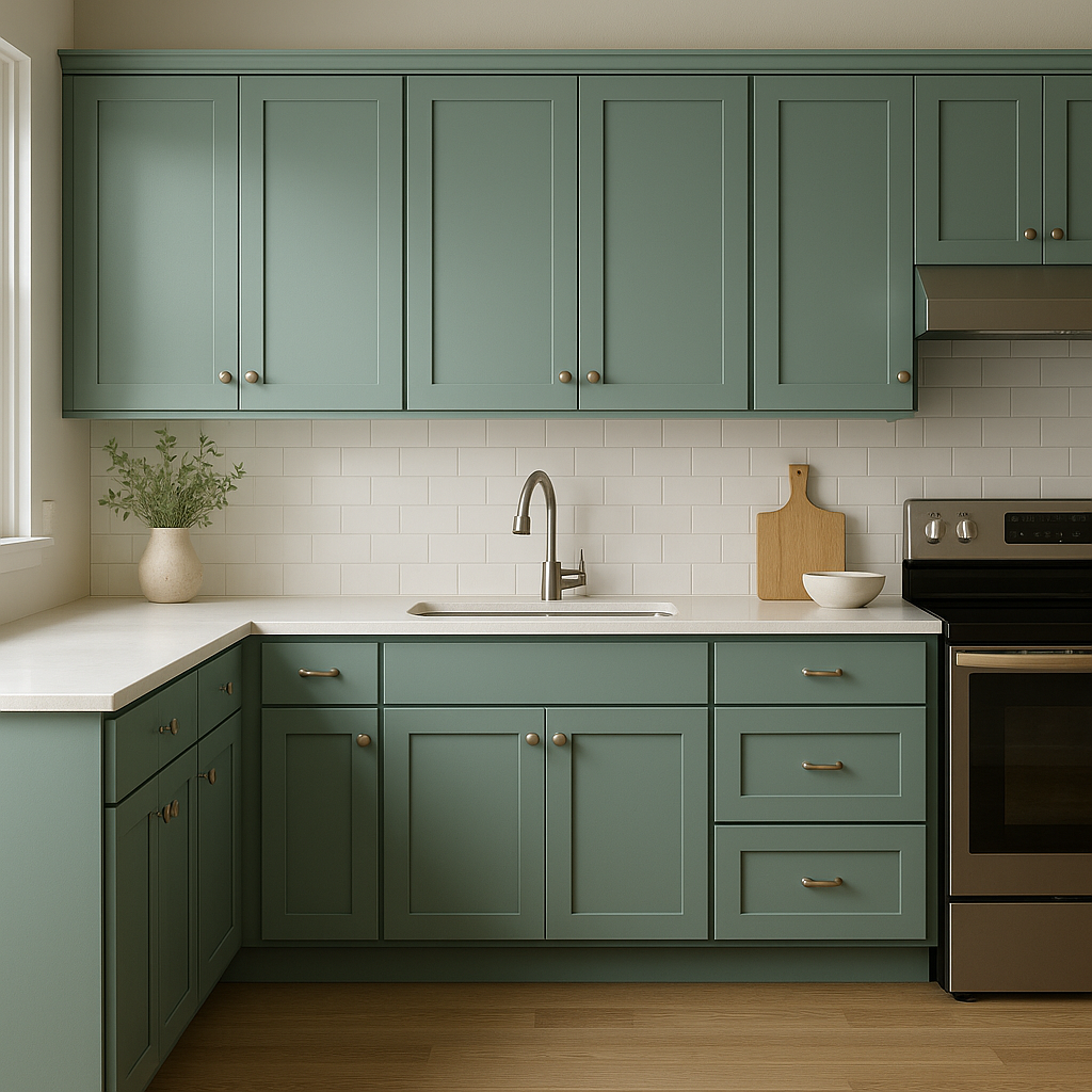
Composed works beautifully in kitchens and dining areas, especially when paired with white cabinetry or marble countertops. Its cool undertones create a clean and modern look. For a dramatic effect, consider using Composed on lower cabinets or an accent wall in a dining area.
As a calming yet focused hue, Composed is ideal for home offices. It fosters productivity while maintaining a relaxing atmosphere. Pair it with sleek furniture in neutral tones and incorporate natural textures like woven baskets or wooden shelving for added warmth.
In bathrooms, Composed feels fresh and spa-like. Use it on walls alongside crisp white tiles and silver or brushed nickel fixtures. Add greenery or botanical-inspired decor to enhance the natural vibe.
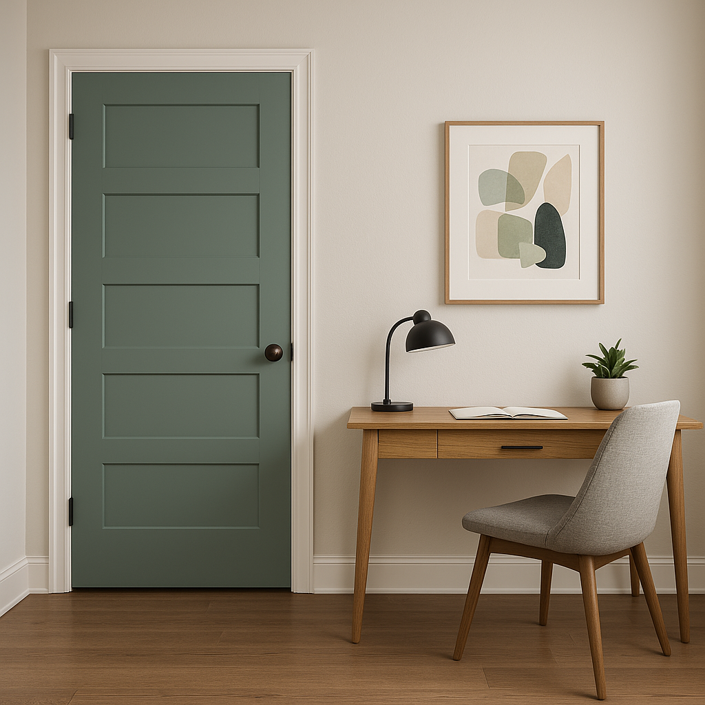
If you're not ready to commit to full walls, Composed makes a stunning accent color. Use it on a feature wall, built-ins, or furniture pieces like a painted dresser or console table, adding depth and personality to your space.
Lighting plays a significant role in how Composed appears in your home. In natural light, the cool blue and gray undertones become more pronounced, making the color feel fresh and airy. In artificial lighting, it may lean slightly deeper and more muted, adding a cozy and intimate vibe. Be sure to test the color in different lighting scenarios to ensure it aligns with your desired look and mood.
Sherwin-Williams Composed is an exceptional choice for anyone seeking a versatile green that feels timeless, sophisticated, and serene. Its ability to pair effortlessly with other colors and adapt to various design styles makes it a go-to option for homeowners and designers alike. Whether used as a main wall color, an accent shade, or even for cabinetry, Composed offers endless possibilities to elevate your interior spaces.
Note: These images were all generated with AI, there may be inaccurate color results. Please only use a general reference to get a rough idea of what a color may look like, we will continue to generate new images to improve accuracy.
View Colors Only by Brand (No Imagery):
Sherwin-Williams
|
Benjamin-Moore
|
Behr
|
Valspar
Live on the Eastern Slope of Colorado and looking for a local painting professional, check out all our painting services and reach out for a free estimate.
Copyright © 2026 : Wild Fox Painting Inc. : 12435 Mead Way, Littleton, CO 80125


