Sherwin-Williams Glimmer (SW 6476) is a soft, ethereal green with a whisper of blue undertones that evokes a sense of tranquility and renewal. Perfectly balanced between a pastel and a muted tone, this color brings a rejuvenating, airy quality to any space, making it a favorite for homeowners and designers alike. Whether you're looking to refresh a small room or create a cohesive palette for your entire home, Glimmer offers versatility, sophistication, and charm.
Glimmer is a delicate blend of green and blue, leaning slightly toward a minty hue. Its cool undertones give it a crisp, clean vibe that pairs beautifully with both light and dark colors. While it carries a hint of blue, it won't overwhelm a space, instead offering a soft and subtle glow that feels almost luminescent. The color is perfect for those who want a gentle pop of color without veering into overly saturated territory. Its undertones make it ideal for both coastal-inspired themes and modern minimalist designs.
To create a harmonious color palette, pair Glimmer with complementary tones that enhance its refreshing quality. Sherwin-Williams suggests the following coordinating colors:
For those seeking a bolder contrast, charcoal grays like Peppercorn (SW 7674) or deep navy blues like Naval (SW 6244) can ground the space while making Glimmer pop.
Sherwin-Williams Glimmer is an incredibly versatile paint color that works beautifully in a variety of spaces and design styles. Here are some of the top ways to incorporate it into your home:
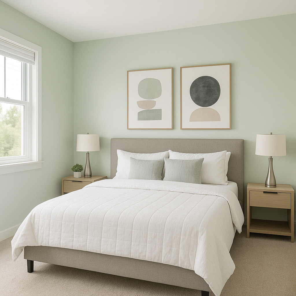
Glimmer is a perfect choice for bedrooms, where its soothing green-blue hue creates a tranquil retreat. Pair it with crisp white linens, light wood furniture, and soft accents like sage or blush for a serene atmosphere. Add texture with woven baskets or a plush area rug to complete the look.
The cool undertones of Glimmer make it an excellent option for bathrooms. It evokes the freshness of a spa and pairs wonderfully with white subway tiles, polished chrome fixtures, and natural stone countertops. Add greenery or eucalyptus touches for an organic, rejuvenating feel.
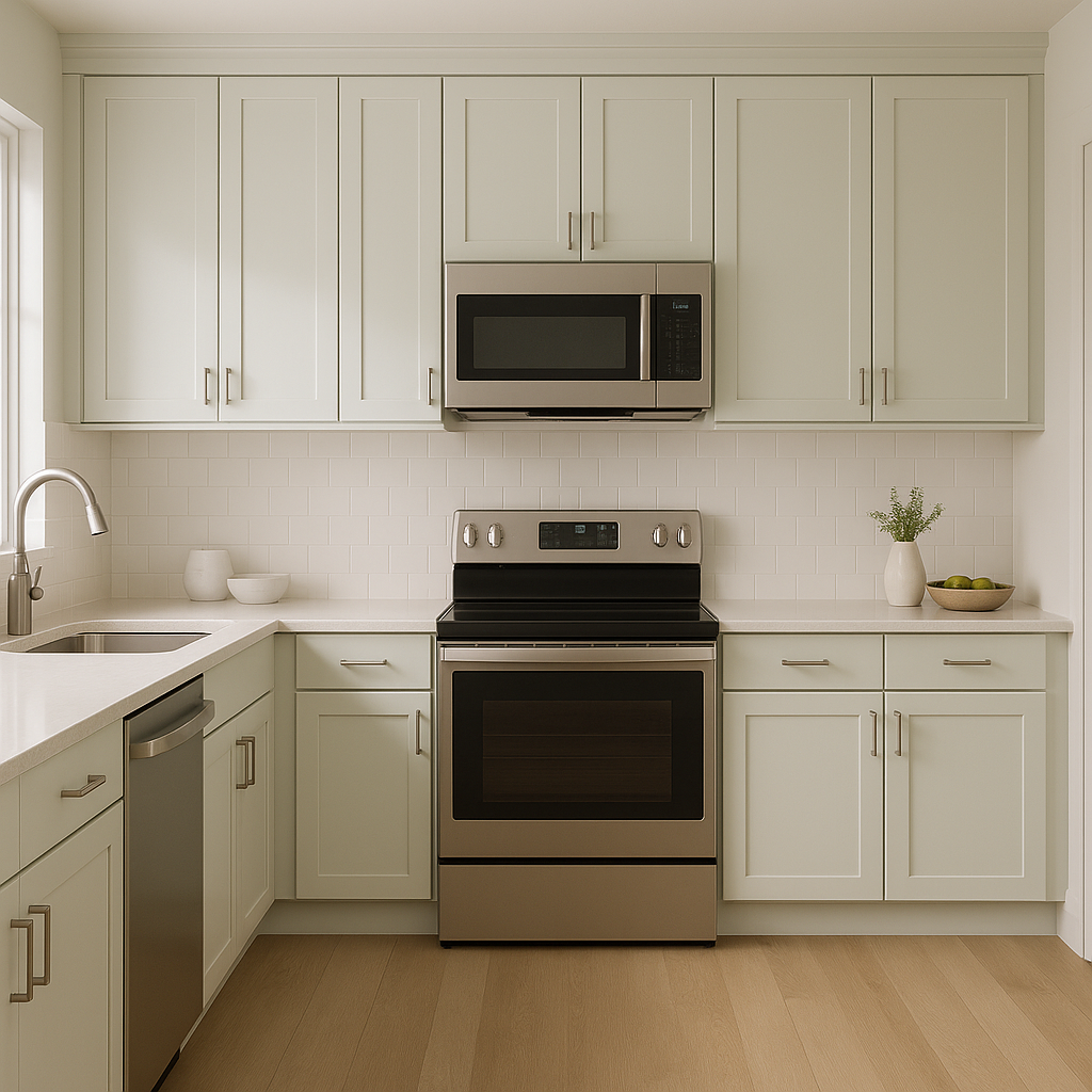
Bring a subtle splash of color to kitchen cabinets or walls with Glimmer. It works well with white or light gray countertops, brushed nickel hardware, and open shelving. For a farmhouse-inspired look, pair it with warm wood tones and natural textures.
In living spaces, Glimmer sets a calm and welcoming tone. Use it on the walls and pair it with neutral furniture and metallic accents like brass or gold for a sophisticated yet approachable design. Layer textures with throw pillows and curtains in complementary shades of gray, cream, or soft blue.
Glimmer’s delicate pastel quality makes it a charming choice for nurseries or children’s rooms. Pair it with soft whites and muted yellows for a gender-neutral palette, or add touches of blush pink or sky blue to create a playful, dreamy space.
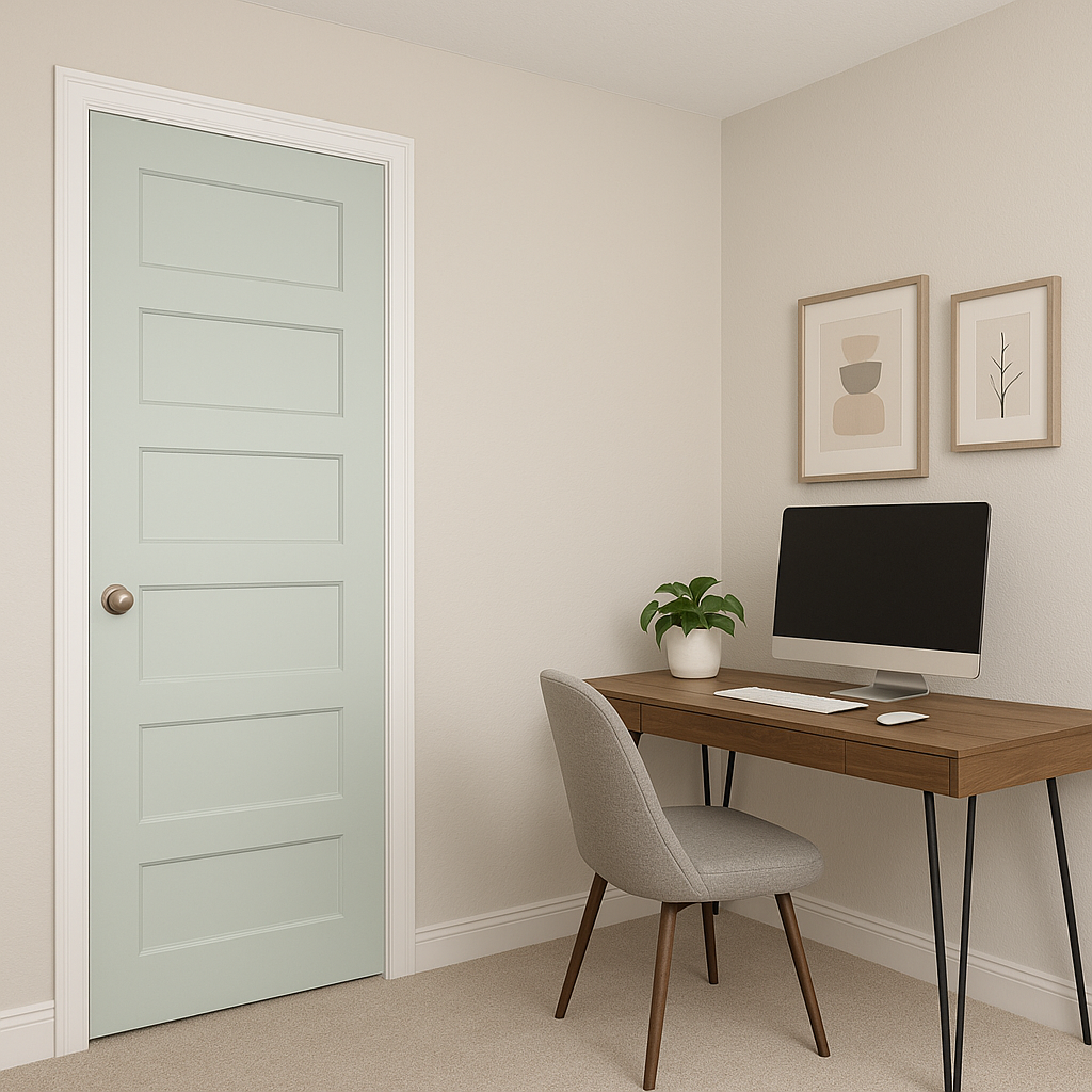
Create a productive yet peaceful workspace by using Glimmer on the walls of your home office. Its cool tones reduce visual clutter while providing a refreshing background for focused work. Pair it with natural wood finishes and sleek, modern furniture for a clean and inspiring environment.
Glimmer’s blend of green and blue evokes feelings of calmness, renewal, and connection to nature. Green is known for its restorative qualities, while blue promotes relaxation and focus—making this color an ideal choice for spaces where you want to unwind or concentrate. Its lightness also reflects natural light beautifully, brightening rooms and making smaller spaces feel more expansive.
Sherwin-Williams Glimmer (SW 6476) is the perfect color for creating serene, inviting spaces that feel fresh and modern. Its versatility, paired with its subtle undertones, makes it a standout choice for a wide range of interior design styles. Whether you're revitalizing a single room or coordinating a whole-home palette, Glimmer offers timeless beauty and effortless elegance.
Note: These images were all generated with AI, there may be inaccurate color results. Please only use a general reference to get a rough idea of what a color may look like, we will continue to generate new images to improve accuracy.
View Colors Only by Brand (No Imagery):
Sherwin-Williams
|
Benjamin-Moore
|
Behr
|
Valspar
Live on the Eastern Slope of Colorado and looking for a local painting professional, check out all our painting services and reach out for a free estimate.
Copyright © 2026 : Wild Fox Painting Inc. : 12435 Mead Way, Littleton, CO 80125


