Sherwin-Williams Watery (SW 6478) is a tranquil, refreshing, and versatile color that effortlessly evokes the peacefulness of coastal waters. With its soft blue-green tones, Watery creates a sense of calm and relaxation, making it a perfect choice for a variety of spaces in your home. Whether you're aiming for a beach-inspired retreat or simply want to infuse your interiors with soothing vibes, this color is an exceptional option that works beautifully in virtually any room.
Watery is a balanced blend of blue and green, with subtle gray undertones. These gray undertones give the hue a soft, muted quality, preventing it from feeling overly saturated or bold. The combination results in a sophisticated color that feels fresh and modern while maintaining an inviting softness.
Its versatility lies in the way it adapts to different lighting conditions. In bright natural light, Watery leans more toward a crisp blue, while in dimmer settings, the green undertones become more pronounced, lending a slightly earthy feel. This dynamic quality makes it a flexible color choice for any space.
Sherwin-Williams Watery pairs harmoniously with a variety of complementary colors, allowing you to create a cohesive and well-balanced palette. Here are some suggestions for coordinating colors:
Whites and Off-Whites: To maintain a light and airy aesthetic, pair Watery with crisp whites like Sherwin-Williams Pure White (SW 7005) or softer options like Alabaster (SW 7008). These colors help highlight the serene qualities of Watery, making it feel fresh and open.
Neutrals: Add warmth and balance with neutral tones such as Accessible Beige (SW 7036) or Repose Gray (SW 7015). These shades create a grounded yet elegant pairing, perfect for transitional or modern spaces.
Deeper Blues and Greens: For a layered, coastal-inspired look, pair Watery with richer hues like Tidewater (SW 6477) or Naval (SW 6244). The deeper tones complement Watery’s lightness while adding depth and dimension.
Accent Colors: To introduce a pop of color, consider pairing Watery with coral tones such as Coral Reef (SW 6606) or sunny yellows like Honey Bees (SW 9018). These accents bring a lively energy to the serene base color.
Sherwin-Williams Watery is a versatile choice that can be used in a variety of settings, both residential and commercial. Here are some ideas for incorporating this dreamy color into your spaces:
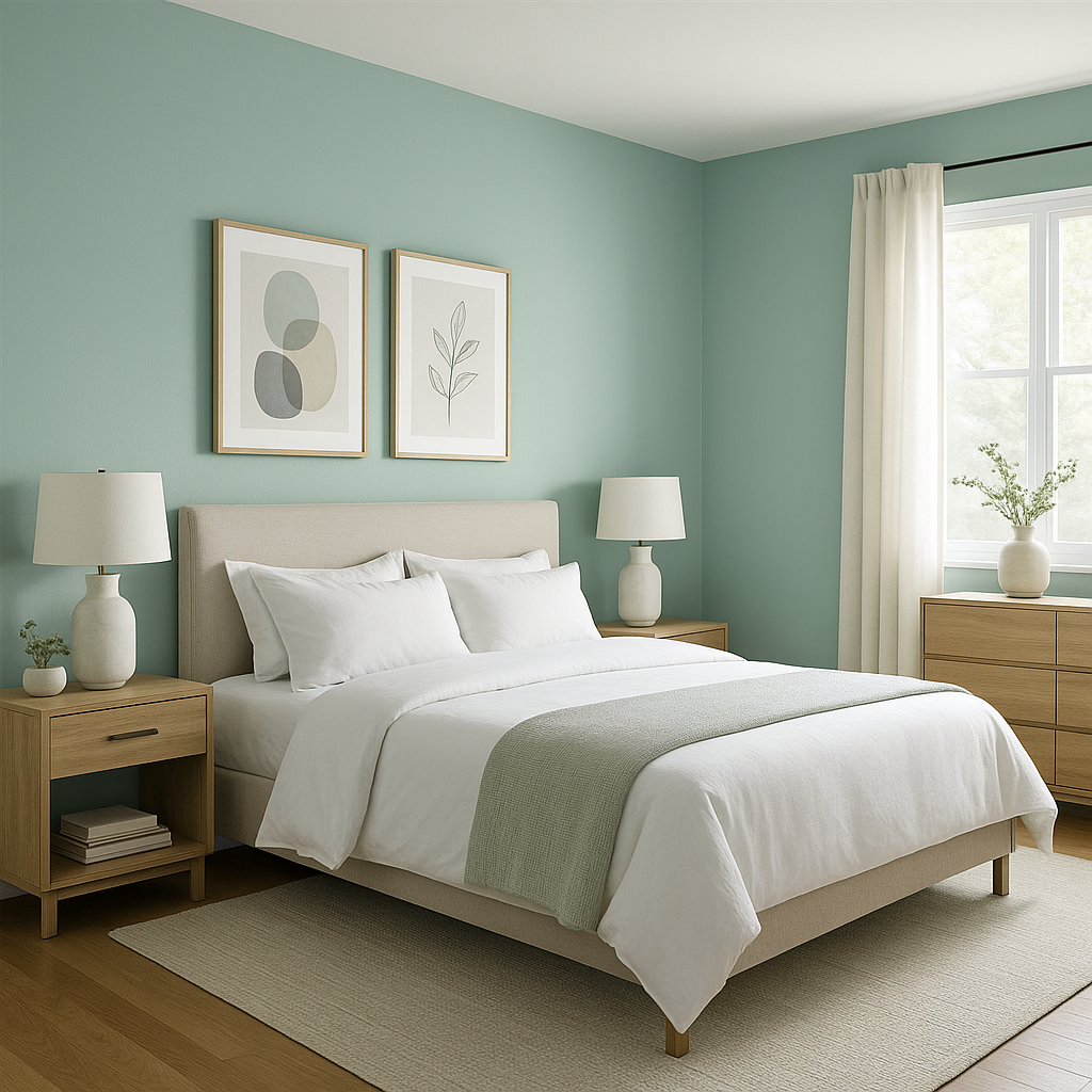
Bedrooms: Watery is an excellent choice for bedrooms, where its soothing tones can promote relaxation and restful sleep. Pair it with soft white bedding and natural wood accents for a serene retreat.
Bathrooms: The coastal vibe of Watery makes it a popular option for bathrooms. Use it on walls or cabinetry, paired with white subway tile and brushed nickel fixtures for a clean, spa-like feel.
Living Rooms: Create a welcoming and airy living room by using Watery as a wall color. Incorporate neutral furniture and navy accents for a sophisticated yet casual look.
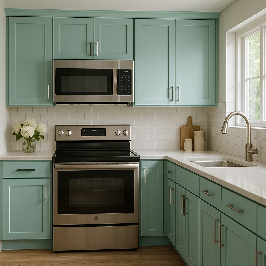
Kitchens: Watery works beautifully on kitchen cabinets, bringing a fresh, modern twist to the space. Combine it with white or gray countertops and backsplashes for a polished finish.
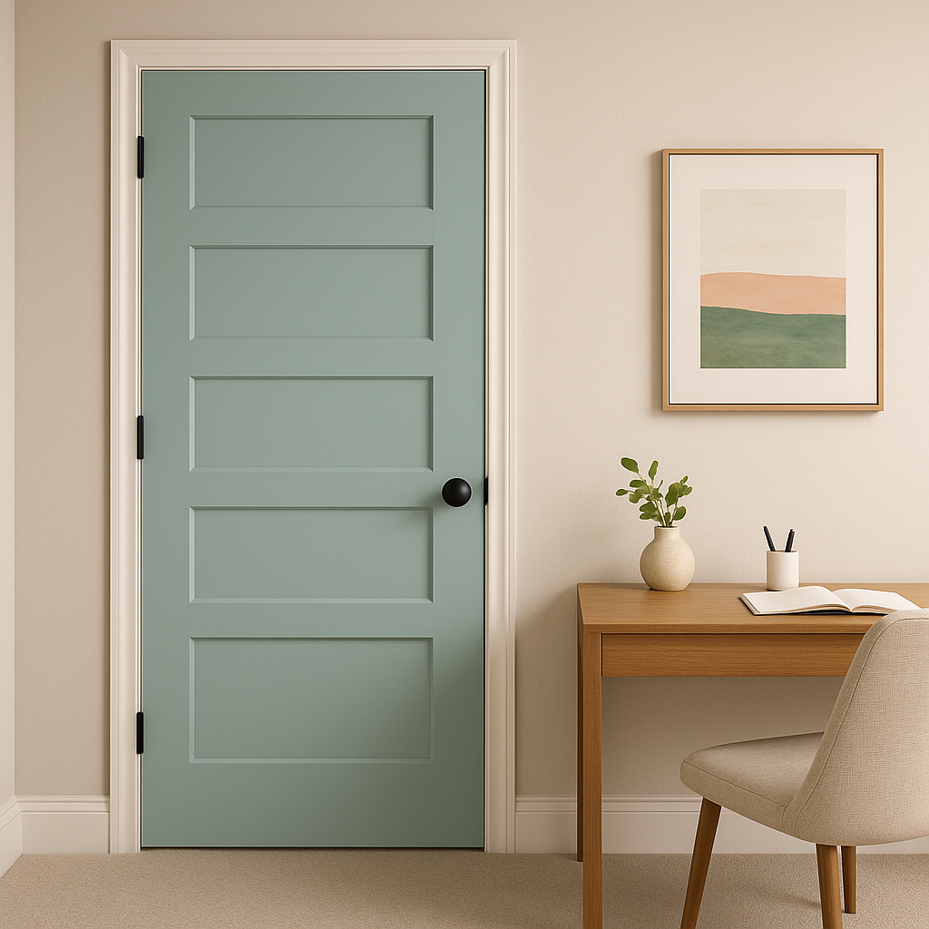
Accent Walls: If you're hesitant to commit to Watery for an entire room, use it as an accent wall color. Pair it with neutral tones or complementary blues and greens for a striking focal point.
Nurseries: The gentle and calming qualities of Watery make it a wonderful choice for nurseries or children’s rooms. It provides a soothing backdrop that promotes relaxation and creativity.
Sherwin-Williams Watery (SW 6478) is more than just a color—it’s a mood. Its ability to straddle the line between blue and green while remaining soft and approachable makes it a timeless choice for interior design. Whether you're looking to create a serene environment, add a coastal touch, or simply bring a refreshing vibe to your home, Watery delivers. With its adaptable nature and wide range of coordinating color options, this hue is a designer favorite that can elevate any space with ease.
Note: These images were all generated with AI, there may be inaccurate color results. Please only use a general reference to get a rough idea of what a color may look like, we will continue to generate new images to improve accuracy.
View Colors Only by Brand (No Imagery):
Sherwin-Williams
|
Benjamin-Moore
|
Behr
|
Valspar
Live on the Eastern Slope of Colorado and looking for a local painting professional, check out all our painting services and reach out for a free estimate.
Copyright © 2026 : Wild Fox Painting Inc. : 12435 Mead Way, Littleton, CO 80125


