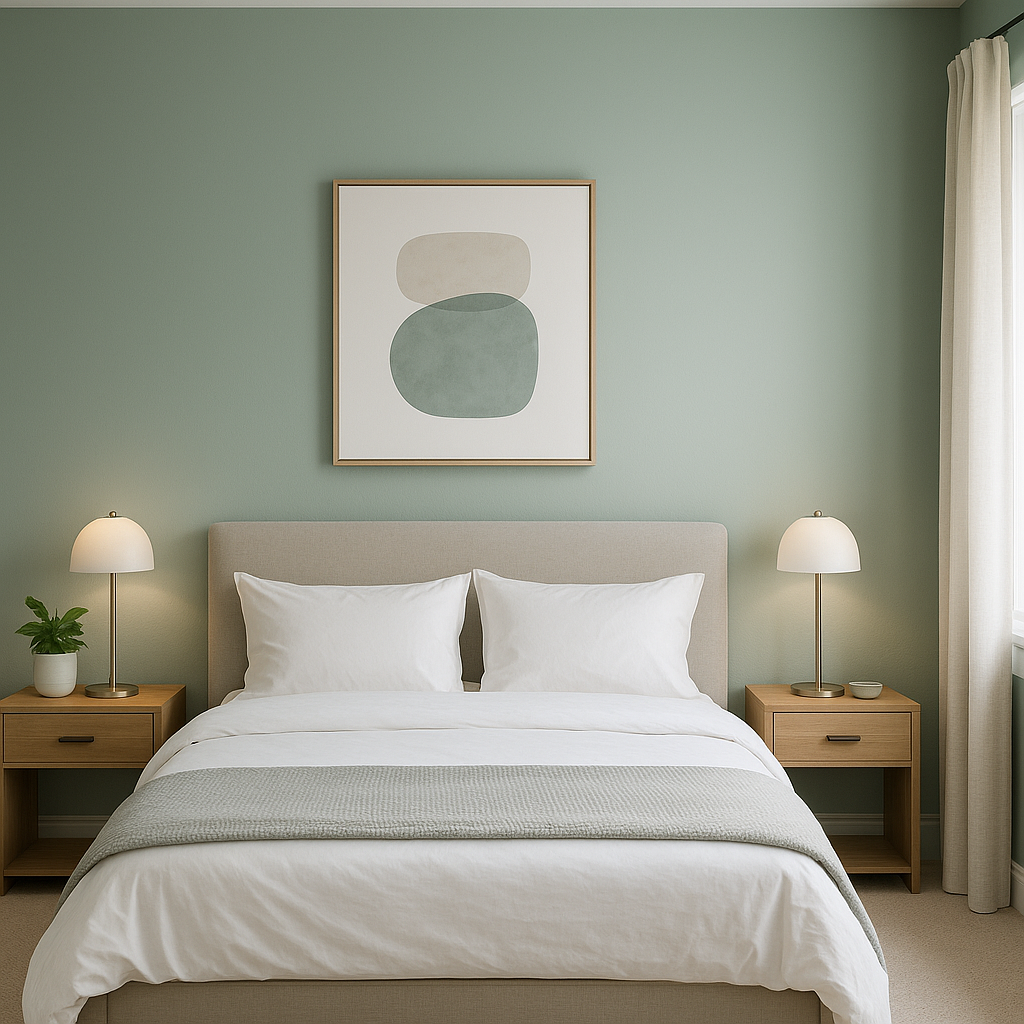
Sherwin-Williams Drizzle (SW 6479) is a captivating blue-green shade that evokes a sense of calm and natural elegance. This delicate color draws inspiration from the serene beauty of coastal waters and misty mornings, making it an excellent choice for spaces where tranquility and sophistication are desired. With its versatile undertones and ability to pair effortlessly with various palettes, Drizzle is a timeless hue that works well in a variety of interior design styles.
Drizzle features balanced undertones of blue and green, creating a soft, muted aqua appearance. It leans slightly cooler, making it an ideal choice for spaces that benefit from a refreshing and airy vibe. While its blue undertones impart a calming essence, the subtle green notes add a touch of organic warmth, making the color feel grounded without being overpowering. The muted nature of Drizzle ensures it doesn’t feel overly bright, offering understated sophistication that complements both modern and classic aesthetics.
Sherwin-Williams Drizzle is remarkably versatile, allowing for seamless pairing with a range of complementary hues. Here are some excellent options for coordinating colors:
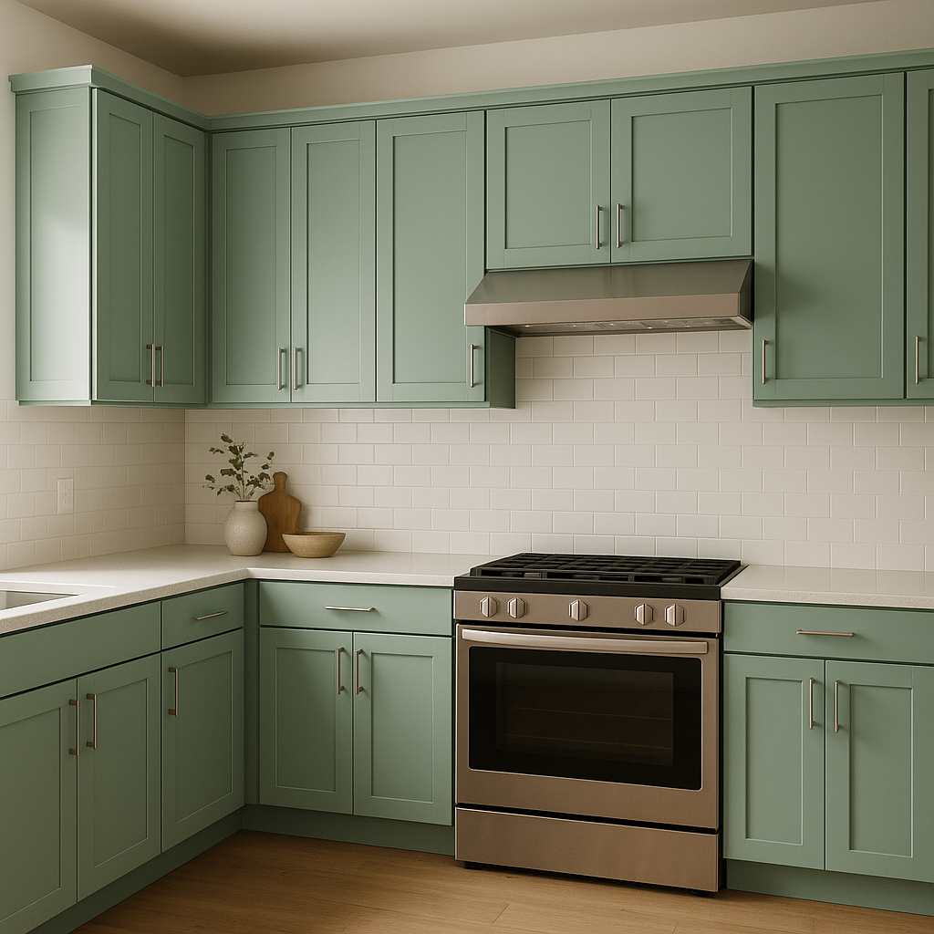
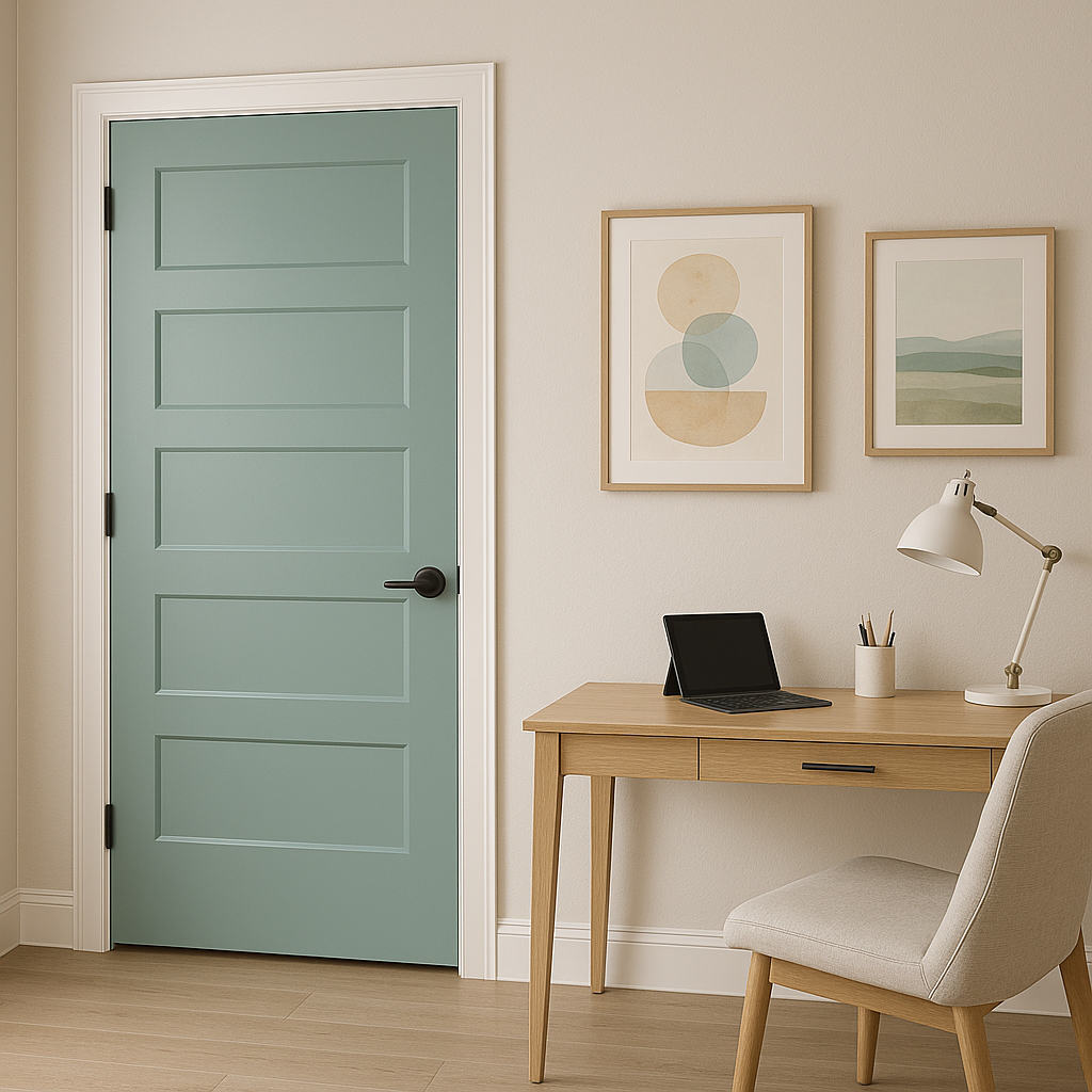
Drizzle’s soothing qualities make it a versatile choice for various applications throughout the home. Its balanced tone works well as a main wall color, an accent shade, or even for cabinetry and furniture. Here are some creative ways to incorporate Drizzle into your space:
The appearance of Drizzle can shift depending on lighting conditions. In spaces with ample natural light, the blue-green undertones are more prominent, creating a crisp and airy feel. In dimly lit areas or rooms with warm artificial lighting, Drizzle may take on a slightly warmer greenish tone, adding coziness to the space. To ensure the color works well in your specific room, test it in various lighting conditions before committing to it.
Sherwin-Williams Drizzle (SW 6479) strikes the perfect balance between serenity and sophistication. Whether you’re designing a relaxing bedroom, a spa-inspired bathroom, or a coastal-themed living area, Drizzle’s muted blue-green tones provide the ideal backdrop. Its versatility, timeless appeal, and ability to pair beautifully with a wide range of colors make it a favorite choice for homeowners and designers alike. With Drizzle, you can bring a sense of calm and understated elegance into any space.
Note: These images were all generated with AI, there may be inaccurate color results. Please only use a general reference to get a rough idea of what a color may look like, we will continue to generate new images to improve accuracy.
View Colors Only by Brand (No Imagery):
Sherwin-Williams
|
Benjamin-Moore
|
Behr
|
Valspar
Live on the Eastern Slope of Colorado and looking for a local painting professional, check out all our painting services and reach out for a free estimate.
Copyright © 2026 : Wild Fox Painting Inc. : 12435 Mead Way, Littleton, CO 80125


