Sherwin-Williams Cape Verde (SW 6482) is a rich, sophisticated shade of green that evokes a sense of nature’s elegance and timeless beauty. This jewel-toned hue blends depth and vibrancy, offering a versatile choice for both modern and classic interior design styles. Whether you’re looking to create a bold accent wall, refresh cabinetry, or add a touch of drama to a room, Cape Verde delivers an impactful yet grounded aesthetic.
Cape Verde boasts subtle blue undertones, giving it a cool and refreshing edge without veering too far into teal territory. These undertones balance the richness of the green, making it adaptable to various lighting conditions. In spaces with natural light, Cape Verde may lean slightly brighter and more vibrant, while in dimmer settings, it takes on a deeper, moodier tone. The blue undertones also give the color a coastal vibe, making it ideal for creating serene, sophisticated spaces.
When working with Cape Verde, the key lies in creating harmony with complementary and contrasting shades. Here are some suggestions:
Cape Verde’s versatility makes it an ideal choice for a variety of applications, from small accents to large-scale transformations. Here are a few design ideas:
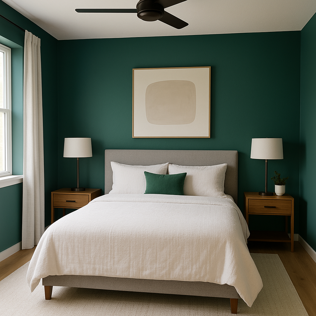
Cape Verde shines as a statement color for an accent wall. In living rooms or bedrooms, this rich green creates a focal point that adds personality and depth to the space. Pair it with neutral furnishings and metallic accessories for a polished, modern look.
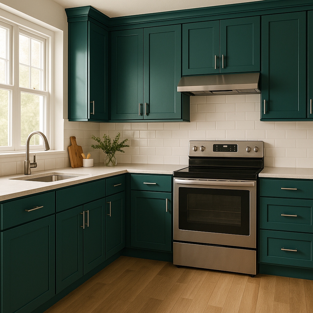
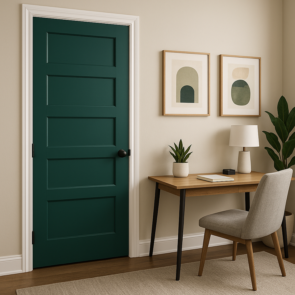
Revitalize kitchen or bathroom cabinetry with Cape Verde for a bold yet classic upgrade. Its jewel-tone quality adds a layer of sophistication to traditional wood or sleek, minimalist designs. Similarly, furniture pieces painted in Cape Verde, such as a desk or bookshelf, can serve as eye-catching elements in any room.
For a unique design twist, use Cape Verde on ceilings or trim. This unconventional application creates visual interest and elevates the overall design. Pair it with lighter wall colors for a striking contrast.
Cape Verde is equally stunning for exterior use. Whether on shutters, doors, or siding, its vibrant yet grounded hue adds curb appeal and a touch of personality to your home. Pair it with crisp whites or muted grays for a timeless exterior color scheme.
Cape Verde’s earthy green makes it a natural choice for spaces that embrace biophilic design. Pair it with organic textures like wood, stone, or rattan for a calming, nature-inspired retreat.
Cape Verde’s dynamic undertones make it sensitive to lighting conditions. In rooms with ample natural light, expect the color to appear livelier and more vibrant. In spaces with artificial or dim lighting, it will lean darker and moodier, emphasizing its jewel-toned appeal. Consider testing a sample in different areas of your home to see how it interacts with the light throughout the day.
Sherwin-Williams Cape Verde (SW 6482) is a stunning choice for anyone looking to incorporate a deep yet inviting green into their home. Its versatile undertones, ability to pair beautifully with coordinating colors, and adaptability across design styles make it a standout option for interior and exterior projects alike. Whether you're aiming for bold drama or serene sophistication, Cape Verde is the perfect shade to elevate your space.
Note: These images were all generated with AI, there may be inaccurate color results. Please only use a general reference to get a rough idea of what a color may look like, we will continue to generate new images to improve accuracy.
View Colors Only by Brand (No Imagery):
Sherwin-Williams
|
Benjamin-Moore
|
Behr
|
Valspar
Live on the Eastern Slope of Colorado and looking for a local painting professional, check out all our painting services and reach out for a free estimate.
Copyright © 2026 : Wild Fox Painting Inc. : 12435 Mead Way, Littleton, CO 80125


