Sherwin-Williams Cloudburst (6487) is an exquisite deep blue that captivates with its refined, moody undertones and versatile applications. Perfect for creating dramatic yet inviting spaces, this color effortlessly balances sophistication and comfort. Whether you're looking to design a cozy retreat or make a bold statement, Cloudburst is a shade that evokes tranquility and depth, adding richness to any interior or exterior setting.
Cloudburst is much more than a simple blue; it carries subtle green and gray undertones that give it a layered, complex appearance. The green undertones lend a natural vibrancy and a whisper of earthiness, while the gray softens the overall hue, making it feel grounded and serene. This combination ensures that Cloudburst is neither overly intense nor overly muted, making it adaptable to various styles and moods.
Its undertones also make it responsive to lighting conditions. In brighter spaces, Cloudburst can appear lighter and more vibrant, showcasing its green hues. In dimmer, shadowed environments, the gray undertones become more prominent, giving it a deeper, more dramatic feel. This dynamic quality makes Cloudburst a perfect choice for spaces with varied lighting throughout the day.
Pairing Cloudburst with complementary and contrasting shades can enhance its beauty and create a cohesive palette. Below are some coordinating colors that work exceptionally well with this stunning hue:
Neutral Pairings:
Accent Colors:
Coordinating Blues and Greens:
Cloudburst is an incredibly versatile color that can adapt to a wide range of spaces and styles. Below are some ideas for where and how to incorporate this rich, moody blue into your home or business:
Cloudburst is a fantastic choice for living spaces where you want to create a cozy yet elegant atmosphere. Use it as the primary wall color and pair with light-colored furniture and metallic accents, such as brushed brass or copper, to elevate the room’s sophistication.
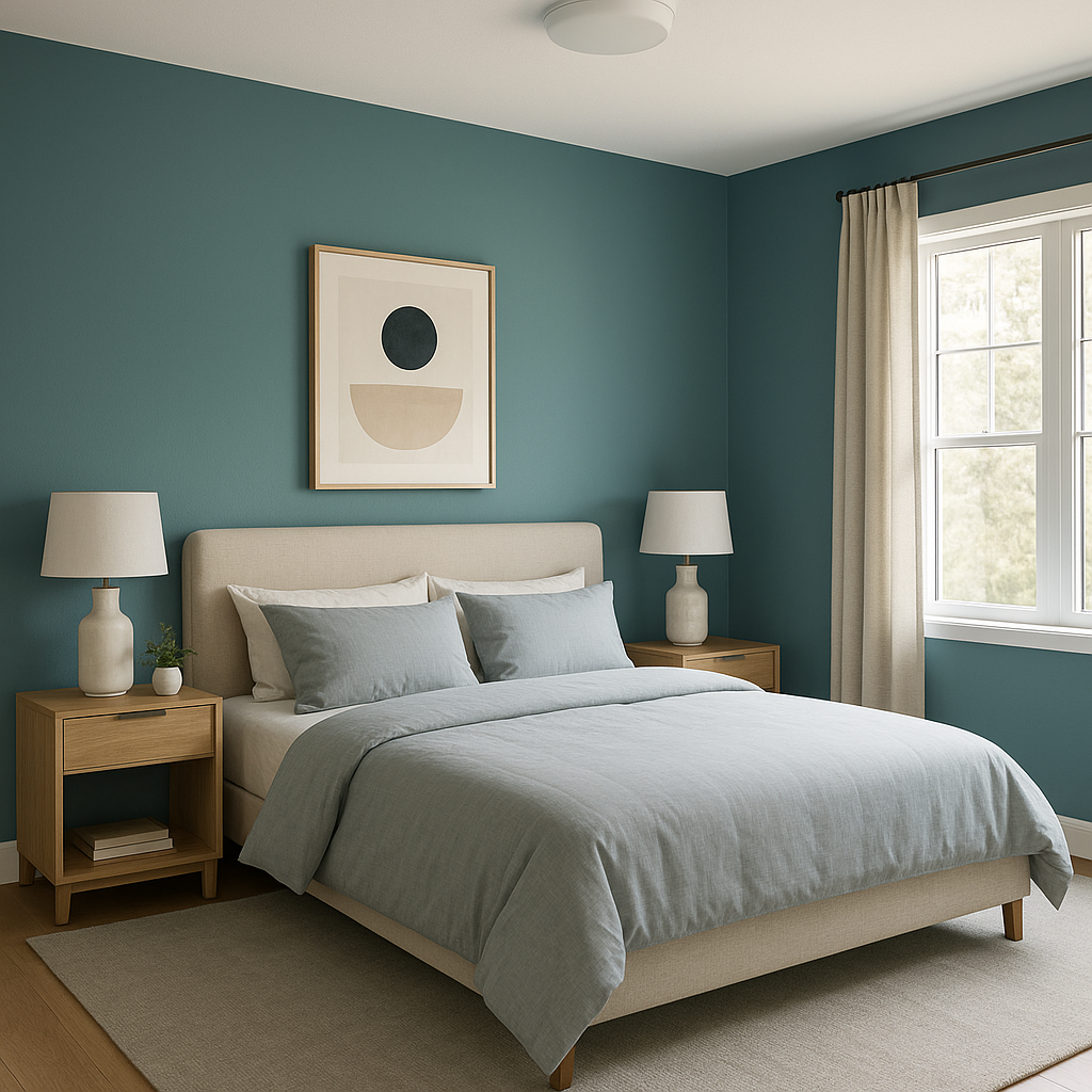
In bedrooms, Cloudburst offers a serene and cocoon-like feel, perfect for relaxation. Consider painting an accent wall behind the bed for a bold, dramatic effect, or use it throughout the room for a more enveloping vibe. Pair with white bedding and soft gray textiles for a calming, cohesive retreat.
Create a spa-inspired bathroom by pairing Cloudburst with crisp white tiles and natural wood accents. Its calming undertones make it ideal for spaces designed to rejuvenate. Add touches of greenery, like potted plants, to enhance the organic feel.
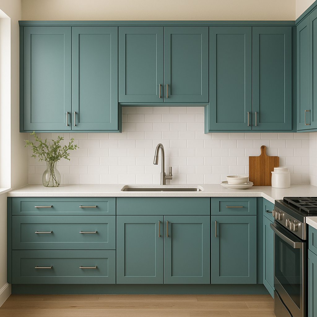
Cloudburst can add a touch of sophistication to kitchen cabinetry or an island centerpiece. Pair it with marble or quartz countertops and sleek hardware for a modern, polished look. Alternatively, use it for an accent wall and complement with neutral tones for a balanced aesthetic.
This shade is equally stunning in outdoor settings. Use Cloudburst for siding or shutters to give your home a bold yet timeless curb appeal. Pair with white trim and natural stone accents for a classic, enduring exterior design.
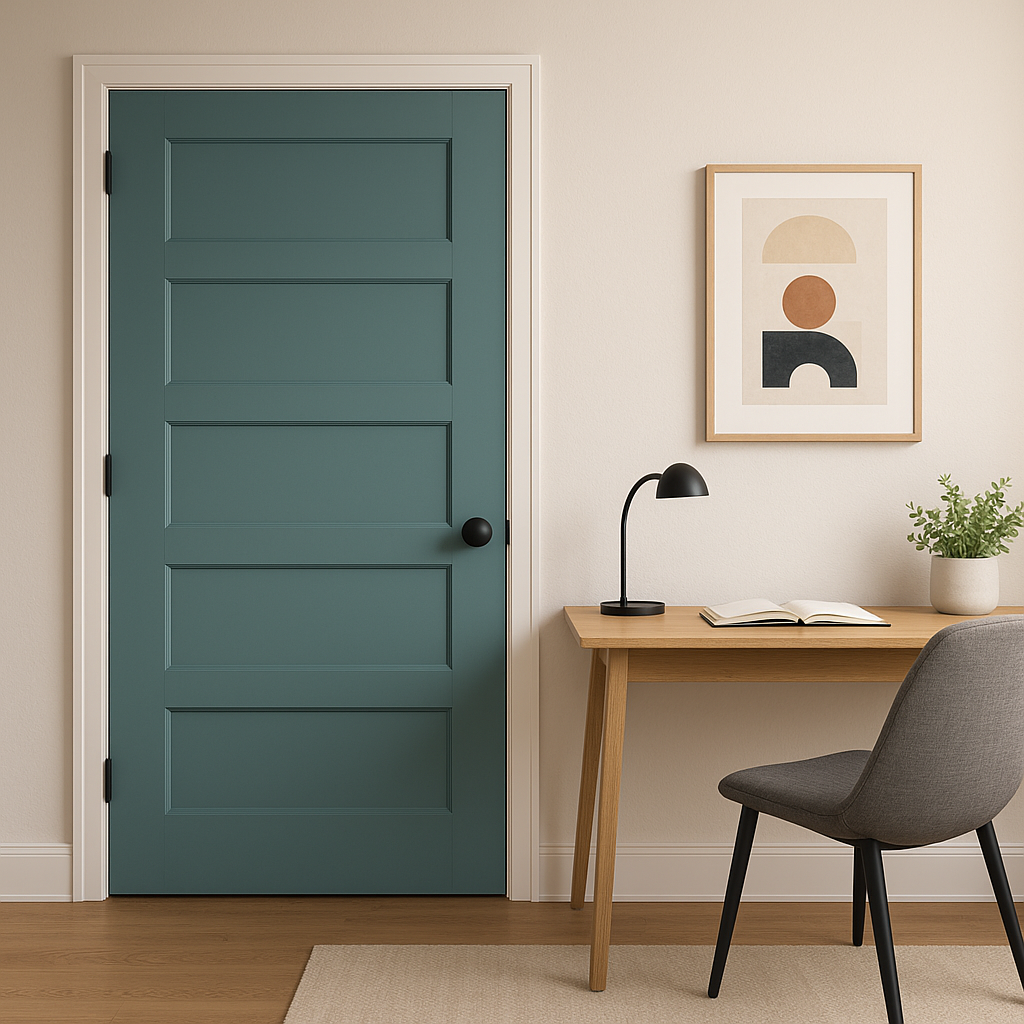
In offices or creative spaces, Cloudburst fosters an environment of focus and calm. Use it for walls or furniture to create a professional yet inviting atmosphere. Pairing it with lighter neutrals ensures the space feels balanced and energizing.
Sherwin-Williams Cloudburst (6487) is a timeless, versatile blue that makes an impact without overwhelming a space. Its ability to adapt to various lighting conditions, pair beautifully with a range of colors, and suit both modern and traditional styles makes it a favorite among interior designers. Whether used as a statement color or a complementary shade, Cloudburst brings depth, sophistication, and an undeniable sense of calm to any environment.
This color is ideal for homeowners and designers seeking a bold yet approachable hue that can elevate their spaces with an air of refinement. Its adaptability ensures it will remain a favorite for years to come.
Note: These images were all generated with AI, there may be inaccurate color results. Please only use a general reference to get a rough idea of what a color may look like, we will continue to generate new images to improve accuracy.
View Colors Only by Brand (No Imagery):
Sherwin-Williams
|
Benjamin-Moore
|
Behr
|
Valspar
Live on the Eastern Slope of Colorado and looking for a local painting professional, check out all our painting services and reach out for a free estimate.
Copyright © 2026 : Wild Fox Painting Inc. : 12435 Mead Way, Littleton, CO 80125


